The network for creativity
Join 1.25M professional creatives like you
Connect with clients, get discovered, and run your business 100% commission-free
Creatives on Contra have earned over $150M and we are just getting started
Back to feedPost


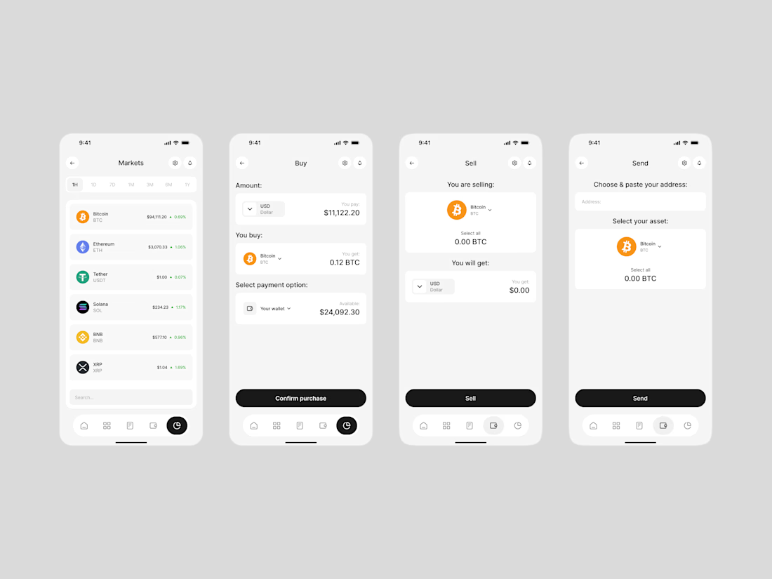

The buy/sell flow states are clean, especially the confirm screen keeping the fee breakdown visible instead of hiding it behind a tap. Since you've got Claude tagged here, how much of this was AI-generated versus you refining it manually afterward?

Really like how clean and organized these screens feel.

Crypto apps usually feel intimidating but these read clean and calm, the buy and sell flows are stripped to exactly what matters. Confirm purchase as a big black button is the right amount of friction for money moves.

Fantastic UI!


Love the minimal vibe on this. It keeps the interface looking sleek and lets the actual numbers and assets stand out exactly how they should.

Great work!

Love how clean clear the designs are

You nailed the overall mood here. The details just reinforce it nicely.


clean

Strong graphic quality .

Nice UI design I like it ❤️

Crypto apps usually feel so cluttered, but these screens stay really calm and readable. Nice job keeping the numbers easy to scan

Amazing!
The network for creativity
Join 1.25M professional creatives like you
Connect with clients, get discovered, and run your business 100% commission-free
Creatives on Contra have earned over $150M and we are just getting started

Challenges
View all


Related posts

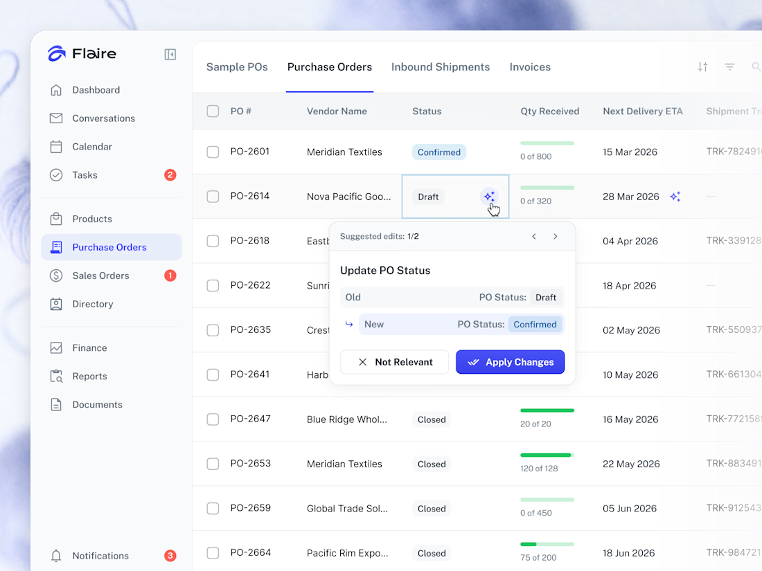
✨ AI Suggestions on the Purchase Orders list. Proposed record edits surface inline for the user to apply or dismiss in one tap.


Great work



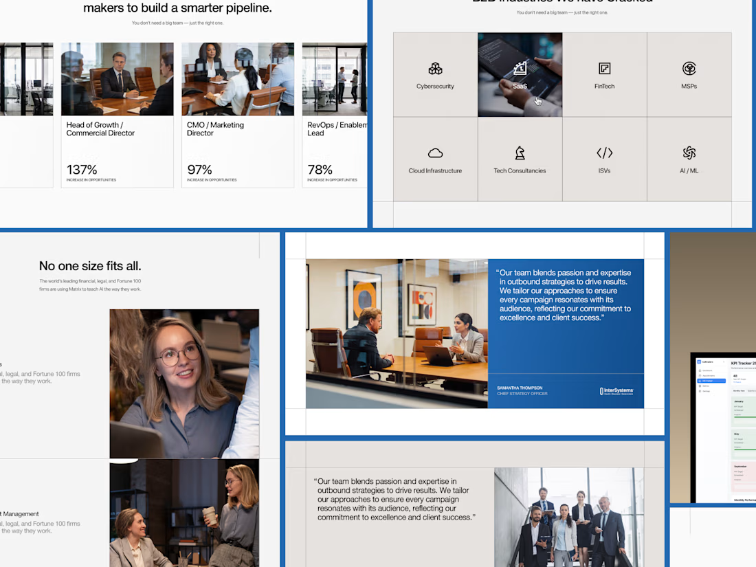


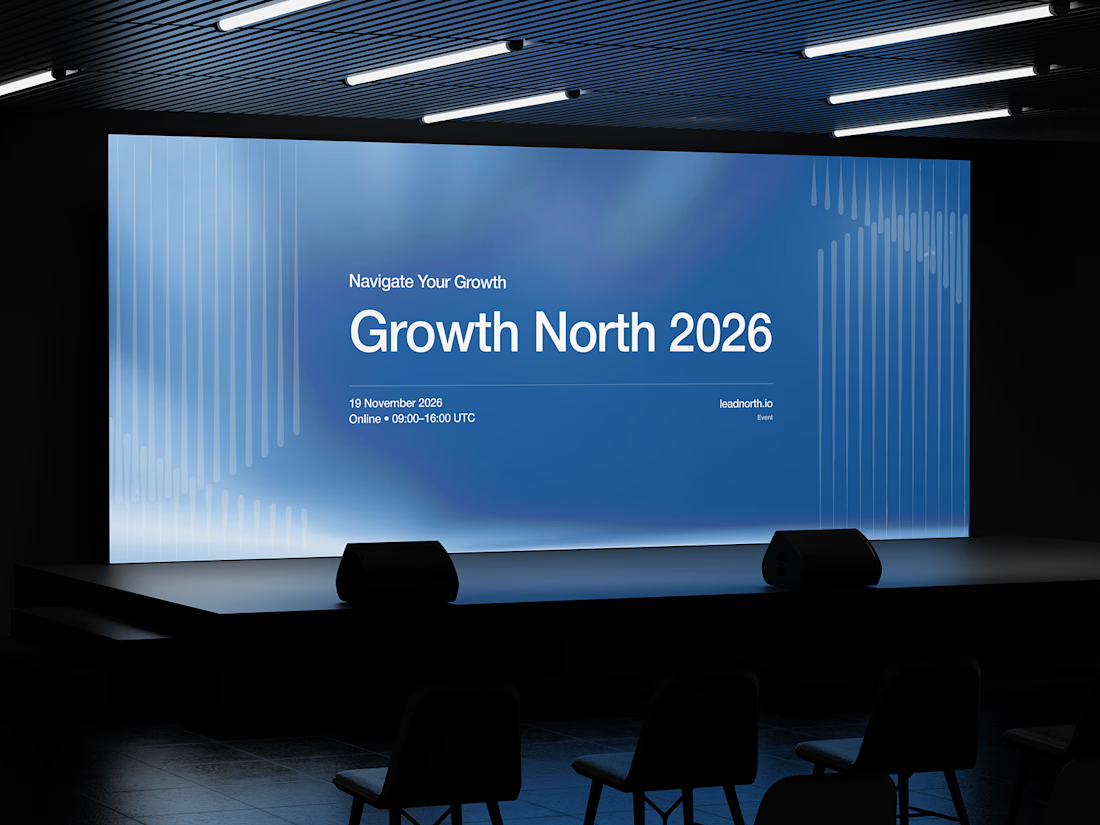


That saturated cobalt blue carries cleanly from the laptop hero onto the outdoor billboard and the Growth North 2026 stage screen.