The network for creativity
Join 1.25M professional creatives like you
Connect with clients, get discovered, and run your business 100% commission-free
Creatives on Contra have earned over $150M and we are just getting started
Back to feedPost

I finally wrote about the process behind The Postcard 🌷
What started as me staring at an old postcard on Pinterest somehow turned into a Config Makeathon project, 50+ Figma Make versions, lots of failed iterations, debugging sessions, and a surprisingly fun introduction to vibe coding.
I shared how the idea came about, what went wrong, what I learned and how the project evolved from a simple prototype into a working experience.
If you're curious about the behind-the-scenes process, give it a read 💌


medium.com
My First Config Makeathon Project — The Postcard
Hi! I’m Vrutika Chavan, a UI/UX Designer, and I love creating experiences that make users think of design as more of a memorable emotional…
The network for creativity
Join 1.25M professional creatives like you
Connect with clients, get discovered, and run your business 100% commission-free
Creatives on Contra have earned over $150M and we are just getting started



Related posts

I designed these editorial-inspired layouts as part of an exploration for a fictional photography and fashion magazine
↳ Master typography & layout - The foundation of timeless web design. Join 350+ designers inside my 13-hour online course https://typomonday.com/course
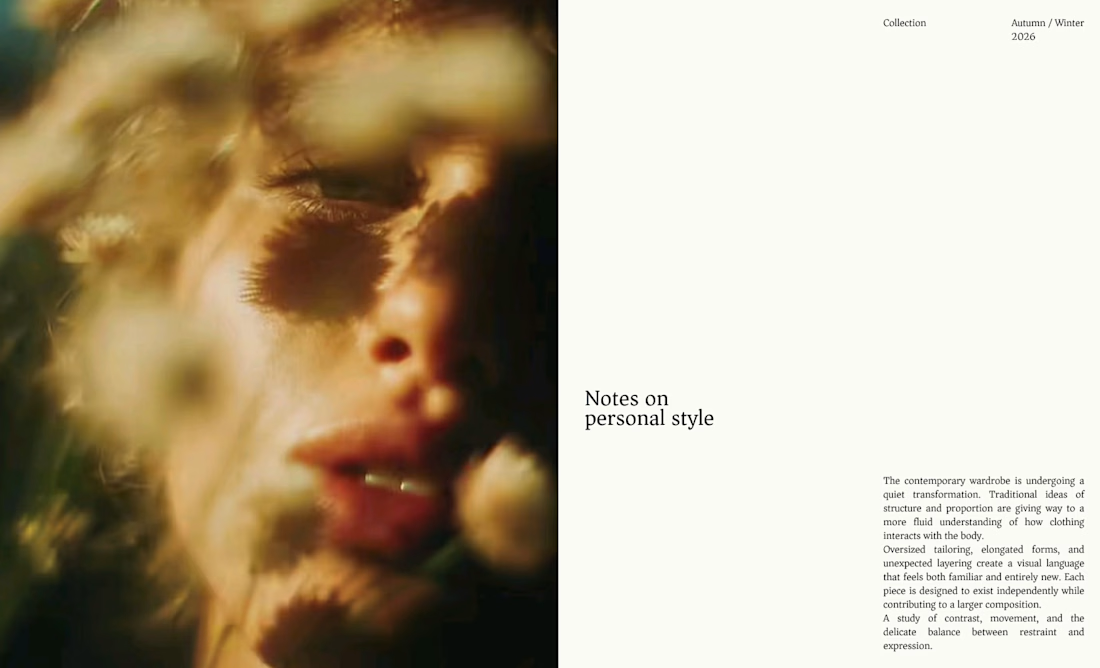
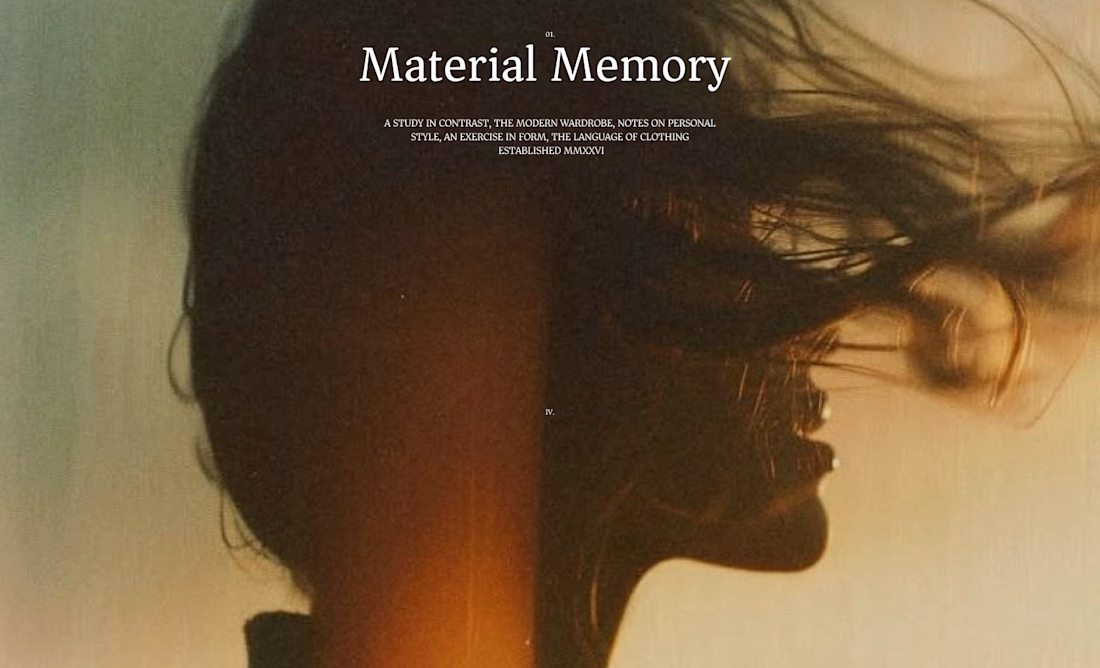
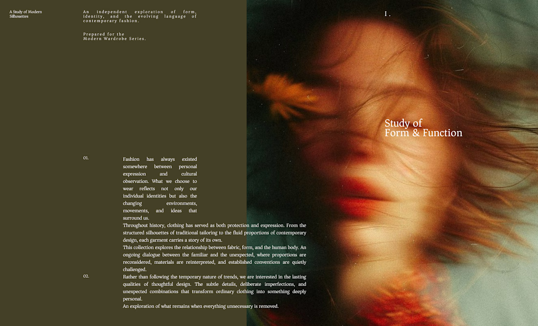
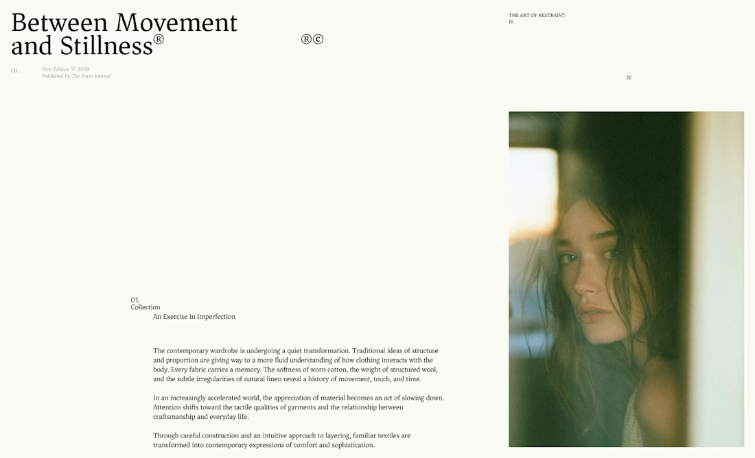

Really nice exploration 👍

New project! Me and @Mary Delaney helped out the folks at Balloon with a rebranding a redesign of their mascot! Check out the new appstore listing and stay tuned for much more!
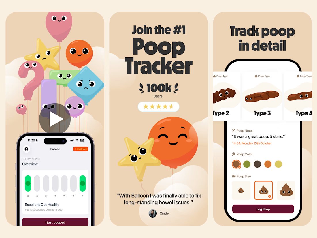
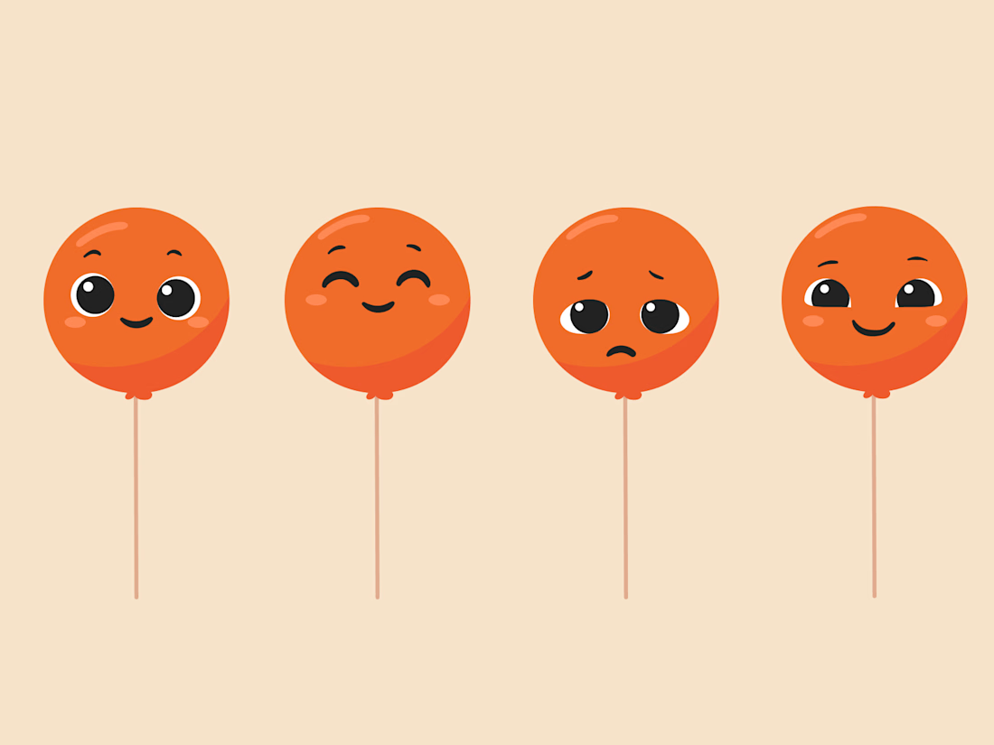

Everything has character! Good job. I like the little faces on the terds 🤣

Deep Focus is a fictional macOS app that silences notifications so people can do deep work. The catch is the audience: people who need a productivity app are already tired of apps. Every competitor promises more features, so this page had to promise relief and turn it into a download within seconds.
What I did
I started from the pain, not the product. The second screen lists what a normal day looks like: push notifications, endless pings, 142 unread emails, context switching. I styled those chips like the four benefit chips in the hero, only white instead of frosted, so the visitor reads before and after without a line of explanation.
The hero section design shows no interface on purpose. This product is about absence, and a screenshot would add noise, so a person alone in a field does the proving. The headline “Deep focus. Anywhere.” is a high-contrast serif because every tool in this category speaks in a grotesque, and a serif sounds calm and human.
I kept one action, Download for macOS, with no pricing and no form. The first job of this landing page design is a download, and everything else can wait until after it.
Would you keep the serif for the headline, or switch to a grotesque so it feels more like software?


Love this!