The network for creativity
Join 1.25M professional creatives like you
Connect with clients, get discovered, and run your business 100% commission-free
Creatives on Contra have earned over $150M and we are just getting started
Back to feedPost
Big brands can make mistakes. Stay with me.
Founders may not have time to test a product, but as a designer, you should test your features and be ready to reiterate based on feedbacks. It is a growth strategy.
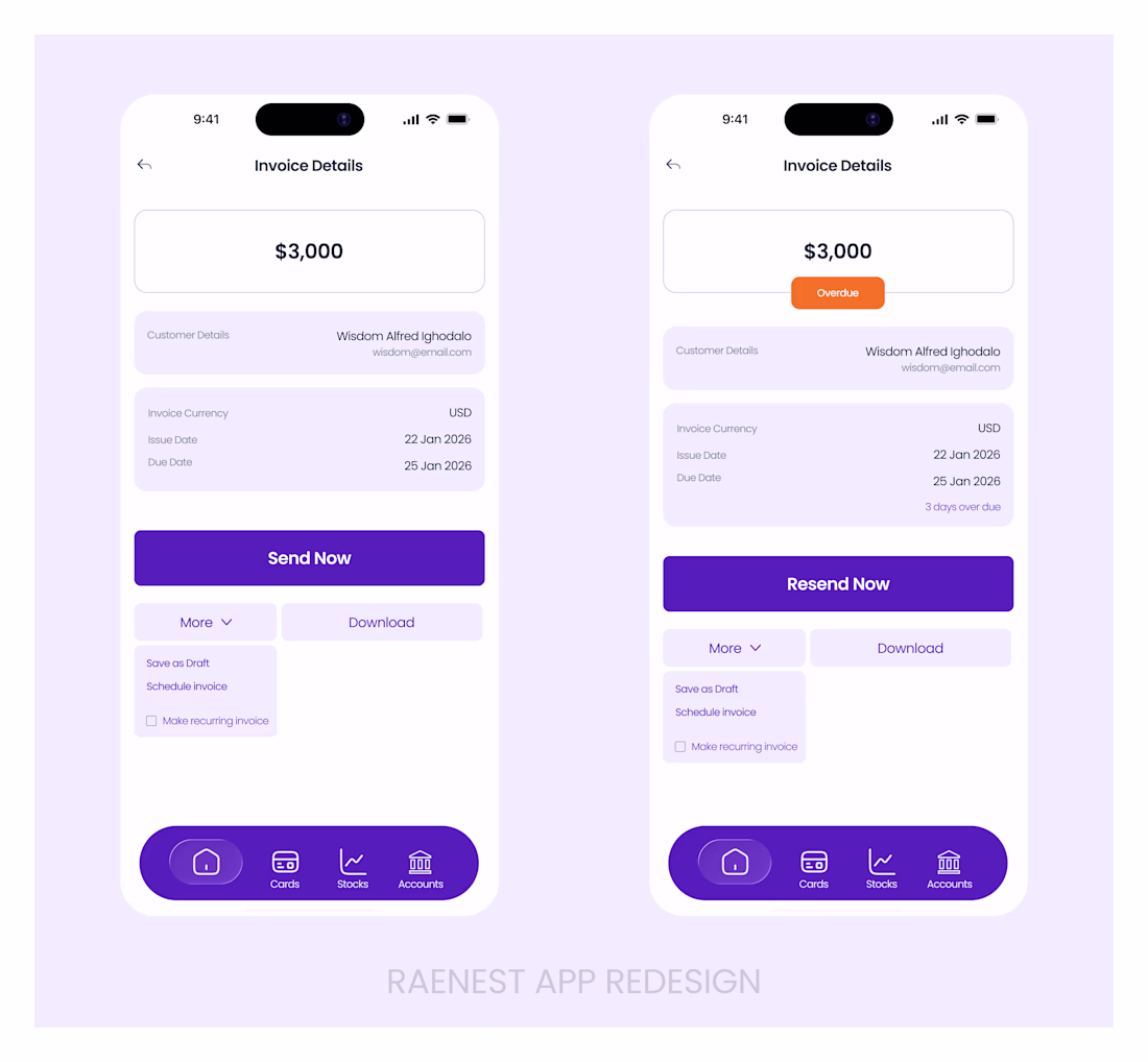
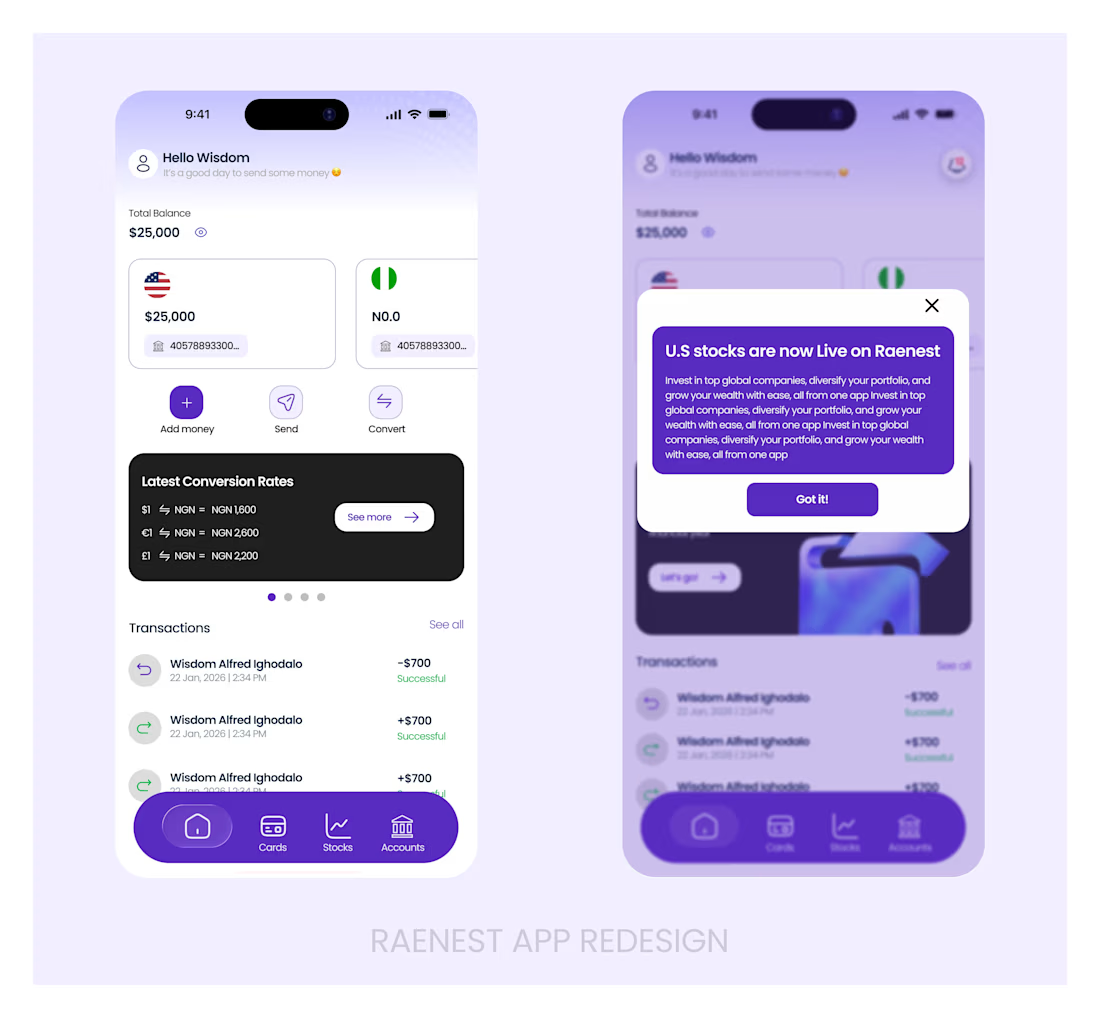
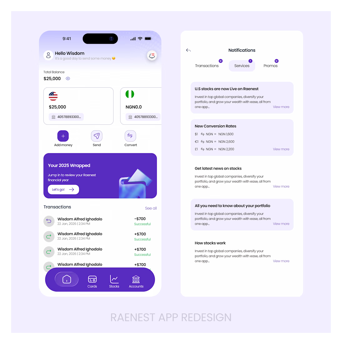
Using the Raenest App, I came across a few user experience issues that I though would be best showing to them rather than telling (They fixed one out of all).
Using a black text on an orange background does not create visual ease. As much as we thought that was some general knowledge, it could be have been an oversight. So I thought to remind the team that white gives more visual ease and would not create mental tension against an orange background.
Then I thought a little upgrade to the menu bar would do.
You can see the remaining suggested upgrades in the photos
The network for creativity
Join 1.25M professional creatives like you
Connect with clients, get discovered, and run your business 100% commission-free
Creatives on Contra have earned over $150M and we are just getting started
Related posts
We all want @Contra HQ to have a mobile app, right? This is how I would approach it! 😉
Great work
How do you turn a brand mascot into a visual system people actually remember?
🐆 Our lynx represents sharp thinking, curiosity, and attention to detail.
For this motion experiment, we pushed the mark into a softer, unexpected direction - rebuilding it with different textures.
Same identity, different emotion.
Which texture fits the Lynksen identity best - flowers, grass, or something else? 👇✨
I personally love the soft blue and white version the most. Nice to scale it into the brand campaign or ad video 😃
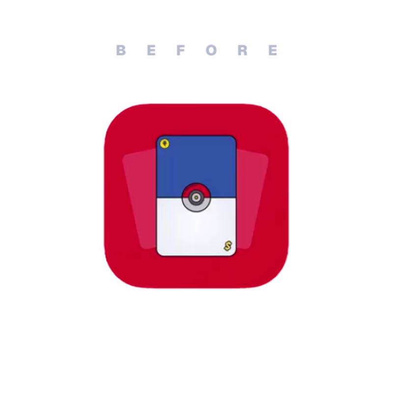
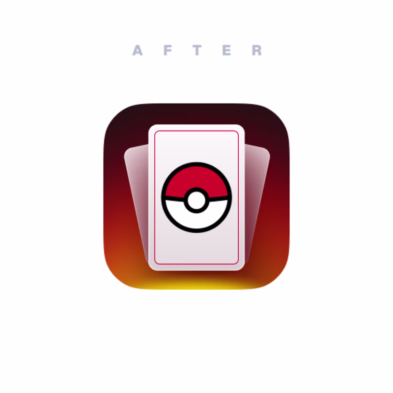
I am not a logo designer and not an icon designer, but...
When there is an opportunity (and vision) I always try to help the client - as a small bonus to the main task.
Here is one example. Which one is better?
4 voted
13%
28 voted
87%
32 votes
Closed
After, easily. The gradient card + rounded Pokeball reads so much cleaner at small sizes, the before version's flat white/blue split gets muddy once you shrink it to an actual home screen icon. Was this an unpaid "extra" you pitched to the client, or did they specifically ask for icon options?
Challenges
View allTrending
Claude
Claude has entered the design space. How are you using Claude Design?
Contra University
Learn from expert creatives how to earn more using next-gen AI tools.
fifaworldcup2026
The World Cup is here and the whole world's watching. How are you designing for the world stage?
creativeaiflow
Creative AI workflows are evolving. What tools do you use, and what are their strengths and weaknesses?
freelancerlife
Freelancer life is wins, pivots, and everything in between. What’s yours right now?