The network for creativity
Join 1.25M professional creatives like you
Connect with clients, get discovered, and run your business 100% commission-free
Creatives on Contra have earned over $150M and we are just getting started
Back to feedPost

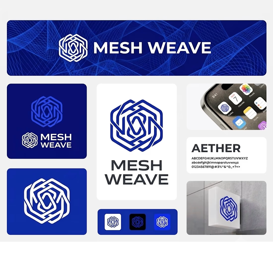
Mesh Weave — Brand Identity & Visual Design System
Excited to share the complete brand identity design for Mesh Weave! The core concept centers around a dynamic geometric weave pattern, reflecting connectivity, precision, and modern technology.
Key Highlights of the Project:
Logo System & Marks: A versatile geometric mark paired with flexible light and dark vector variations designed for seamless adaptation across all platforms.
Typography & Palette: Clean pairing featuring the AETHER typeface, anchored by a high-contrast palette of Cobalt Blue, Deep Royal, and crisp white for a high-end, tech-forward aesthetic.
Mockups & Application: Real-world execution across mobile UI, social media banners, and physical outdoor signage.


The network for creativity
Join 1.25M professional creatives like you
Connect with clients, get discovered, and run your business 100% commission-free
Creatives on Contra have earned over $150M and we are just getting started











Related posts


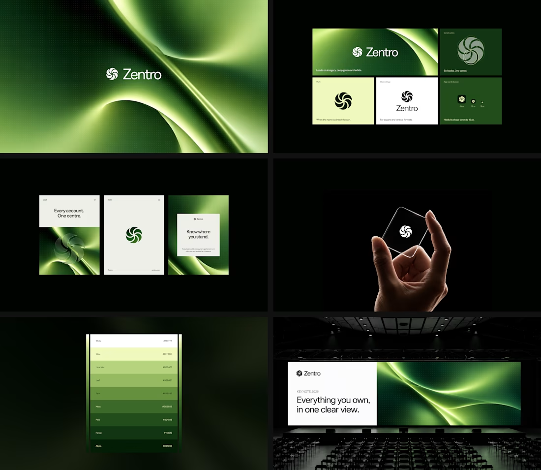

Clean and confident work! The green gradient with the mark feels very modern for fintech - trustworthy but not boring. The app screens look really polished. Curious how you landed on this mark, does it represent growth / movement?

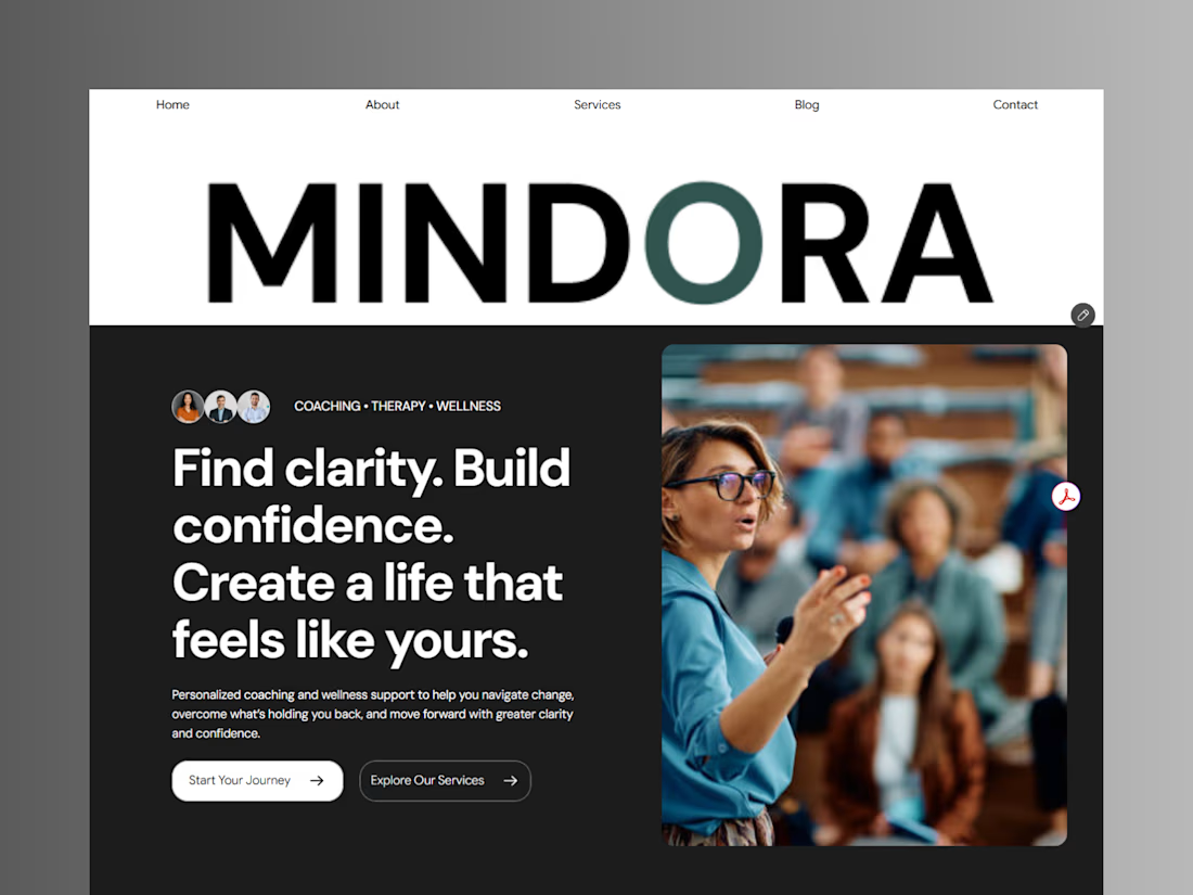
Introducing Mindora — a Life Coaching & Wellness Framer Template.
I designed Mindora for life coaches, wellness professionals, and personal growth brands looking for a calm, modern, and welcoming online presence.
Inspired by clarity, confidence, and meaningful growth, Mindora features a thoughtful layout, dedicated service sections, a blog for sharing valuable insights, and a clean visual style designed to help brands connect with their audience.
Built with Framer, it's a customizable starting point for creating a professional coaching or wellness website.
Explore Mindora and bring your next website idea to life.
Kindly check it out the template: https://www.framer.com/marketplace/templates/mindora-life-coach/



Great work

Pakeging Design Brand Design Product Design