The network for creativity
Join 1.25M professional creatives like you
Connect with clients, get discovered, and run your business 100% commission-free
Creatives on Contra have earned over $150M and we are just getting started
Back to feedPost

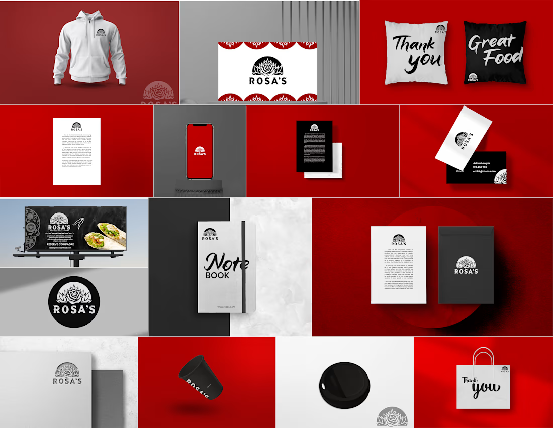
This project for Rosa's was developed as a holistic brand identity and merchandising system designed to transition a traditional culinary brand into a modern, lifestyle-centric competitor. The development strategy focused on "Brand Ubiquity," ensuring that the visual language translates seamlessly from physical storefronts to digital screens and tangible merchandise.
Here is the breakdown of the development and design strategy for this brand:
1. Visual Strategy: The "Bold & Botanical" Language
The core identity was developed to balance the grit of Mexican street culture with a modern, high-contrast aesthetic.
Logo Development: We created a distinctive rose-based emblem that doubles as a badge. The heavy linework was engineered for versatility, ensuring it remains legible whether it is embroidered on a hoodie or embossed on a business card.
Color Psychology: A high-energy Crimson Red was selected as the primary brand driver to stimulate appetite and passion. We paired this with a stark Monochrome (Black & White) secondary palette to ground the brand in sophistication and "cool."
Typography: The project utilizes two distinct styles—a bold, geometric sans-serif for authority and a fluid, "street-style" script for a hand-crafted, approachable feel (seen on the "Thank You" and "Notebook" assets).
2. Multi-Channel Collateral Design
We developed a suite of mockups to test the brand’s scalability across different touchpoints:
The "Lifestyle" Pillar: By developing hoodies, notebooks, and pillows, we moved the brand beyond just "food" and into "culture." This strategy encourages customer loyalty by turning fans into walking brand ambassadors.
The "Service" Pillar: For the physical restaurant experience, we designed high-contrast coffee cups, take-out bags, and billboard layouts. Each piece uses the logo as a centerpiece, reinforced by a "Mexican folk art" pattern for cultural texture.
The "Professional" Pillar: Business cards and stationery were designed with a minimalist "Swiss-meets-Street" layout, utilizing large blocks of color and precise logo placement to convey business maturity.
3. Brand Architecture & Asset Testing
Texture & Finish: We experimented with different manufacturing finishes, including matte black cardstock, white embroidery, and embossed paper stock. This adds a tactile layer to the brand that feels premium and intentional.
Spatial Layout: The billboard and stationery designs were developed to handle large amounts of whitespace. This prevents the brand from feeling "cluttered" and allows the bold red to do the heavy lifting in attracting the eye from a distance.
4. Technical Goals
The final deliverables were provided as a modular toolkit. This allows the client to apply the branding to new items—like staff uniforms or digital menus—using the established grid systems and color ratios without losing visual consistency.


The network for creativity
Join 1.25M professional creatives like you
Connect with clients, get discovered, and run your business 100% commission-free
Creatives on Contra have earned over $150M and we are just getting started
Related posts



Love this!

Every piece tells a story. The brand should too.
This project is a luxury jewelry label that needed to feel timeless, elegant, and shoppable. We built a deep teal visual world model, campaigns, close-up product shots, and a cohesive grid identity.
The result? A brand that looks as precious as what it sells.
Available for branding & content projects; let's talk.
#JewelryDesign #BrandDesign #LuxuryAesthetic #FineJewelry #VisualIdentity #ContentCreation #FreelanceDesigner

Nice work!

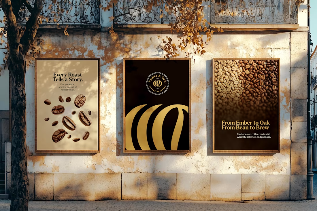
The strongest logos tell simple stories.
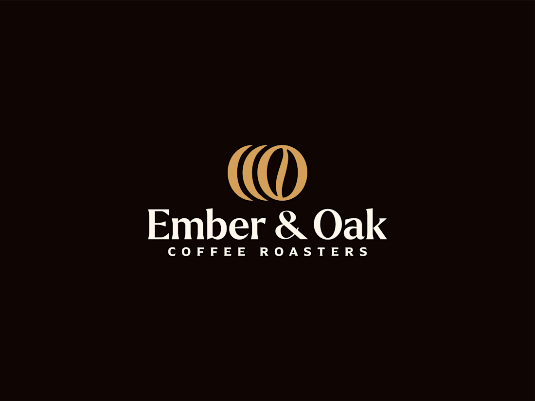
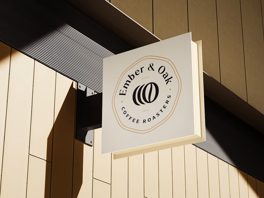
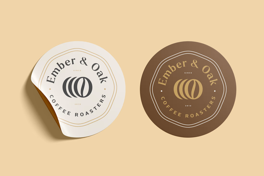
For Ember & Oak Coffee Roasters, overlapping beans represent each roasting stage, with warm brown tones capturing the farm-to-cup journey. A clean mark that builds trust.
Ready for yours? DM or email to info@donatus.agency.
logodesignerbranddesignerbrandidentityBrand DesignBrand StrategyLogo DesignAdobe FireflyAdobe IllustratorAdobe Photoshop









Trending

Claude
Claude has entered the design space. How are you using Claude Design?

Contra University
Learn from expert creatives how to earn more using next-gen AI tools.
creativeaiflow
Creative AI workflows are evolving. What tools do you use, and what are their strengths and weaknesses?
portfolioreview
The best portfolios tell a story, not just show a grid. Share yours for feedback.
freelancerlife
Freelancer life is wins, pivots, and everything in between. What’s yours right now?