The network for creativity
Join 1.25M professional creatives like you
Connect with clients, get discovered, and run your business 100% commission-free
Creatives on Contra have earned over $150M and we are just getting started
Back to feedPost
I built a Valentine mini product.
Built with Wispr Flow + Lovable.
Short demo below 👇
Say It Properly is a Valentine mini-experience that helps people turn messy, emotional voice messages into clear, respectful and emotionally mature messages.
This product focuses on emotional clarity, vulnerability and better communication, not gifts or dating.
Users speak freely, select what they truly want to say (apology, confession, closure or gratitude), and receive a refined message presented as a beautiful, shareable card.
The experience is intentionally small and voice-first.
Using Wispr Flow
I used Wispr Flow as the main interaction:
users speak naturally
their voice becomes the raw emotional input
that raw voice is transformed into a clear message
Voice is not a feature, it is the product.


What do you think of this challenge. Have you tried it yet.

This is so thoughtful! so many people experience a range of emotions on Valentine’s Day. I love the choice to highlight different perspectives.
Thank you for this, it means a lot to me.
This is what the card looks like.
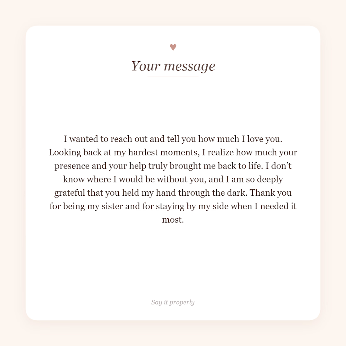

@Shammah Ugbebor This is really cool! 🎉 I love how you turned raw, emotional voice input into thoughtful, shareable messages, it’s such a fresh, human-centered approach to communication.
Thank you so much. I appreciate it.
The network for creativity
Join 1.25M professional creatives like you
Connect with clients, get discovered, and run your business 100% commission-free
Creatives on Contra have earned over $150M and we are just getting started







Related posts


Have you ever gone this bold on a 404? ⚡
Back to our latest poll: y'all voted Black (60%). We shipped Pink anyway.
Our client's call, not ours - and once you see her brand, you'll get why. Feminine-led, bold, unapologetic - Pink was never really up for debate on her end. 💗👠
See it live: https://productionportugal.com/404
404pagecreativewebsitewebdesignCreative Design Motion DesignWeb DesignAdobe After EffectsFigmaWebflow


You nailed the overall mood here. The details just reinforce it nicely.


Team Sections: Professional Only or Professional + Personal?
A team section can build trust in different ways.
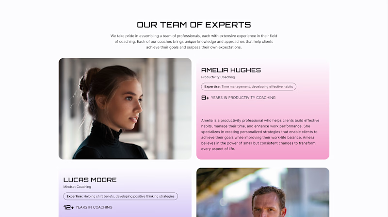
Version A - Professional. Focuses on the coaches’ professional experience - their expertise, years of practice, and approach to working with clients.
Version B - Professional + Personal. Keeps this information but adds a Weekend Mode with personal photos, interests, and small stories about life outside work.
For a coaching website, both sides matter: expertise shows competence, while personality helps visitors feel a human connection.
Which version would make you more likely to choose a coach?
22 voted
61%
14 voted
39%
36 votes
Closed
Upgoating version B

Meriot personal portfolio Website Homepage showcase
A portfolio website designed to turn personal expertise into a strong digital presence.
The goal was to create a website that communicates experience, personality, expertise, and credibility within the first few seconds.
I focused on:
Clear positioning and personal branding
Strong visual hierarchy
Editorial-style typography
Project-focused storytelling
UX/Product Design service presentation
Testimonials and social proof
Clear CTA for potential clients
Responsive, conversion-focused layouts
The visual direction combines minimal typography, bold imagery, dark/light sections, and subtle interactions to give the portfolio a distinctive personality without making it difficult to navigate.


Top notch execution