The network for creativity
Join 1.25M professional creatives like you
Connect with clients, get discovered, and run your business 100% commission-free
Creatives on Contra have earned over $150M and we are just getting started
Back to feedPost
Taste Test


Team Sections: Professional Only or Professional + Personal?
A team section can build trust in different ways.
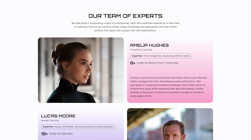
Version A - Professional. Focuses on the coaches’ professional experience - their expertise, years of practice, and approach to working with clients.
Version B - Professional + Personal. Keeps this information but adds a Weekend Mode with personal photos, interests, and small stories about life outside work.
For a coaching website, both sides matter: expertise shows competence, while personality helps visitors feel a human connection.
Which version would make you more likely to choose a coach?
22 voted
61%
14 voted
39%
36 votes
Closed


Upgoating version B


I’d choose Version B — adding a personal side makes the coaches feel more approachable and helps build a stronger human connection with potential clients.

Version B. People usually pick a coach they feel they'd click with, so a short personal line next to the credentials goes a long way.


B, weekend mode wins me over

I think I am going for the A

Version B for me. People hire a coach they feel they can click with, so a bit of personality next to the credentials closes the trust gap pure expertise cannot. Professional alone reads like a corporate about page.

Version B, and I'd keep the personal photos above the fold rather than lower on the page. Coaching is one of those categories where the buying decision is really about the person, not the service, so the trust signal has to land before someone scrolls past it.

Idea of version B is really unique.


im going for A

Version A

version B for more options
The network for creativity
Join 1.25M professional creatives like you
Connect with clients, get discovered, and run your business 100% commission-free
Creatives on Contra have earned over $150M and we are just getting started









Related posts

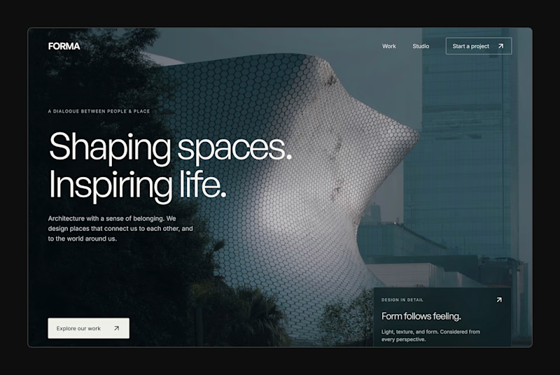
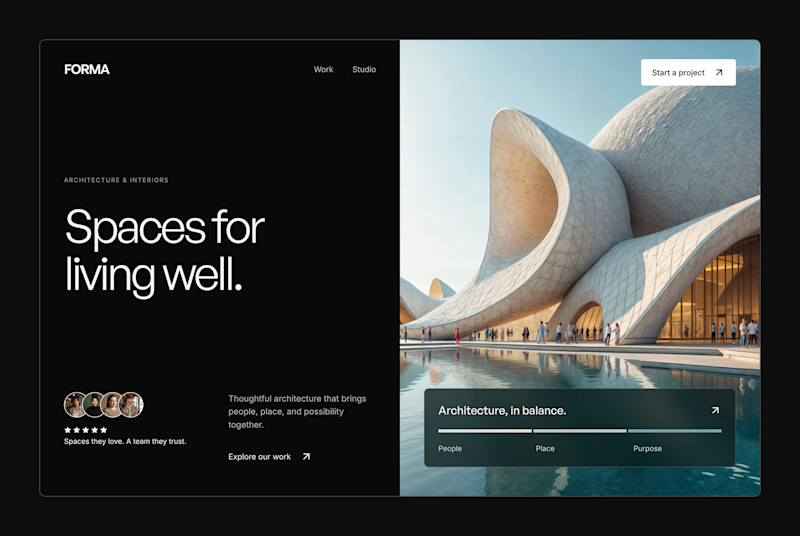
Design Exploration: Hero Section of Architecture Website. Which one do you think much better?


12 voted
43%
16 voted
57%
28 votes
Closed


Hey everyone! 👋
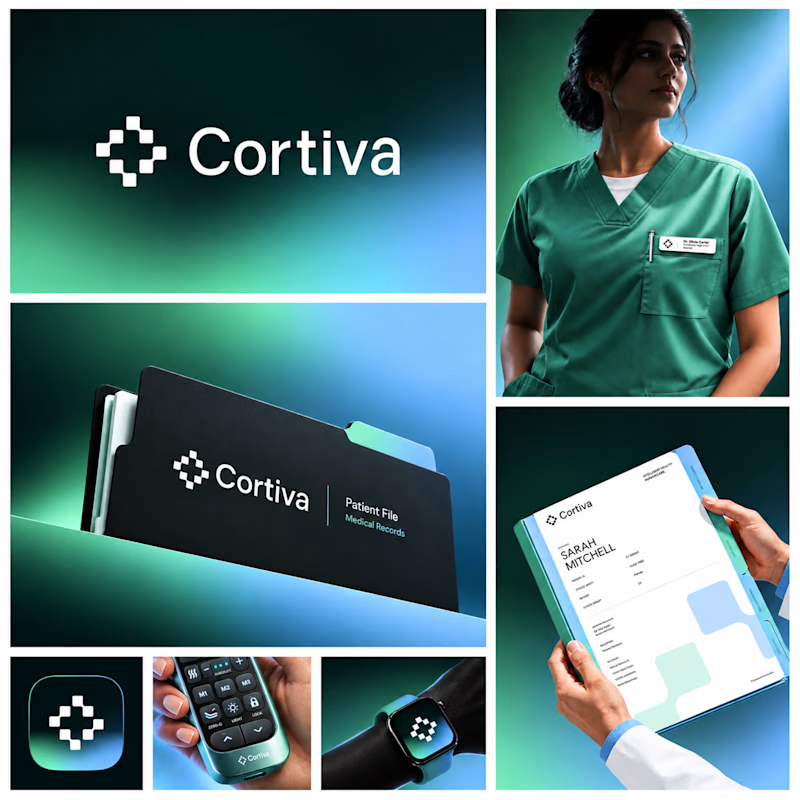
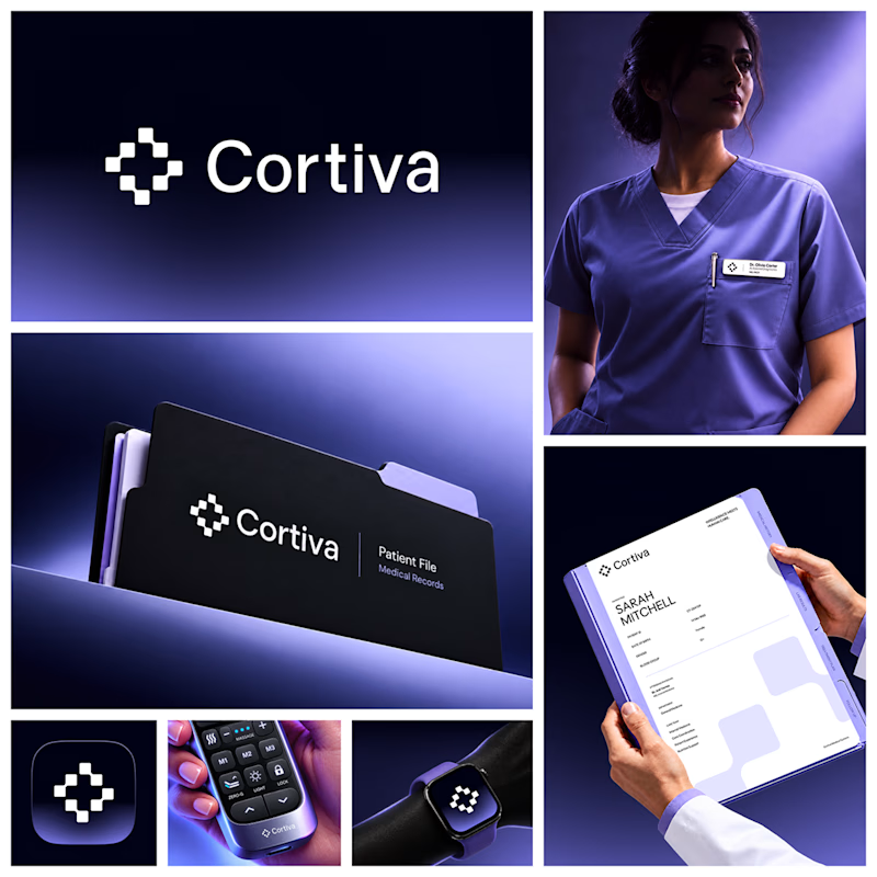
Working on Cortiva, an AI-first hospital branding project.
I've already finalized the color direction, but I thought it would be fun to explore two different moods.
Option 01💚 or Option 02? 💜
Both have their own personality, and I'm curious to see which one you prefer!
Let's see which one wins! 👀
5 voted
33%
10 voted
67%
15 votes
Closed

Option 01 for me. Green gets to "care" faster in a hospital setting, while the violet pulls the whole system toward a tech product. Since the identity is AI-first, I'd be curious whether you want patients to read it as clinical or as friendly first.


Which Kajabi photography-course design makes you want to explore?
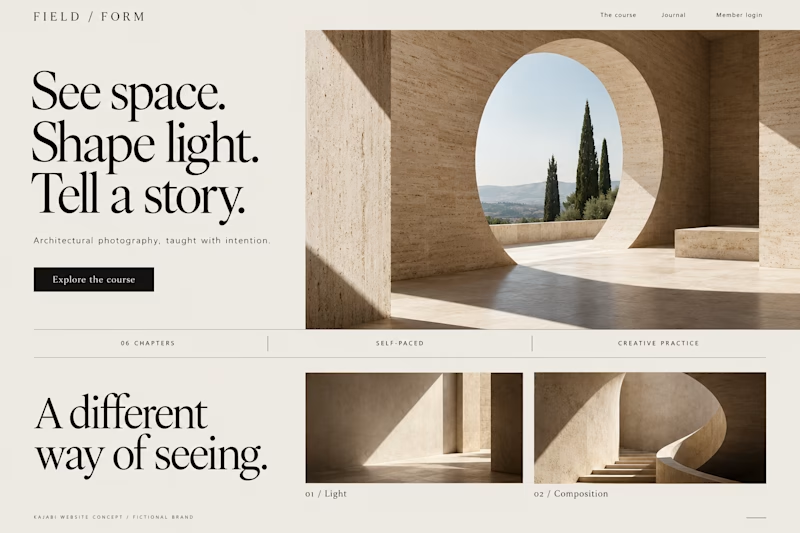
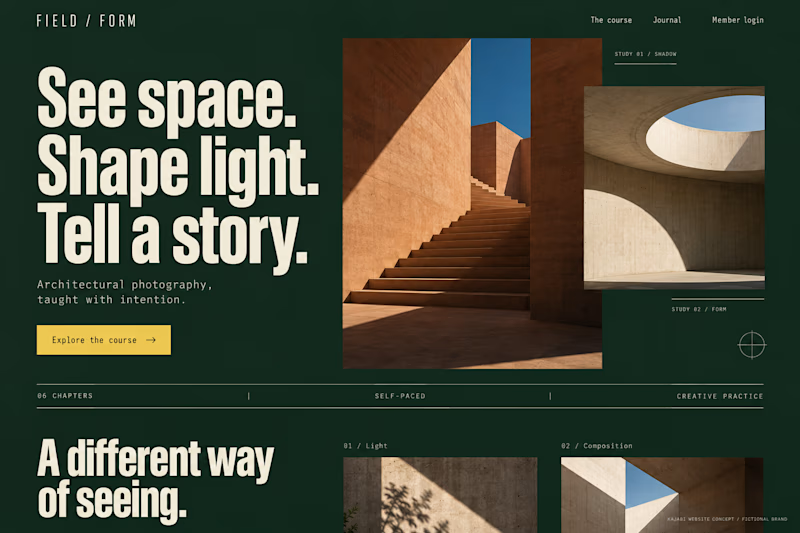
Two original AI-generated concepts for FIELD / FORM, a fictional architectural-photography school. Gallery Study pairs expressive serif type with warm stone and generous space. Field Journal uses forest green, bold condensed type and a layered photo study.
Same course, two directions. Which would you choose, and why?

15 voted
75%
5 voted
25%
20 votes
Closed

Galary study Hits better to me❤️❤️
great job Kraig🔥🔥