The network for creativity
Join 1.25M professional creatives like you
Connect with clients, get discovered, and run your business 100% commission-free
Creatives on Contra have earned over $150M and we are just getting started
Back to feedPost
Taste Test


Which one would you launch with?
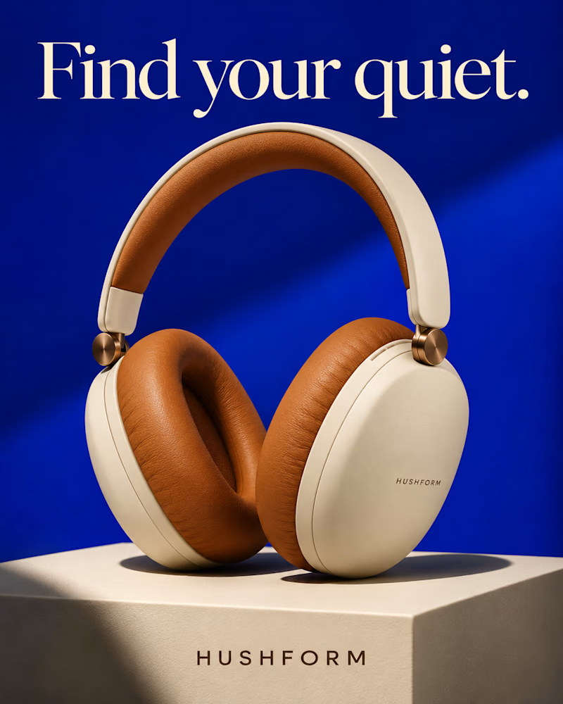
The first is a pair of cream over-ear headphones with tan leather cushions and copper hinges, standing on a cream block against cobalt, one diagonal of light across the wall, the headline in cream serif.
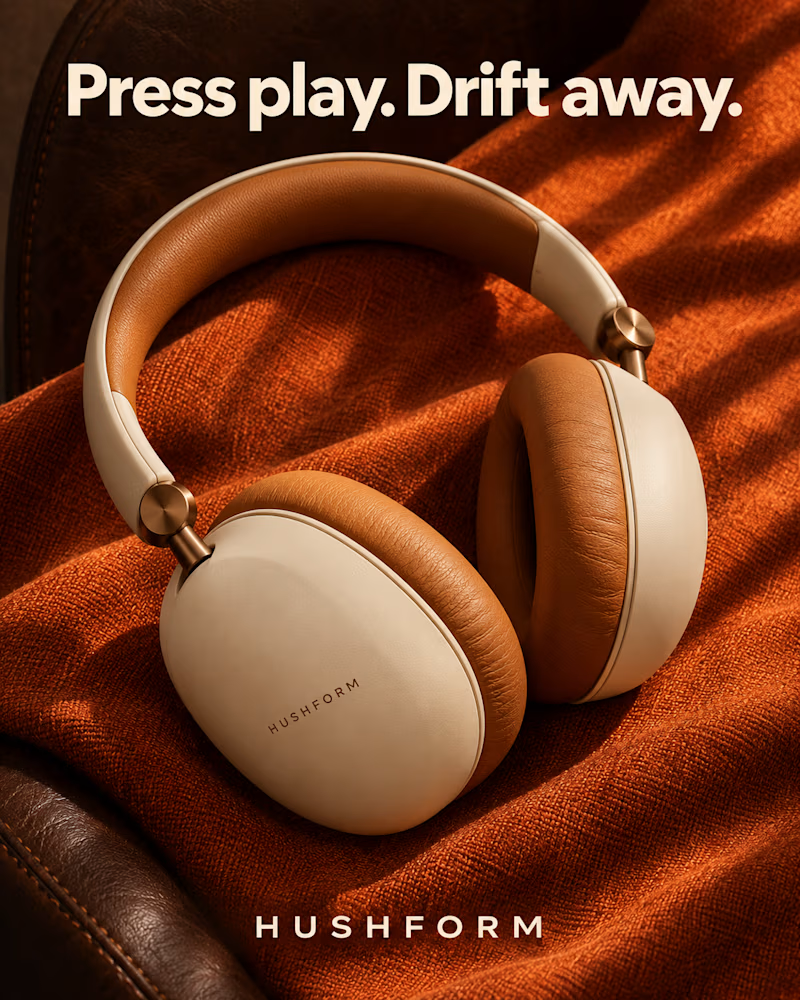
The second is the same pair lying on a rust wool throw over a brown leather armchair, low warm sun raking across the weave, heavy cream sans headline.
One sells the design. The other sells the escape.
👇 #productdesign #brandconcept #productphotography
12 votes
Ends in 1d
The network for creativity
Join 1.25M professional creatives like you
Connect with clients, get discovered, and run your business 100% commission-free
Creatives on Contra have earned over $150M and we are just getting started





Related posts

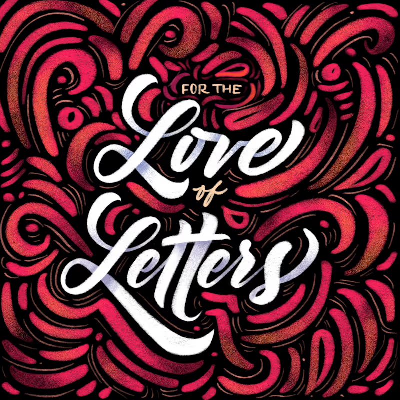
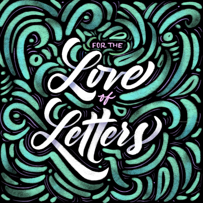
Same lettering, two color directions. Which one would you pick?
I got nostalgic this week looking at this lettering design. About 8 years ago I was deep into it and drew every day. Little by little I lost that rhythm, and now I only do it once in a while for gifts and small things.
Back then I could spend a lot of time choosing colors and comparing options. A taste test like this would have saved me so much time. 😅 I keep wondering how much I would have improved if I had never stopped practicing.
Is there something you used to practice a lot and would love to get back to? I had my lettering, illustration AND tufting phase.
37 voted
61%
24 voted
39%
61 votes
Closed


8 years later and the lettering still holds up

Which vibe do you prefer — moody Periwinkle or clean Magenta? Cast your vote! 🪄

2 voted
67%
1 voted
33%
3 votes
Closed

Great work

Need a second pair of eyes 👀
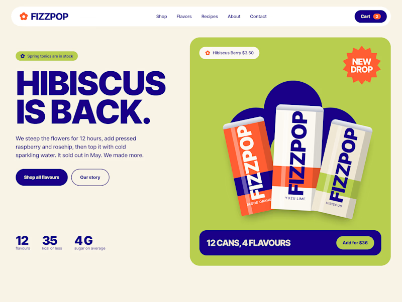
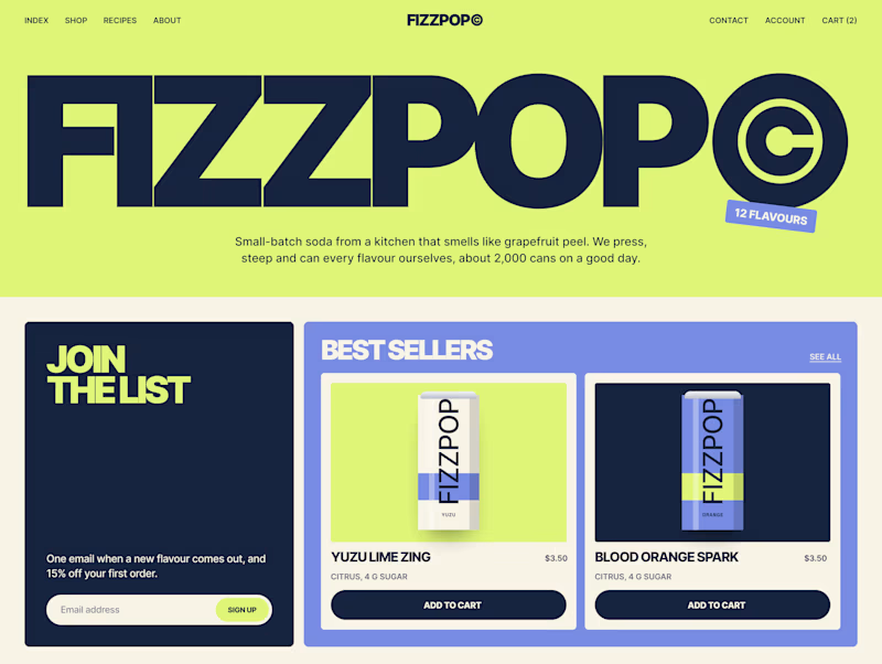
I'm designing the online store for FizzPop, a craft soda brand: all-natural sodas, sparkling waters and botanical tonics.
Flower Fizz(A): eggshell, tiger orange and deep ultramarine, with flower shapes and stacked colour swatches for the flavours
Corner Shop(B): lime, soft blues and navy, editorial layout with a giant wordmark and menu-style flavour tiles

38 voted
44%
48 voted
56%
86 votes
Closed
