The network for creativity
Join 1.25M professional creatives like you
Connect with clients, get discovered, and run your business 100% commission-free
Creatives on Contra have earned over $150M and we are just getting started
Back to feedPost
FinForge needed more than a logo, it needed a Corporate Brand Identity that could make a complex crypto platform feel trustworthy, innovative, and easy to understand in a highly competitive digital market.
I approached the project through Brand Strategy, Brand Positioning, and Brand Design, creating a distinctive visual direction around a bold geometric Logo Design, futuristic typography, and a high contrast visual system. The solution was expanded into Brand Identity & Guidelines, covering the Brand Style Guide, color system, typography, Brand Book, brand patterns, social media, digital applications, packaging, and stationery.
The result is a scalable Brand Identity system that gives FinForge consistency across every touchpoint allowing the team to maintain a recognizable, professional presence as the business grows, without needing to redesign its visual language for every new application.
Building a brand that stays consistent, recognizable, and relevant as your business grows? Let’s create an identity designed to work beyond the logo.


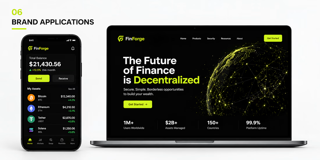
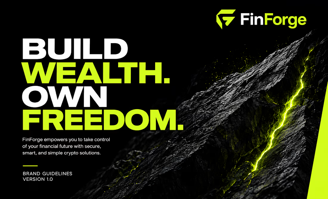
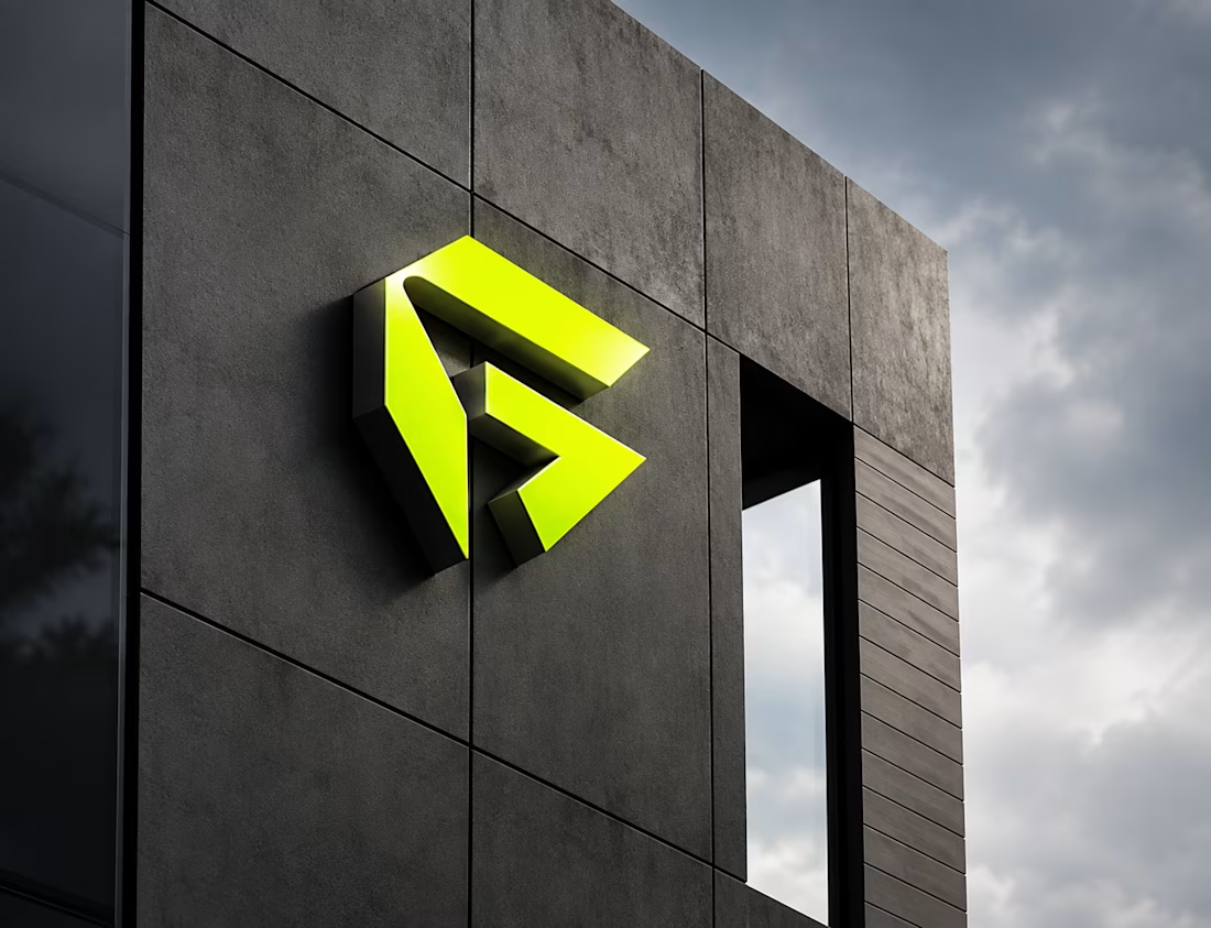
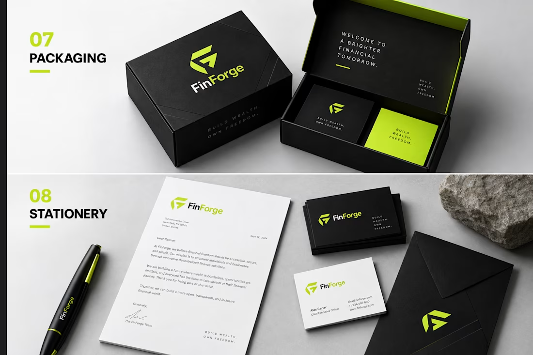

Trust in crypto branding usually comes from restraint, and the move that sells it here is carrying the mark onto real stationery and packaging. The moment an identity lives on physical collateral it stops reading as another hype token and starts feeling like an actual company.

Exactly. That was a key part of the thinking behind the identity making sure the brand felt credible beyond the screen and could hold its own across real-world touchpoints.
Appreciate you noticing that, Asif.

The app screen is carrying more of the trust argument than the mark is, which is usually how it goes in fintech — balances set in a face with even, tabular figures read as precise long before anyone registers the brand. Did the product typography stay in the same family as the...
@Artur Mikhov
I kept it within the same typographic family, but adjusted the hierarchy and weight for the product interface. The goal was to preserve brand recognition while making dense financial data feel clear, structured, and effortless to scan.

The black-and-neon green combination gives the identity a strong, tech-focused feel.
Thanks for the kind words, Zara

Perfect contrast between green and black it feels powerful
Congratulations nice job🎉🎉
The network for creativity
Join 1.25M professional creatives like you
Connect with clients, get discovered, and run your business 100% commission-free
Creatives on Contra have earned over $150M and we are just getting started




Related posts

💳 Making Financial Products Feel Simple
I designed this finance website for Sendit, with one goal in mind: make everyday payments feel simple, trustworthy, and effortless.
The design focuses on:
Clear messaging and strong visual hierarchy
Trust-focused finance UI
Simple payment interactions
Clean, modern layouts
Conversion-focused sections
A responsive experience designed around the user
For fintech products, good design isn’t just about looking modern. It’s about making people feel confident when money is involved.
If you’re building a fintech, SaaS, payment platform, or financial product and need a website that communicates trust and clarity, I’d love to work with you.


This caught my eye instantly! 🎨

Which T-Rex Vector Logo You Guys Like Most?
These 100% Handmade Vector Logos Are Also Available For Purchase With Exclusive Copyrights Transfer Ownership, Feel Free To Contact Us.
3 voted
27%
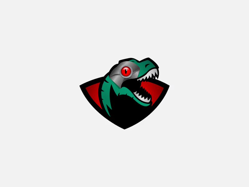
8 voted
73%
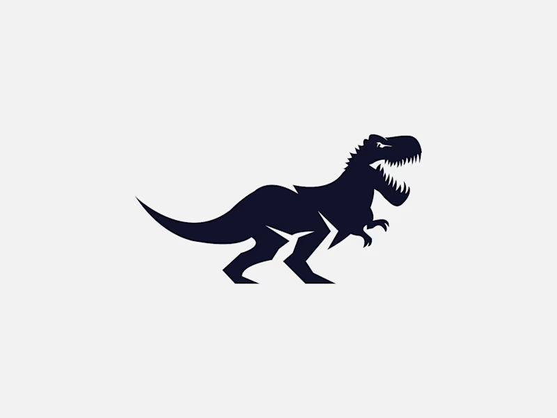
11 votes
Closed

A strong brand is more than just a logo. It needs a clear and consistent visual identity that people can recognize and remember.
I will design a professional logo, brand identity, and branding kit tailored to your business, audience, and style. Whether you are launching a new business or refreshing an existing brand, I will create visuals that work consistently across digital and print platforms.
What I Can Design:
Logo Design & Logo Variations
Brand Identity Design
Color Palette
Typography Selection
Brand Guidelines
Social Media Branding
Business Stationery
Brand Assets & Mockups
Professional Source Files
Why Choose This Gig?
Custom-designed for your brand
Clean and consistent visual identity
Professional, practical, and ready-to-use files
Organized source files
Clear communication throughout the project
This gig is suitable for startups, small businesses, personal brands, e-commerce businesses, restaurants, fashion brands, beauty brands, and growing companies.
Please select the package that best fits your branding needs. If you need something more specific, feel free to message me before placing your order.
Let's build a brand identity that represents your business.