The network for creativity
Join 1.25M professional creatives like you
Connect with clients, get discovered, and run your business 100% commission-free
Creatives on Contra have earned over $150M and we are just getting started
Back to feedPost
Hello beauties and gentlemen! As a proud monday .com Partner, I had the privilege of attending our annual summit in Prague this year. It was truly an unforgettable experience—from the stunning scenery to the invaluable connections. #Internationaldigitaldiva #creativepartner #CRM


Prague is an incredible city for a summit — sounds like a powerful mix of inspiration and meaningful connections. Glad you had the opportunity to be part of it.

Yes, thank you so much. It was incredible.
What was the biggest takeaway for you?
As a woman in a highly analytical field, I’m often the only person in the room who speaks 'systems.' In Prague, it was incredibly refreshing to be surrounded by like-minded, tech-savvy thinkers. Being in a room where an analytical, systems-first mindset is the 'norm' rather than...
The network for creativity
Join 1.25M professional creatives like you
Connect with clients, get discovered, and run your business 100% commission-free
Creatives on Contra have earned over $150M and we are just getting started

Challenges
View all


Related posts

A or B? 😇👈
Which design delivers the better luxury feel and overall visual experience?

3 voted
17%
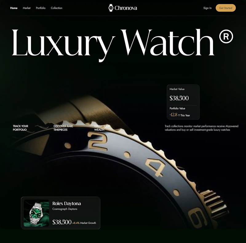
15 voted
83%
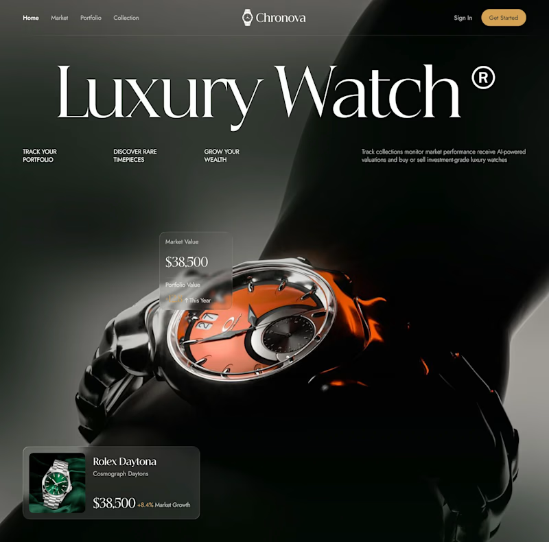
18 votes
Closed

Option B feels more luxurious to me—the watch gets a clearer hero moment and the warmer accent adds just enough energy against the dark field. The typography and product scale also make the comparison feel polished.

Not every project ends with a launch.
Sometimes, the work is good. The direction is clear. The conversation is productive. And then the timeline doesn't quite line up.
That was the case with Cylindrique.
The project ended before we could take this concept all the way through, largely because we couldn't find alignment on the timeline. That's part of working in design. A good creative process still needs a practical agreement around time, feedback, and decision making.
But I didn't want the concept to disappear with the project.
The idea started with something deliberately simple: a cylinder.
From there, I explored how that form could become a modern industrial mark for an AI company, using geometry, segmentation, negative space, and perspective to create a sense of structure and depth.
No generic AI symbols. No unnecessary complexity. Just a system built from one strong form.
I would have liked to see where the identity could have gone with the full process.
Still, some concepts are worth showing even when they don't become the final answer.
Not every design has to become a brand to be worth making.
#Cylindrique #LogoDesign #BrandIdentity #AI #TechBranding #IndustrialDesign #LogoConcept #DesignProcess


Nice

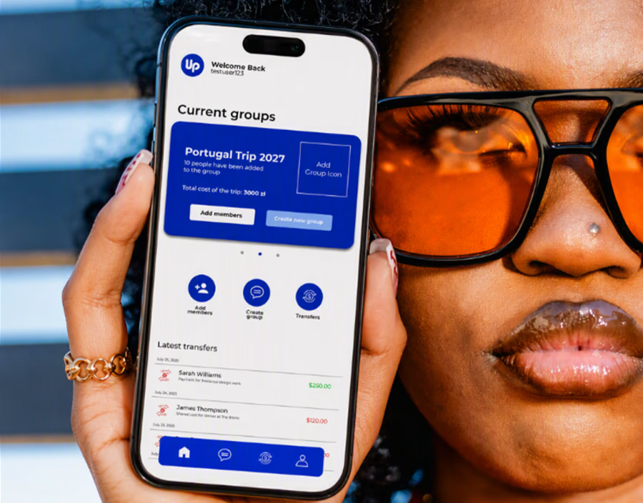
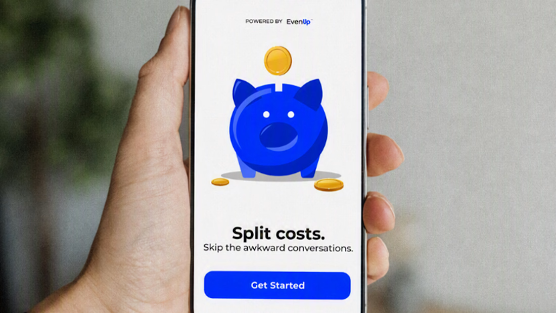
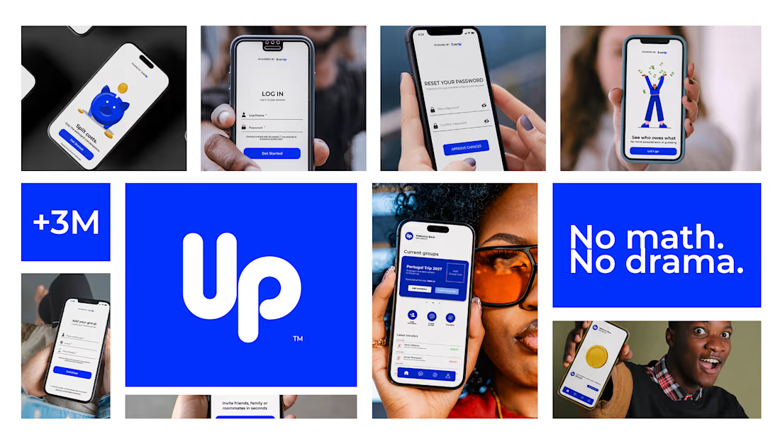
New case study just dropped 💙 EvenUp — an expense-splitting app design
Ever been the one who remembers who paid for what? 💸 That's the problem EvenUp was designed to solve — because splitting costs with friends was never really about math. It was about the awkward conversation after.
Full UI/UX case study includes:
✅ User research & personas
✅ User flow mapping
✅ Complete design system
✅ Full UI — light & dark mode
✅ Edge cases & error states
✅ Interactive prototype
Full case study on Behance — link in bio ⬆️

Perfect