The network for creativity
Join 1.25M professional creatives like you
Connect with clients, get discovered, and run your business 100% commission-free
Creatives on Contra have earned over $150M and we are just getting started
Back to feedPost
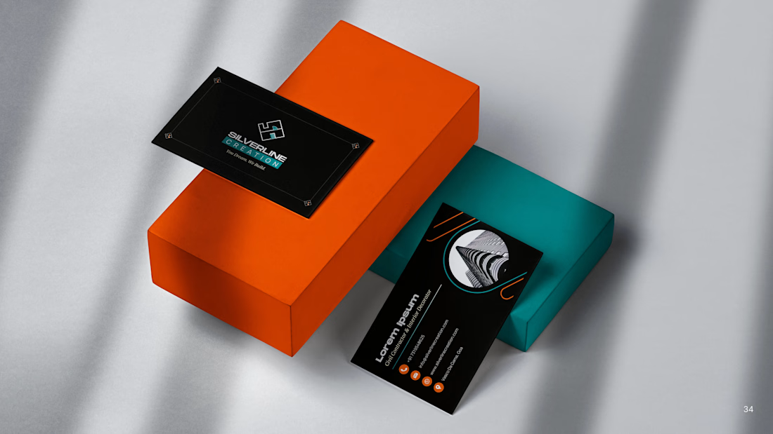
Silverline Creation is an emerging construction company based in Goa, India. When they approached us, the brand had a meaningful name and an existing logo built from the founders’ initials, but the identity no longer reflected the industry context or the scale they were growing toward.
Our goal was to realign the brand visually with its domain. We studied construction-led forms and architectural cues to build a mark rooted in relevance, not ornamentation.
The final logo integrates floor plan geometries, stair structures, and doorway curves with the initials S and C, resulting in a symbol that feels structural, intentional, and distinctive. Supported by a refined colour palette and a cohesive visual system, the identity translates strongly across print and digital touchpoints.
The result is a future-ready brand language that feels aligned, functional, and built to last — received with strong conviction by the founders and team.



Nice work!

Thank you Madob!

This is way clean
Thank you!
The network for creativity
Join 1.25M professional creatives like you
Connect with clients, get discovered, and run your business 100% commission-free
Creatives on Contra have earned over $150M and we are just getting started







Related posts

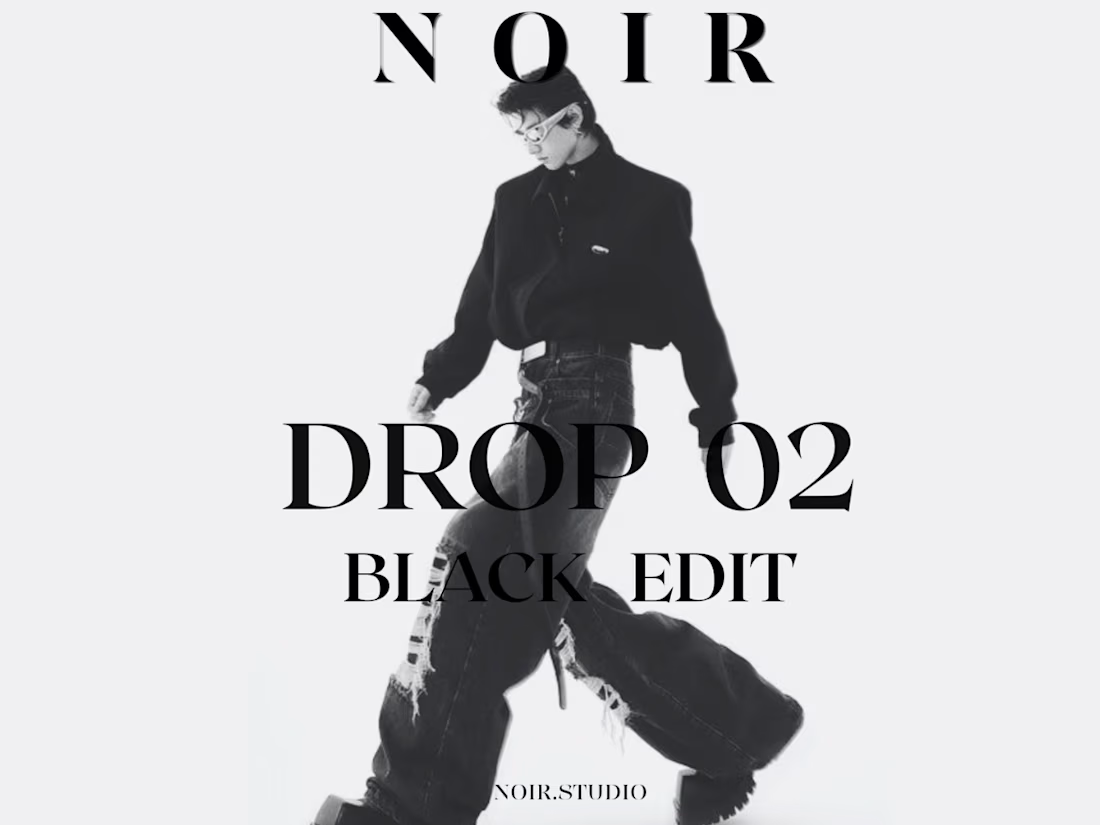
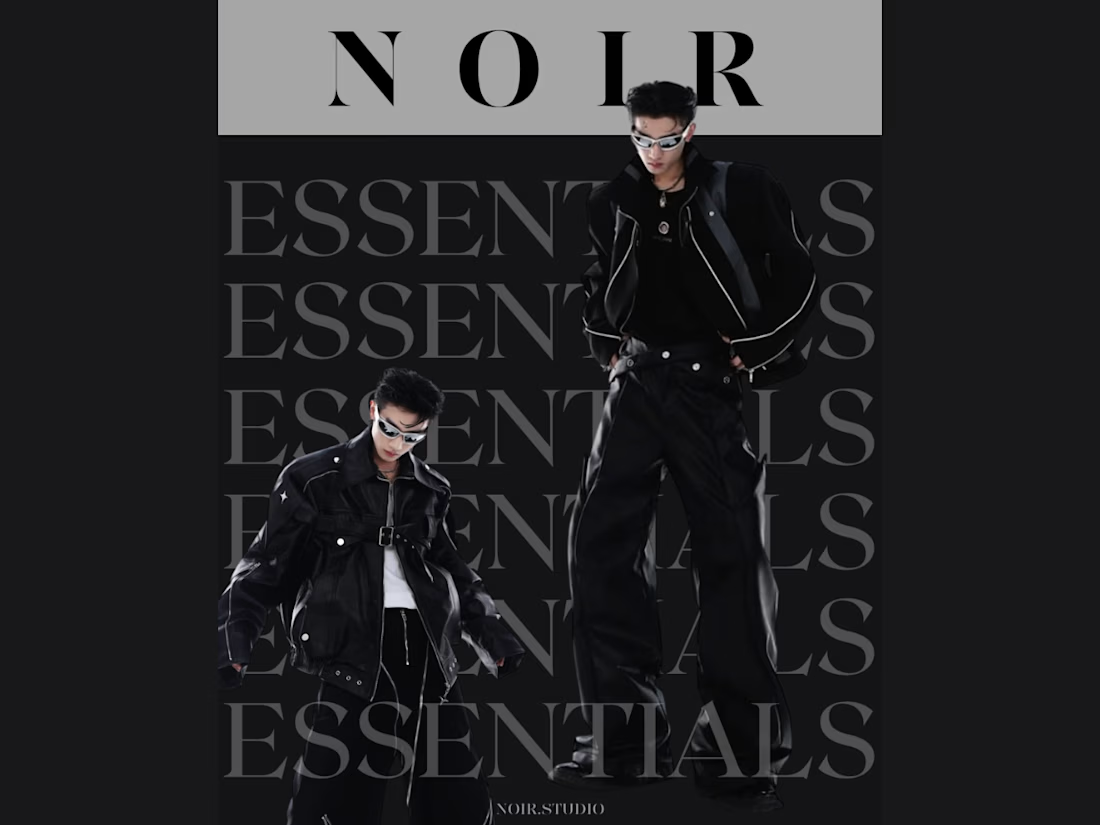
NOIR — DROP 02 // BLACK EDIT/ ESSENTIALS
A monochrome streetwear poster exploring oversized typography, editorial fashion imagery and high-contrast composition.

Nice branding image

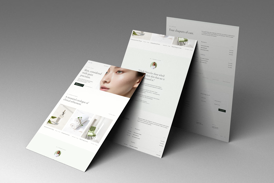
Nova — Clinical & Wellness Web Design
A refined website concept for Nova, a modern clinical and skincare brand focused on precision, care, and a premium patient experience.
The design combines editorial typography, soft neutral tones, spacious layouts, and refined imagery to create a calm and sophisticated digital presence. The website presents Nova’s services, treatments, philosophy, and clinical expertise through a clean, highly intentional visual system.
Focus: Web Design · UI/UX · Art Direction · Luxury Healthcare · Skincare · Editorial Design
#WebDesign #UIDesign #UXDesign #HealthcareDesign #Skincare #WebDesignInspiration #ArtDirection #EditorialDesign



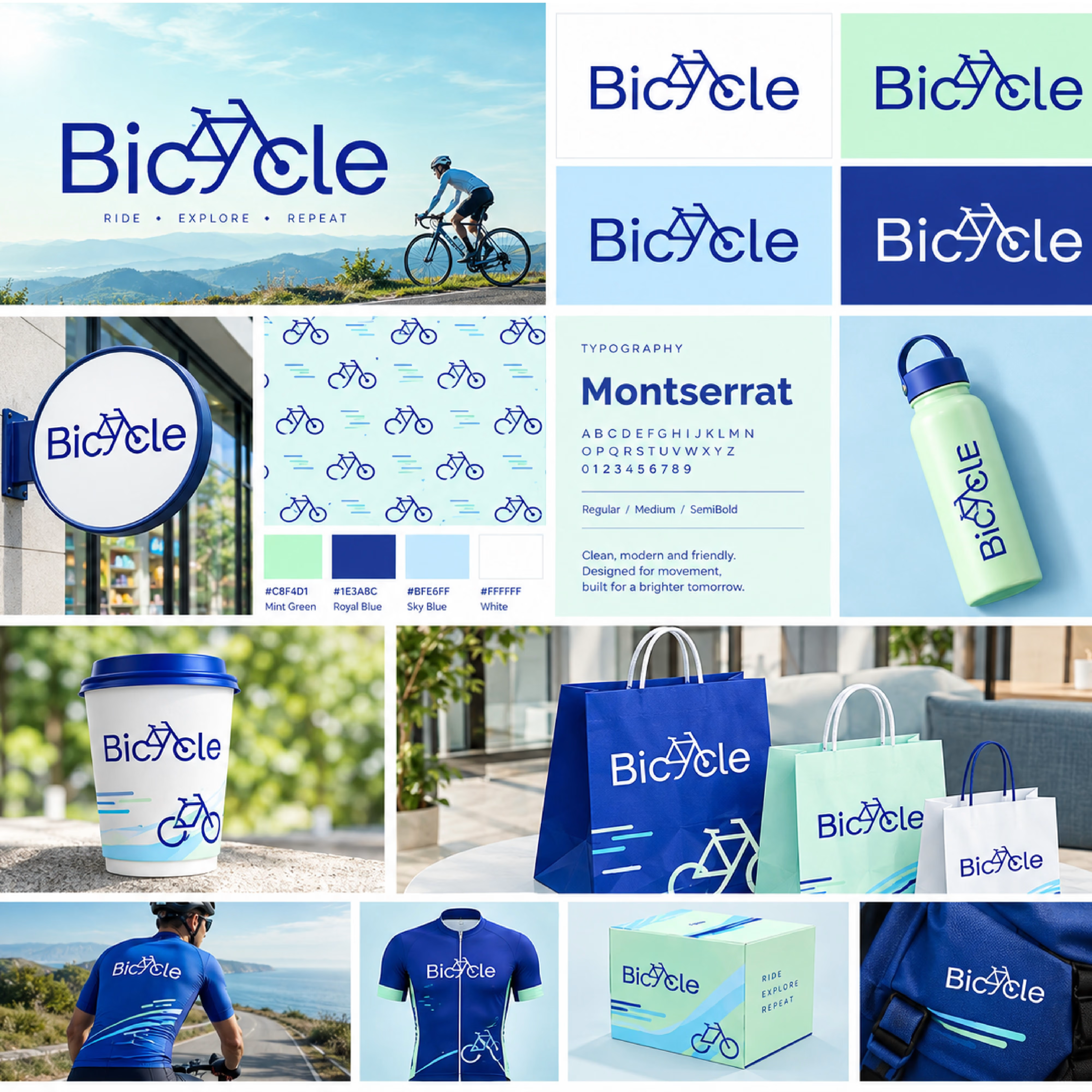
Bicycle Brand Identity — Ride. Explore. Repeat.
Just wrapped up a complete brand identity concept for Bicycle, built around movement, exploration, and an active lifestyle.
The visual direction combines a bold royal blue + mint green palette, clean typography, and a custom bicycle-inspired logo that gives the brand a recognizable and flexible identity.
The system was designed to work consistently across packaging, apparel, retail signage, merchandise, and everyday brand touchpoints.
What I explored:
• Logo & visual identity
• Color palette & typography
• Brand pattern system
• Packaging & merchandise
• Apparel & accessories
• Retail/signage applications
• Brand mockups & visual direction
Ride. Explore. Repeat. 🚴♂️💙
Would love to hear what you think of the visual direction.
#BrandIdentity #Branding #LogoDesign #GraphicDesign #VisualIdentity #PackagingDesign #BrandDesign #ContraCommunity