The network for creativity
Join 1.25M professional creatives like you
Connect with clients, get discovered, and run your business 100% commission-free
Creatives on Contra have earned over $150M and we are just getting started
Back to feedPost
Taste Test
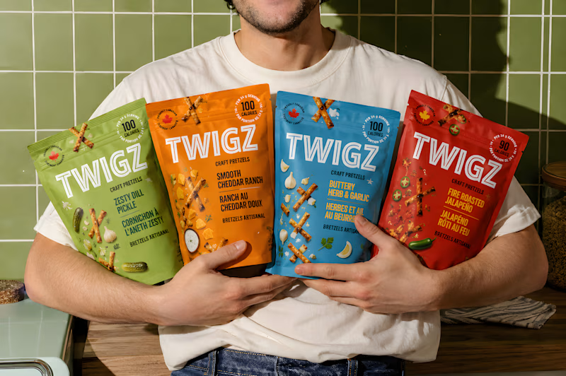
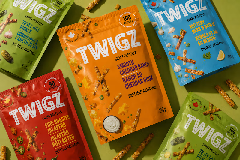

Both works are amazinggg; it's hard to choose

Thank you. Really appreciate 😌

The Flavor Spread....I loved the most becasue the zoomout is attractive!!
Thanks dear for the feedback. Really appreciate ☺️
The network for creativity
Join 1.25M professional creatives like you
Connect with clients, get discovered, and run your business 100% commission-free
Creatives on Contra have earned over $150M and we are just getting started





Related posts


Ambrosia - Bodycare Brand Identity & Packaging
My favorite part of this branding and packaging project was working with the different materials. The dark glass, aluminum, and soft paper each bring something different, so I kept the typography and labels simple to help everything sit together.
Amazinnnggg


Collage

Light or dark, which one wins? ☀️🌙
Same site, two moods. Warm stone and lacquer red, or the same build after dark.
Both are hand-built with a 3D paper crumple, real physics, a stick-figure film drawn in code, and a receipt that gets a bicycle kick. 🔊 Sound on.
Tell me which you'd ship: light or dark? 👇
26 voted
59%
18 voted
41%
44 votes
Closed

I really like how the light version looks, but it has some legibility issues. Since readability is more important for users than visual appeal, I think the dark version is the better option.
BTW, I initially voted for the light version, but after analyzing both options more closely, I changed my mind 😄