The network for creativity
Join 1.25M professional creatives like you
Connect with clients, get discovered, and run your business 100% commission-free
Creatives on Contra have earned over $150M and we are just getting started
Back to feedPost
Taste Test


Orbit looks amazing and cool 😎👌

Orbit. The floating objects around the logo give the hero a clear focal point, where the collage competes with the headline.

collage

I choose orbit it feels unique 🎉🎉

ohh it's tough both


I’d go with Orbit. It feels more refined and immersive—the subtle movement around the logo creates a strong identity without overwhelming the page. 🔥

I like both designs, though it is tough to decide which one is great. Great work

Collage

The collage definitely seems to give the user more freedom to take their time to observe each item and I feel like it's a better choice for a smoother experience, but I do love both!

It's actually hard to choose but when it comes down to personal preference, I would choose the orbit cos the animation is just so silky smooth

Orbit feels way more premium and intentional. It gives the brand room to breathe while holding the user's attention right on the identity. Fantastic execution.

adore both, but orbit is so much fun!

collage for me

Orbit

I think i would go with collage

I mean they both would be such a pleasure to land on!! But the collage looks soo fun 😁


Really Nice work👏🔥🔥

Orbit is unique but user loves cursor interactions


Love the orbit!

Orbit looks better.

I like the orbit more, it feels more restrained and luxurious

Team Orbit. More dynamic less visual clutter and lets the logo breathe.

Orbit!
Easier and smoother on the eyes. + has an organic flow to it, whereas collage feels more static and a bit out of place

3D effects in orbit are very cool, and also the animation is very unique

Orbit!

We always use to see Collage so Orbit is the final answare😊
But collage is not dead Yet 😂

Love it. Collage looks awesome


Orbit, for the reason that matters on a first screen: it gives the eye one place to land, so the headline and CTA still get read. Collage can win on a portfolio page where browsing is the goal.
The network for creativity
Join 1.25M professional creatives like you
Connect with clients, get discovered, and run your business 100% commission-free
Creatives on Contra have earned over $150M and we are just getting started











Related posts

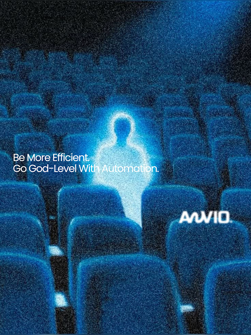
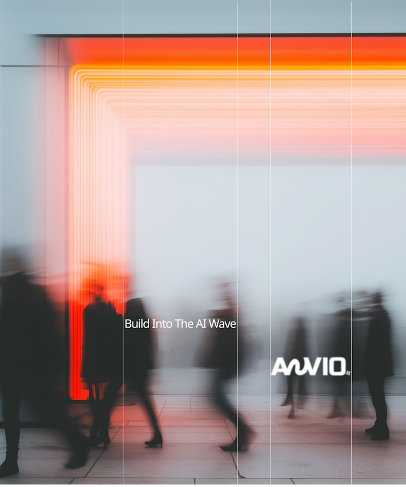
Which creative direction better communicates a Tech-Forward AI Brand Identity for anvio.online ?
25 voted
44%
32 voted
56%
57 votes
Closed

Fast vibrant energy gets my vote. The warm glow feels more human, which is nice for an AI brand.

Same content, different experience. A few thoughtful design choices can completely change how a presentation feels, flows, and communicates. Which version would you choose?

11 voted
31%
24 voted
69%
35 votes
Closed
Verde Vista 1 is more modern and futuristic specially with blue colors and robotic hand❤️
Great job Rasid🎉🎉🔥🔥

The team is cooking
Motion design for the logo we are making for Nation e-commerce


Wou