The network for creativity
Join 1.25M professional creatives like you
Connect with clients, get discovered, and run your business 100% commission-free
Creatives on Contra have earned over $150M and we are just getting started
Back to feedPost
Taste Test
Light or dark, which one wins? ☀️🌙
Same site, two moods. Warm stone and lacquer red, or the same build after dark.
Both are hand-built with a 3D paper crumple, real physics, a stick-figure film drawn in code, and a receipt that gets a bicycle kick. 🔊 Sound on.
Tell me which you'd ship: light or dark? 👇
26 voted
59%
18 voted
41%
44 votes
Closed


Noted, one more for dark. Thanks for voting, Ganesh!

Dark. The red accent and the goggles feel more intentional against it.
"Intentional" is exactly what I was going for. The lacquer red was picked for the light theme first, so it's funny that it lands harder after dark. Thanks, Rafee!

I’d go with Light. The contrast feels really nice here.
Glad someone's backing light. The warm stone was the original direction, so this one means a lot. Thanks, Shubhang!

Light one for me!!
Team light gets another one!! Thanks, Celia!

Dark I'd premium 👌
Dark = premium seems to be the consensus. Appreciate it, Emmanuel!
You're welcome!

I’d go with Dark. It feels more distinctive and atmospheric, and the contrast makes the visuals pop while giving the brand a stronger premium personality. 🔥
"Atmospheric" is a great word for it. Dark does give the visuals more room to pop. Thanks for the thoughtful take, Shohel.

I really like how the light version looks, but it has some legibility issues. Since readability is more important for users than visual appeal, I think the dark version is the better option.
BTW, I initially voted for the light version, but after analyzing both options more closely, I changed my mind 😄
This is the most useful comment here, thank you, Hanna. You're right that readability beats looks. Which parts were hardest to read for you, the body text or the smaller labels? I'd like to fix the contrast on light rather than just let dark win.
That’s what I meant when I wrote the comment. When the text is placed near the face, the left side is readable, but the right column still has some legibility issues.
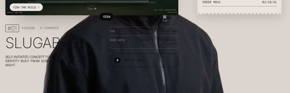
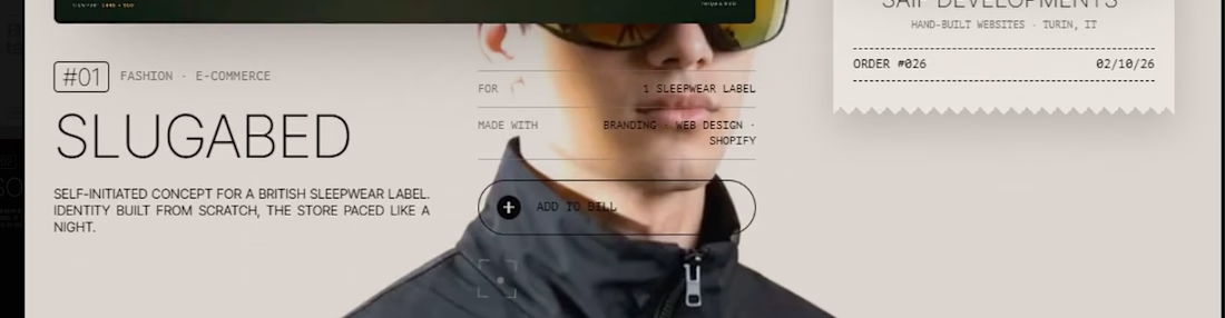
The screenshots make it clear, thank you. The small labels over the photo lose contrast wherever the image behind them gets busy, especially that right column. I'll give those labels a proper backing so they stay readable. Really appreciate you taking the time to show it, Hanna.

love the dark version better
Dark is pulling ahead. Thanks, Sandaruwani!

Both are good; it's hard to choose. Great work
A tie is a fair answer, I went back and forth on it myself. Thanks, Robin!

"Definitely" is the confidence team light needed. Thanks, Komu!

A paper crumple with real physics, a stick-figure film drawn in code and a receipt getting a bicycle kick is a lot of craft for one page. My instinct is dark, motion-heavy builds usually feel more cinematic once the lights go down. Sound on is a nice, brave ask too.
"Cinematic once the lights go down" is a great way to put it, the motion does read differently on dark. And yes, asking for sound was a gamble, glad it landed. Thanks for the close look, Aditya!

"Glows" is the right word, the red was picked for light but it really wakes up on dark. Thanks!

Thank you, appreciate you stopping by!

Light Mood is nice

Dark works is nice
The network for creativity
Join 1.25M professional creatives like you
Connect with clients, get discovered, and run your business 100% commission-free
Creatives on Contra have earned over $150M and we are just getting started



Related posts

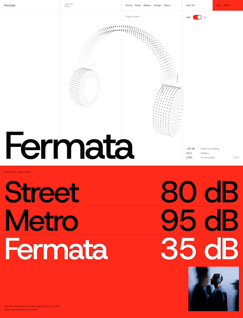
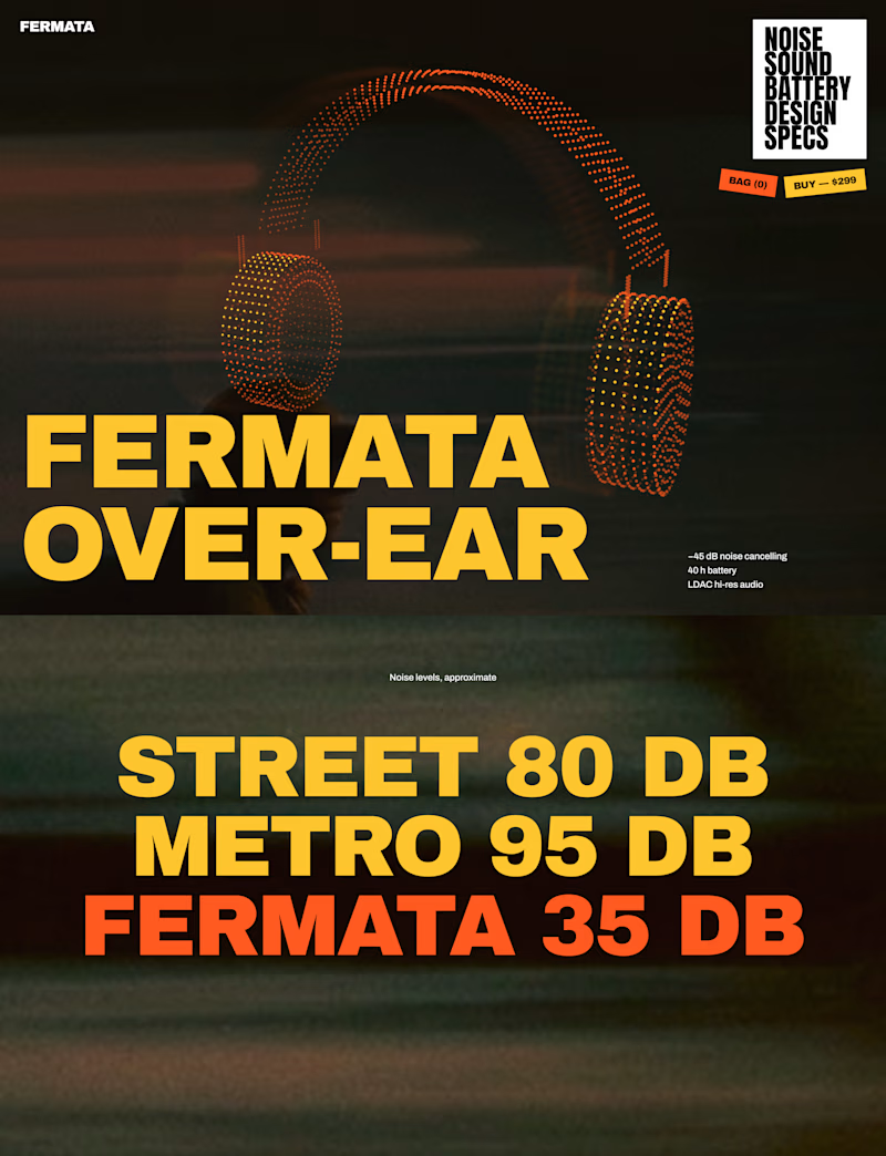
🎧 FERMATA — new over-ear headphones, coming soon.
A — Swiss poster: red, light blue, white and black. Clean grid, one grotesk typeface, product as a stipple 3D model.
B — Night edition: black, yellow and orange. Heavy condensed type, motion-blurred city photography, sticker details.
Both will have a scroll-driven 3D headphone (particles) as the hero.


56 voted
79%
15 voted
21%
71 votes
Closed


The Red Color Scheme looks nice




Both look great, but Violet & Black gets my vote! The purple accents give it a more modern, premium feel while keeping the design clean and focused on conversions. Amazing how a color change can create such a different brand personality. Have you tested which version performs better with visitors?

Codix - Which Visual Direction Works Better? 👀
Exploring two different visual styles for Codix, an experimental tech brand identity.
Option 1
Bold, geometric, and pixel-inspired. A playful mix of digital patterns, modular shapes, and vibrant colors.
Option 2
Abstract, expressive, and futuristic. A dynamic blend of flowing forms, gradients, and digital textures.
Same Brand. Two different creative directions.
Which one would you choose - 01 or 02?
5 voted
24%

16 voted
76%

21 votes
Closed

Option 2 was stunning🔥🔥