The network for creativity
Join 1.25M professional creatives like you
Connect with clients, get discovered, and run your business 100% commission-free
Creatives on Contra have earned over $150M and we are just getting started
Back to feedPost
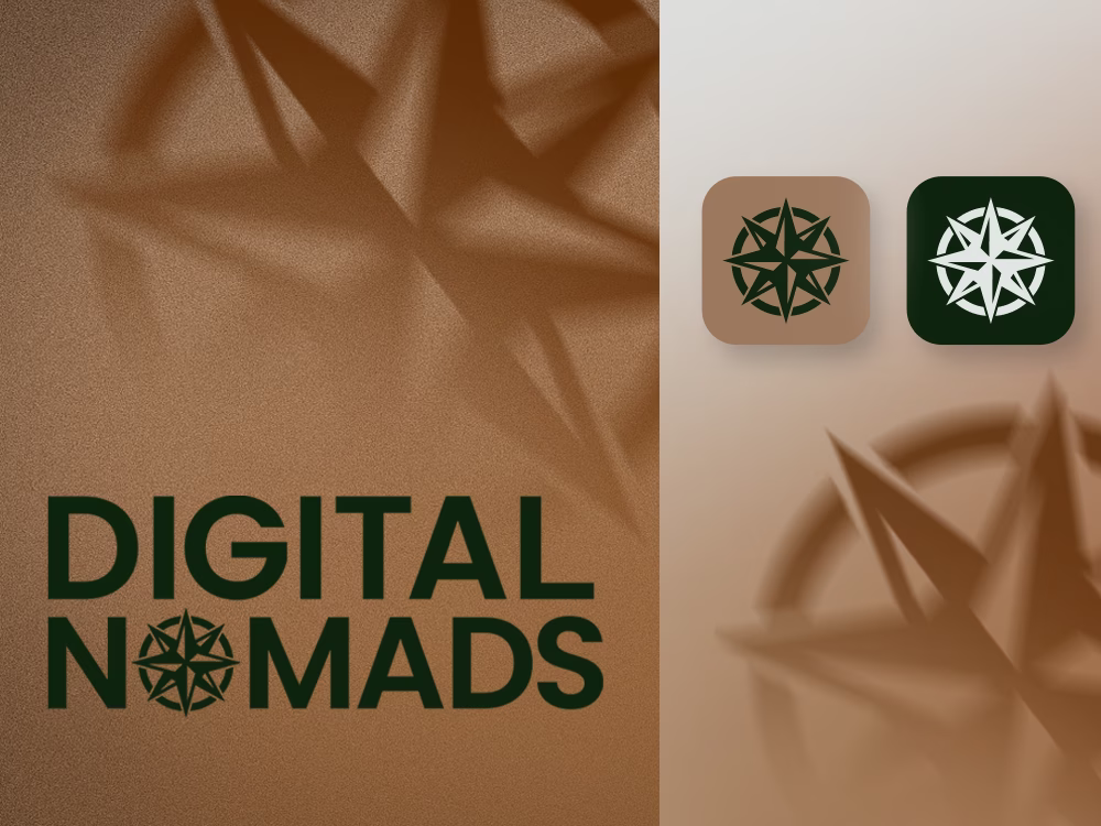
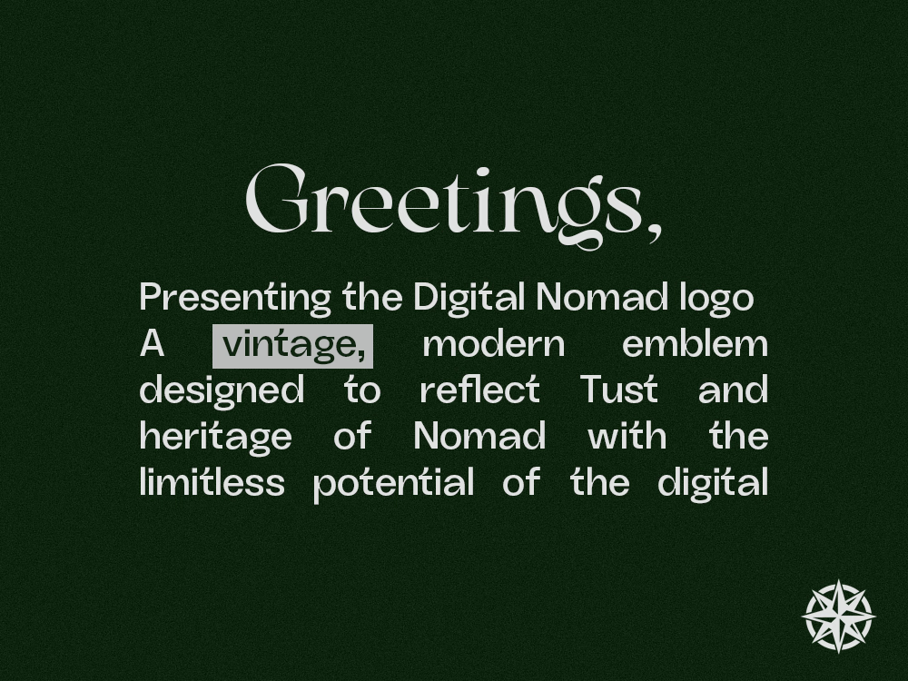
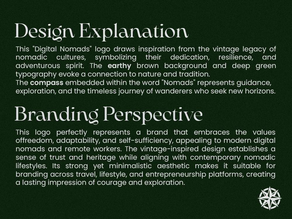
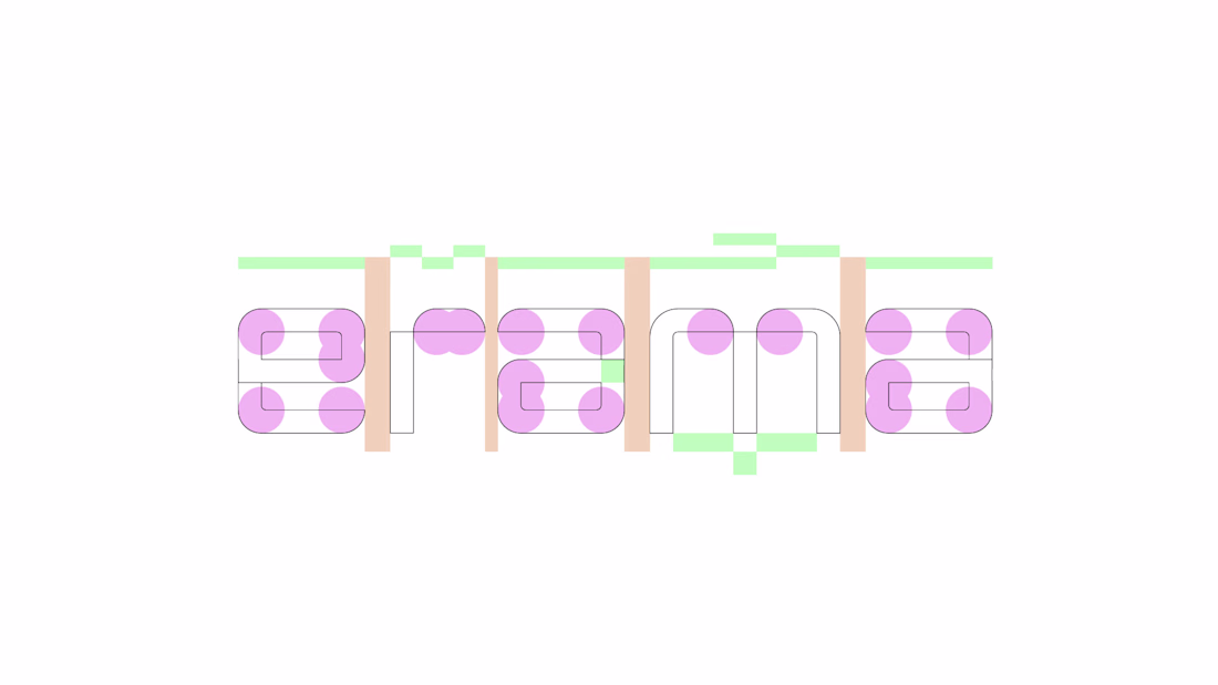
Digital Nomads is an educational institute focused on developing hard and soft skills in students. My role as Brand Designer and Strategist was to build an identity that felt bold and forward-thinking not institutional.
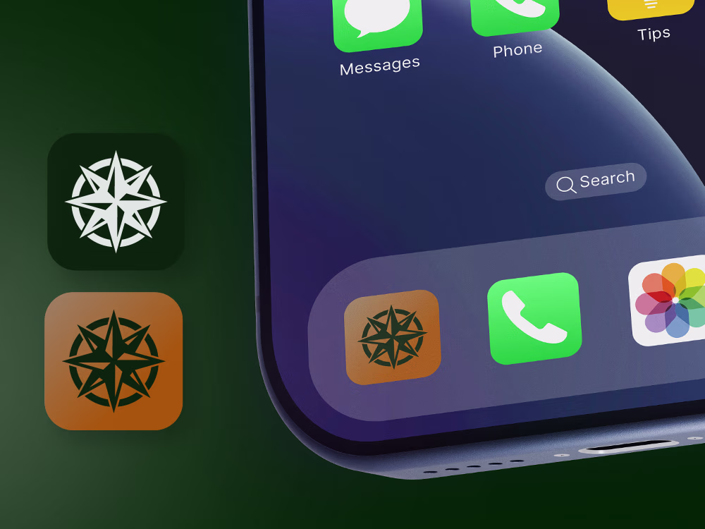
The compass rose became the central symbol, representing navigation and discovery. Embedding it into the wordmark replacing the "O" in NOMADS created a mark that is both conceptually rich and instantly recognizable.
The deep forest green paired with warm desert tan strikes a balance between credibility and warmth. The all-caps geometric wordmark projects confidence, while light and dark app icon variants ensure flexibility across all platforms.
The result is a brand that doesn't look like a school it looks like a movement.
The network for creativity
Join 1.25M professional creatives like you
Connect with clients, get discovered, and run your business 100% commission-free
Creatives on Contra have earned over $150M and we are just getting started
Related posts
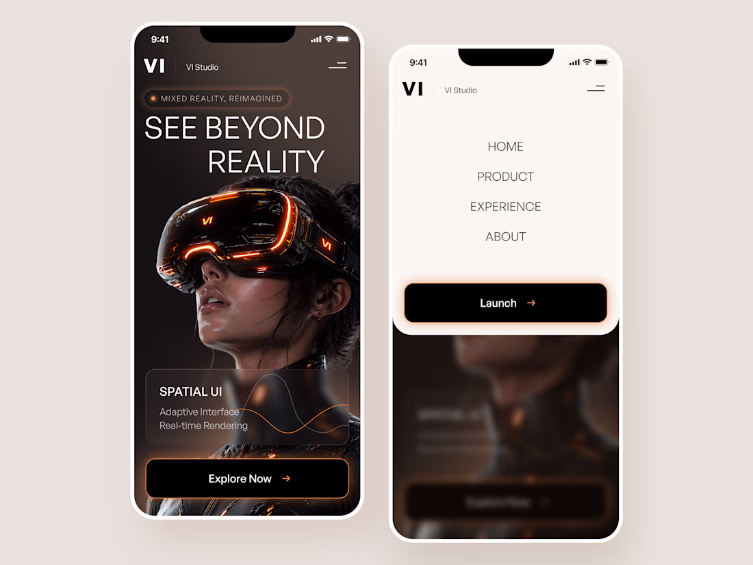
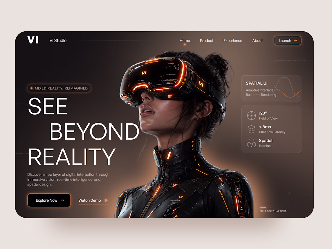
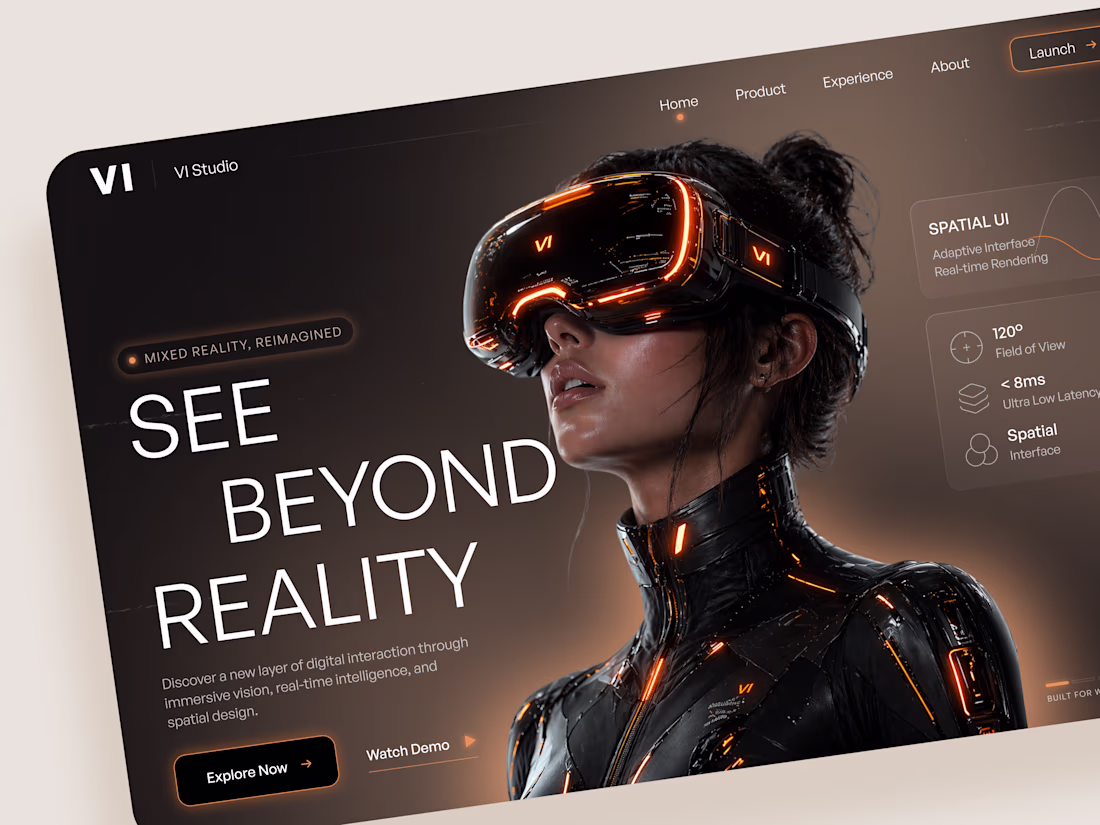
VI Studio — Landing Page Design for a Mixed Reality Headset Brand 🥽
We designed a bold, cinematic landing page for VI Studio — a mixed reality hardware brand positioning itself at the frontier of spatial computing, immersive vision, and real-time intelligence.
🧩 The design is built around a single powerful statement: See Beyond Reality. A dramatic full-bleed hero with a neon-lit headset and high-contrast dark palette creates an immediate sense of technological depth, while compact spec callouts keep the product grounded and credible.
Special attention was given to:
• cinematic hero composition with editorial-grade CGI product photography
• technical spec UI — 120° field of view, <8ms latency, spatial interface — surfaced cleanly without overwhelming the visual
• seamless desktop-to-mobile adaptation including a full-screen overlay navigation
• amber-orange accent system that adds warmth and energy to the dark base
• typography hierarchy that balances impact with clarity across all breakpoints
A high-voltage digital presence that makes a hardware product feel like a cultural moment — designed to capture attention, build desire, and drive early adopters to launch.
Looking to design a product landing page that matches the ambition of what you're building? Let's create something that turns heads!😊
Amazing work
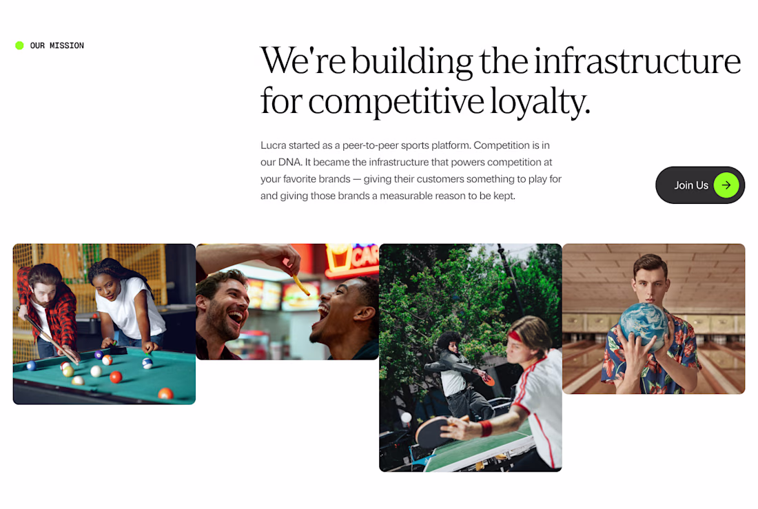
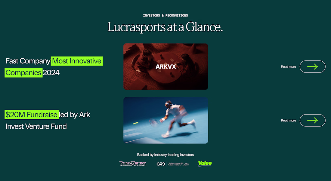
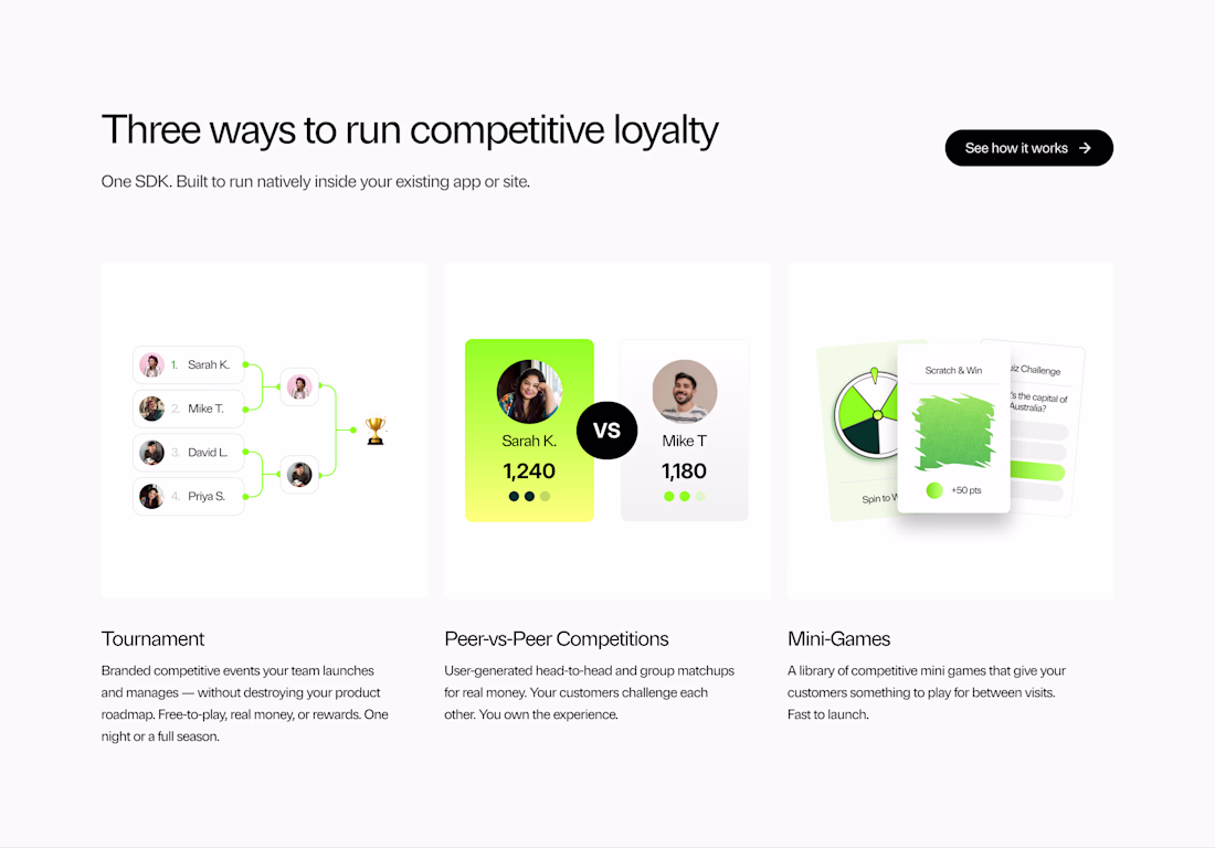
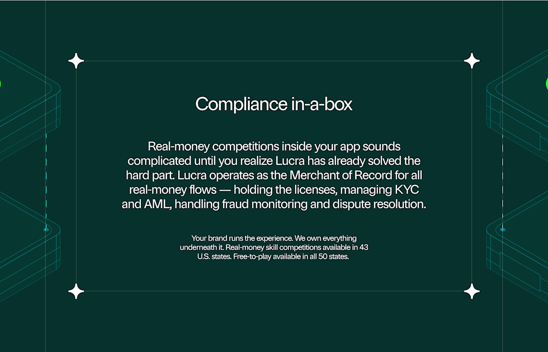
Kicking off the week with something exciting.
We're working on design explorations for Lucra — building the infrastructure layer for the next generation of loyalty across real-world venues and consumer experiences.
Building something and need a design partner who actually gets it? Let's talk. - https://cal.com/digitalforus/15min
⤵️ Taking on new projects.
— Website design & development
— Brand design
— Content strategy
— Framer & Webflow development
Looks nice
It's not a wordmark.
It's a grid, proportions, and 47 versions that looked "almost right."
Btw it was rejected.
x _ x
Love this!
Trending
Claude
Claude has entered the design space. How are you using Claude Design?
Contra University
Learn from expert creatives how to earn more using next-gen AI tools.
MagicPath
The canvas is infinite, and exploration is becoming the workflow. How are you using MagicPath?
creativeaiflow
Creative AI workflows are evolving. What tools do you use, and what are their strengths and weaknesses?
freelancerlife
Freelancer life is wins, pivots, and everything in between. What’s yours right now?