
Aseer Ali
Designer and Creative Brand Agency Owner
New to Contra
Aseer is ready for their next project!

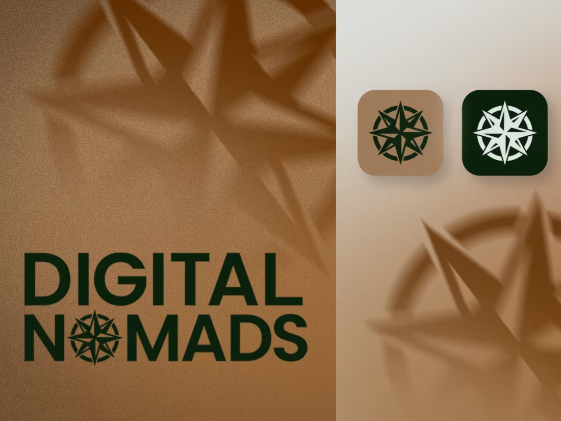
Digital Nomads is an educational institute focused on developing hard and soft skills in students. My role as Brand Designer and Strategist was to build an identity that felt bold and forward-thinking not institutional.
The compass rose became the central symbol, representing navigation and discovery. Embedding it into the wordmark replacing the "O" in NOMADS created a mark that is both conceptually rich and instantly recognizable.
The deep forest green paired with warm desert tan strikes a balance between credibility and warmth. The all-caps geometric wordmark projects confidence, while light and dark app icon variants ensure flexibility across all platforms.
The result is a brand that doesn't look like a school it looks like a movement.
2
63
Video Creation for Brand Agency
1
24
Social Media Post Designs for Microfinance Bank
3
1
68
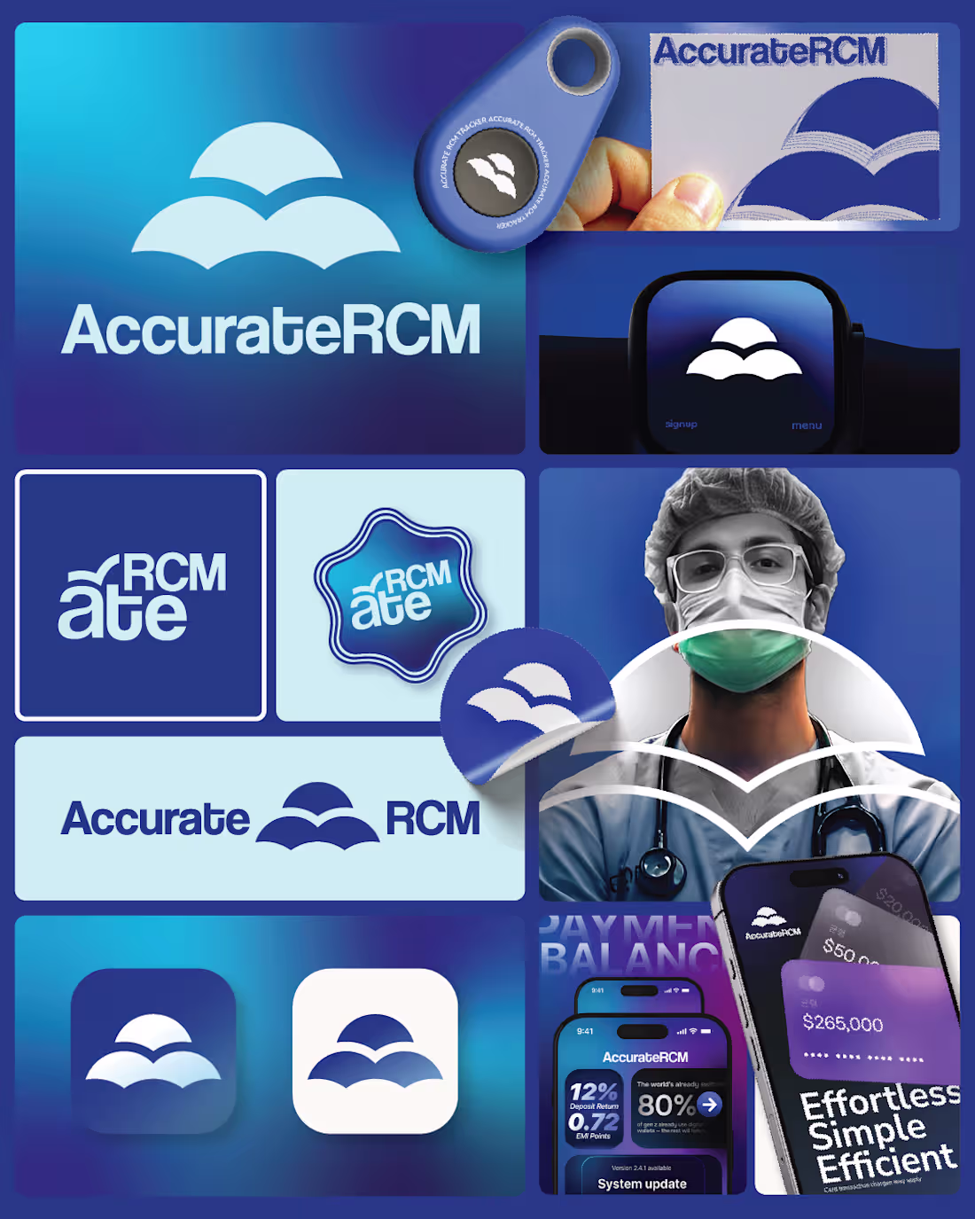
Accurate RCM | Brand Identity & Positioning
AccurateRCM is a medical billing company built on precision, trust, and operational clarity, values critical to the healthcare revenue cycle ecosystem. The objective of this project was to craft a brand that communicates reliability and efficiency while standing out in a typically generic, compliance-heavy market. I developed a complete brand system, starting from brand strategy and positioning to ensure AccurateRCM is perceived not just as a service provider, but as a dependable financial partner for healthcare professionals. The positioning focuses on accuracy-driven performance, transparency, and streamlined revenue management. The visual identity was designed to reflect professionalism and trust, using a clean, modern aesthetic supported by a clinical yet approachable colour palette. The integration of structured graphic elements reinforces the idea of organised systems and layered financial processes, key to medical billing workflows. Alongside the visuals, I defined a brand voice that is clear, confident, and informative, balancing technical expertise with accessibility. This ensures communication resonates with both healthcare providers and administrative stakeholders. To maintain consistency across touchpoints, I created a suite of media design assets, enabling AccurateRCM to present a cohesive and credible.
1
38
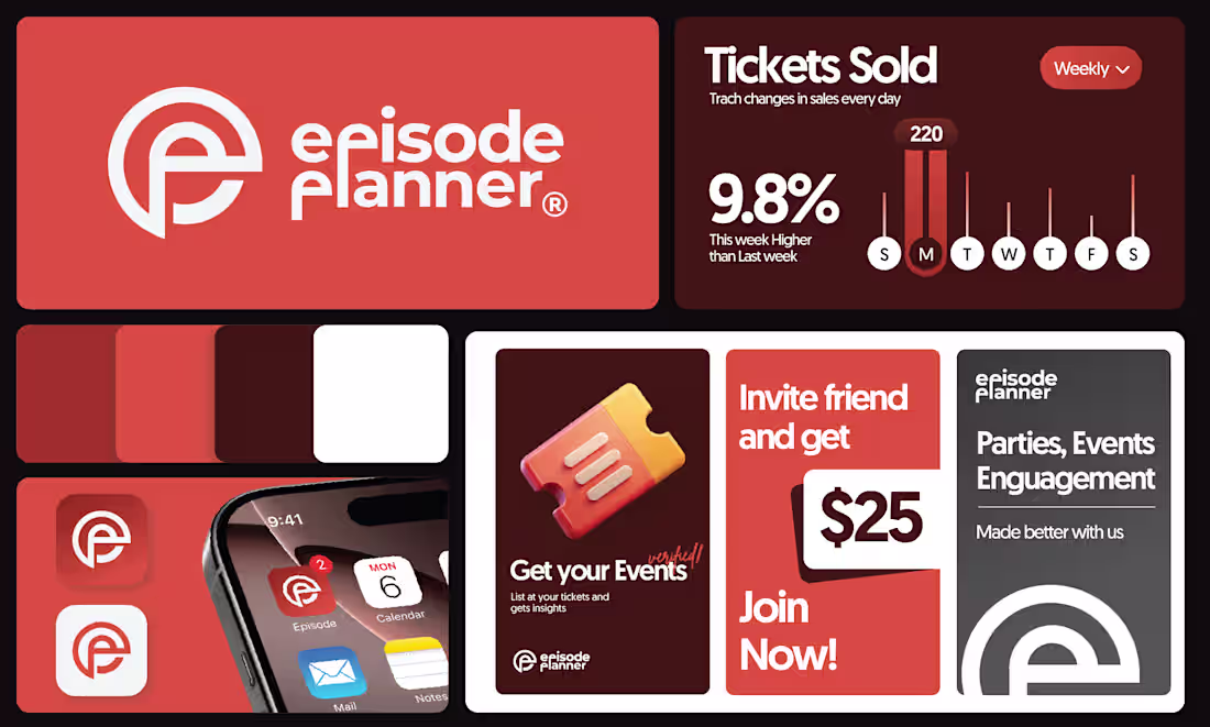
Episode Planner | Brand Identity Design & Brand Guide
Episode Planner is a Singapore-based event management brand delivering end-to-end planning with precision, creativity, and premium execution. The identity transforms each event into a curated “episode” with a strong narrative. The visual direction is bold and modern, combining futuristic aesthetics, dramatic lighting, high contrast, and minimal typography to reflect sophistication, control, and consistency across digital and promotional platforms.
0
32