The network for creativity
Join 1.25M professional creatives like you
Connect with clients, get discovered, and run your business 100% commission-free
Creatives on Contra have earned over $150M and we are just getting started
Back to feedPost

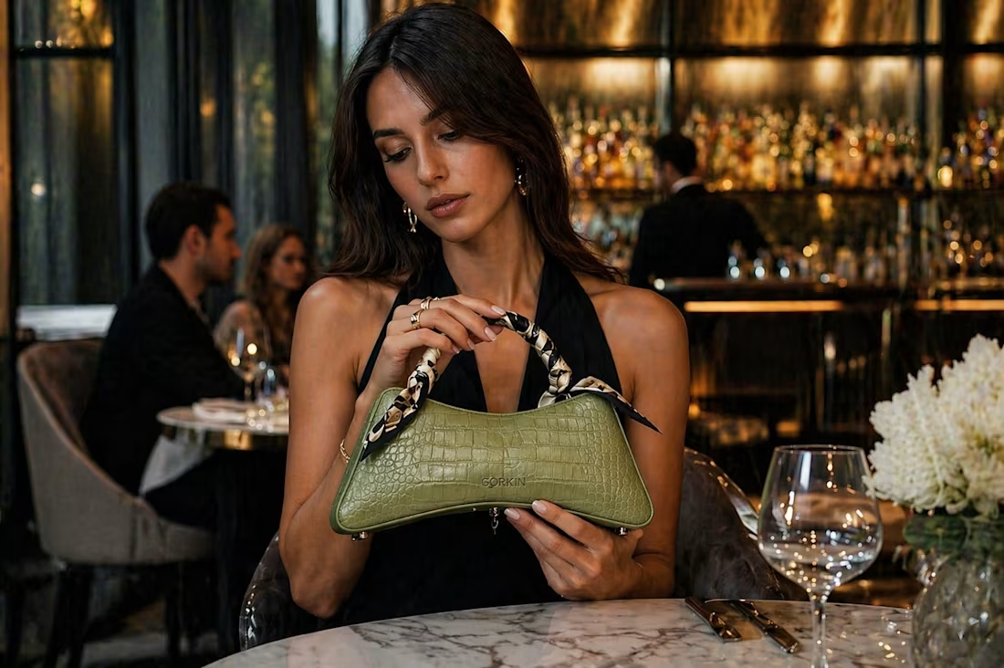
Introducing GORKIN — Architectural Bag Design Worldbuilding.
What if a bag could become more than an accessory?
GORKIN explores the intersection of architectural form, materiality, and visual identity to create a distinctive product concept.
The project brings together:
• Sculptural product form
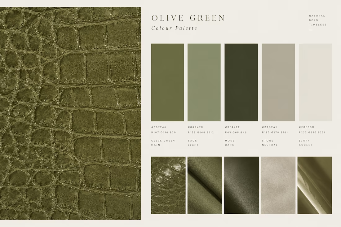
• Material and color exploration
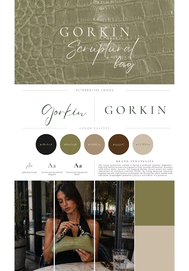
• A cohesive visual direction
• A distinct product identity
Role: concept, brand strategy, visual direction.
An independent concept study exploring how strategic thinking and creative direction can shape a product’s world.
I build brand concepts for emerging lifestyle brands. Open to new projects.
More from the project on Behance:
#BrandStrategy #ConceptDevelopment #CreativeDirection #ProductDesign


The network for creativity
Join 1.25M professional creatives like you
Connect with clients, get discovered, and run your business 100% commission-free
Creatives on Contra have earned over $150M and we are just getting started
Related posts

How many concepts die in your drafts folder? 💀
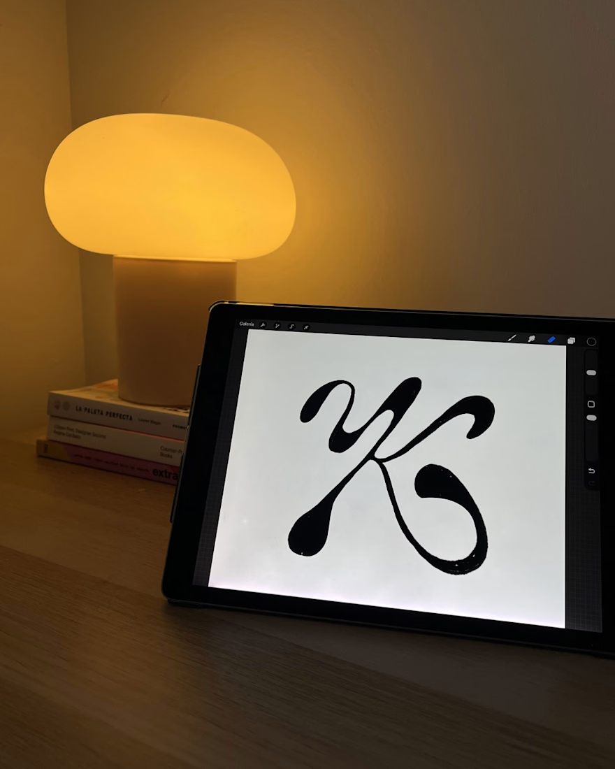
In the spirit of Inktober, a digital sketch that never saw the light.
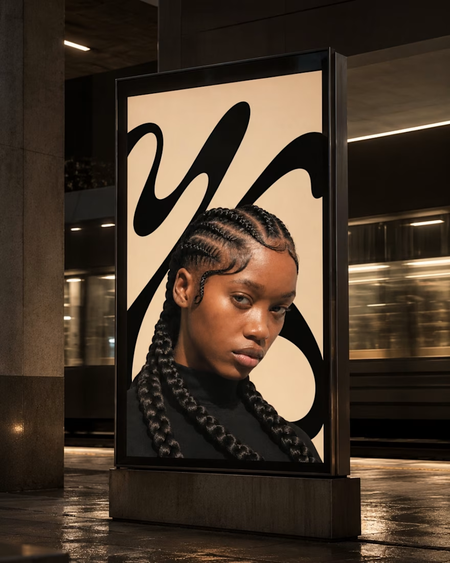
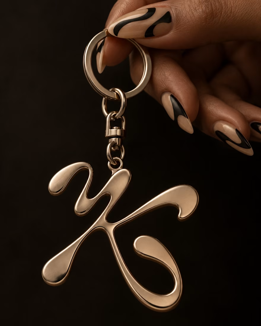
This was a lettering-inspired brandmark sketch playing with the letter K and the movement of hair. I archived it before presenting it. Not because I didn’t like it, but because I felt it wasn’t the right direction for that project.
This is how it would probably have looked, there are still things I’d want to refine.
Has it ever happened to you that you discard a concept even though you like it?

Love the idea of sharing concepts that never made it to the final stage! The K and hair movement is a really interesting direction. Do you usually revisit archived concepts later, or do you prefer to leave them behind?

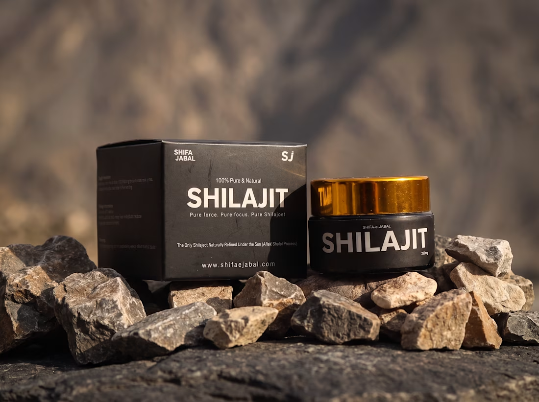
Any good words for the packaging.




🎨 NOCTURNE — Design Taste Test | Cyberpunk vs. Minimalist
Two visual directions. One creative concept. Which style makes the stronger impact?
⚡ Version A: Cyberpunk — Futuristic visuals, bold contrasts, and an energetic digital atmosphere.
◼️ Version B: Minimalist — Clean composition, refined typography, and a focused visual identity.
This taste test explores how different design styles influence perception, mood, and visual appeal. Your feedback will help determine which direction communicates the concept most effectively.
Which version wins your vote — A or B? Drop your choice in the comments and share what made it stand out!
3 voted
50%
3 voted
50%
6 votes
Closed