The network for creativity
Join 1.25M professional creatives like you
Connect with clients, get discovered, and run your business 100% commission-free
Creatives on Contra have earned over $150M and we are just getting started
Back to feedPost
Taste Test

🎨 NOCTURNE — Design Taste Test | Cyberpunk vs. Minimalist
Two visual directions. One creative concept. Which style makes the stronger impact?
⚡ Version A: Cyberpunk — Futuristic visuals, bold contrasts, and an energetic digital atmosphere.
◼️ Version B: Minimalist — Clean composition, refined typography, and a focused visual identity.
This taste test explores how different design styles influence perception, mood, and visual appeal. Your feedback will help determine which direction communicates the concept most effectively.
Which version wins your vote — A or B? Drop your choice in the comments and share what made it stand out!
6 votes
Ends in 48m

I voted for the minimalist version! Love the clean layout, and overall sophisticated feel. 🙌

This minimalist version is so clean! That top-down cup graphic + "Roasted for the late shift" line is perfect for Nocturne ☕

I’d vote for A — Cyberpunk. The bold contrast and futuristic atmosphere make the concept feel more distinctive and memorable. ⚡

Minimalist. it's looks clean and modern.
The network for creativity
Join 1.25M professional creatives like you
Connect with clients, get discovered, and run your business 100% commission-free
Creatives on Contra have earned over $150M and we are just getting started



Related posts


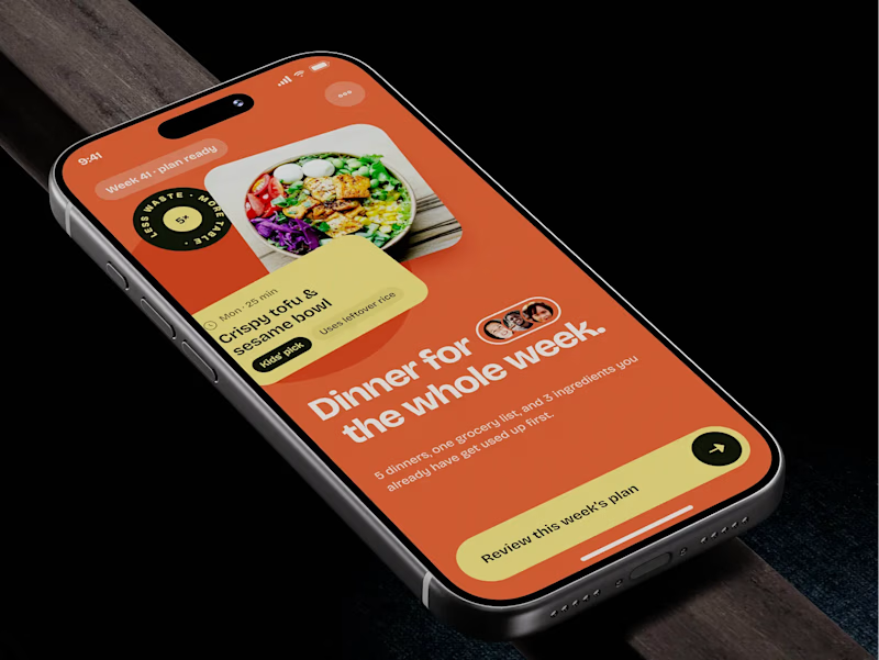
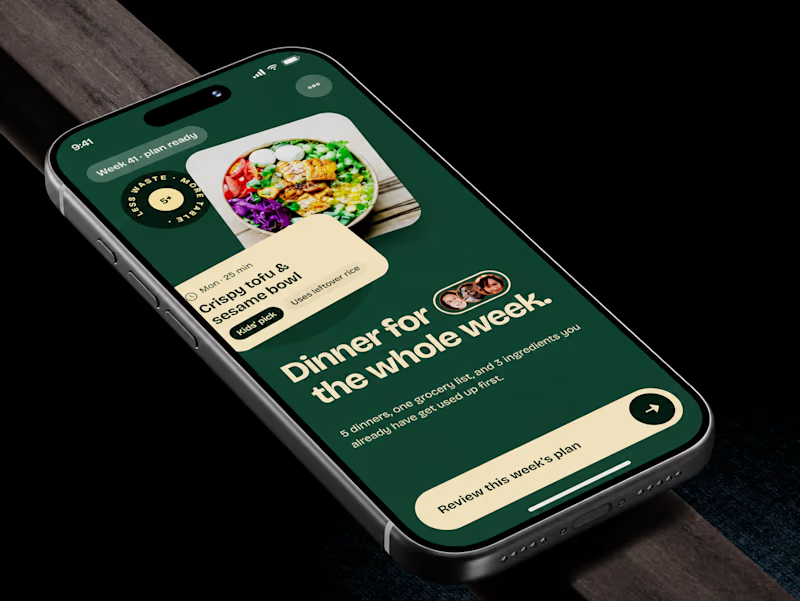
🧪 TASTY TEST: WHICH ONE MAKES NEXT WEEK FEEL SORTED?
Meal planner mobile app design. Same UX, two palettes.
🍊 A · Citrus Energy
Orange + buttery yellow. Appetite first.
🌿 B · Forest Calm
Deep green + cream. A calmer weekly ritual.
💡 GROWTH THINKING
Users want dinner handled, not another planning task.
My hypothesis: orange could win the first tap; green could signal less effort. I’d test plan-open rate AND grocery-list completion. More taps mean little if people abandon the next step.
🗳️ A OR B — WHICH WOULD YOU TRUST WITH NEXT WEEK’S DINNERS?
Vote and tell me why.
📩 BUILDING A MOBILE APP? LET’S FIND WHAT’S HOLDING GROWTH BACK.
https://calendly.com/asol_design/demo
#MobileAppDesign #AsolDesign
15 voted
68%
7 voted
32%
22 votes
Closed

Which ORBIT pulls you in: the quiet one or the loud one? ✨
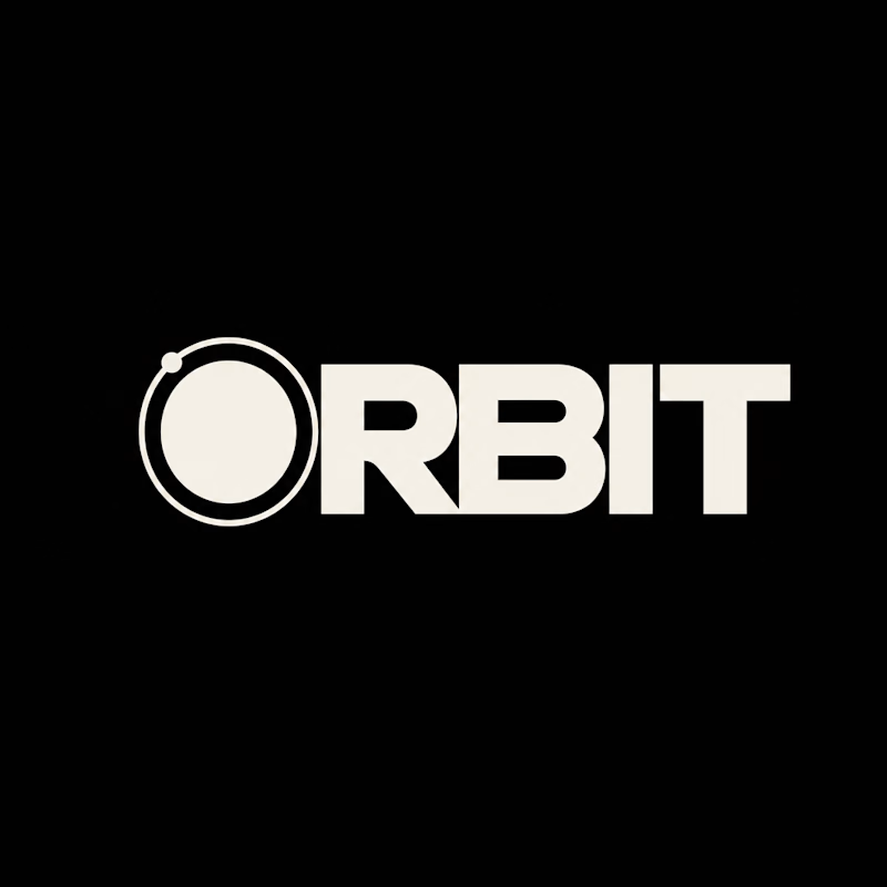
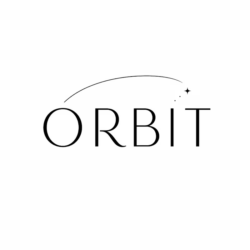
One name, two directions. Same idea, an object in motion around a center.
A → Heavy extended sans on black. The orbit is built into the O, a ring with a single satellite. Compact, graphic, impossible to ignore.
B → Light, high-contrast serif with a hairline arc and a tiny spark. The orbit is a gesture, a trail you almost miss. Elegant, airy, a little mysterious.
If you ask me, I'd pick A.

36 voted
80%
9 voted
20%
45 votes
Closed


We're currently working on this animation for a mobile app. We're debating whether to use fall colors, like seasonal ones or stick with the app's current color scheme.
Community, which color scheme would you vote for?

8 voted
38%
13 voted
62%
21 votes
Closed

Option 2 was stunning🔥🔥🔥🔥