The network for creativity
Join 1.25M professional creatives like you
Connect with clients, get discovered, and run your business 100% commission-free
Creatives on Contra have earned over $150M and we are just getting started
Back to feedPost

GREEN EARTH
Overview
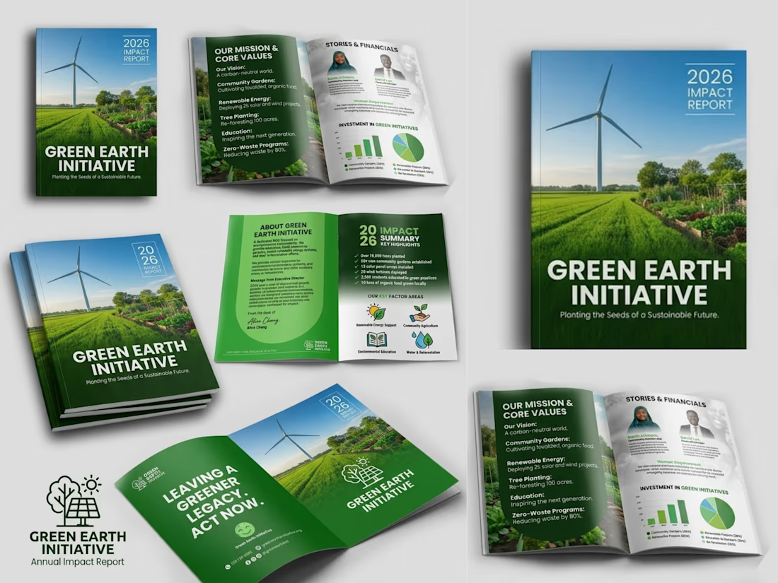
I made a professional company profile design for GREEN EARTH INITIATIVE that showcases their brand's identity, values, services, and strengths through a clean, engaging, and visually compelling layout.
Goal
Create a company profile that builds credibility, communicates the brand's value, and leaves a lasting impression on clients, partners, and investors.
Challenges
Presenting detailed business information in a clear, organized, and visually appealing format while maintaining a strong brand identity.
Solutions
Developed a modern, well-structured design with strategic layouts, compelling visuals, and consistent branding to enhance readability, professionalism, and business impact.


The network for creativity
Join 1.25M professional creatives like you
Connect with clients, get discovered, and run your business 100% commission-free
Creatives on Contra have earned over $150M and we are just getting started





Related posts

Post
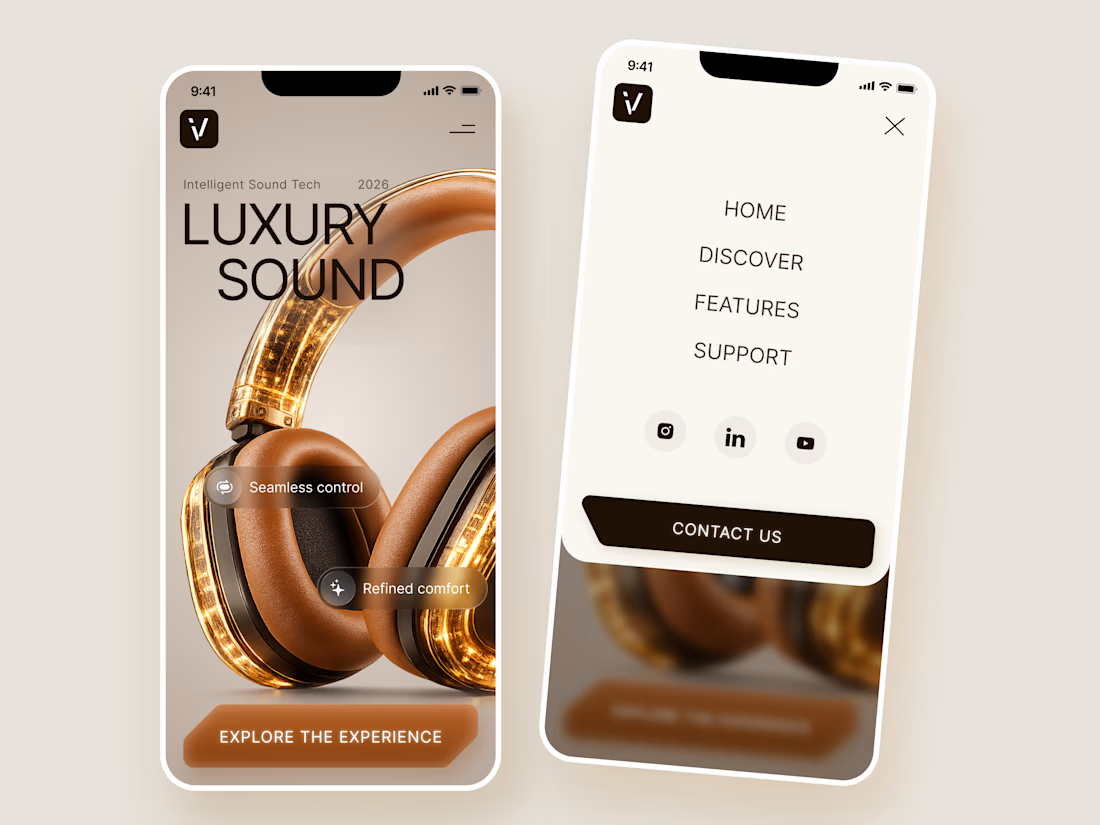
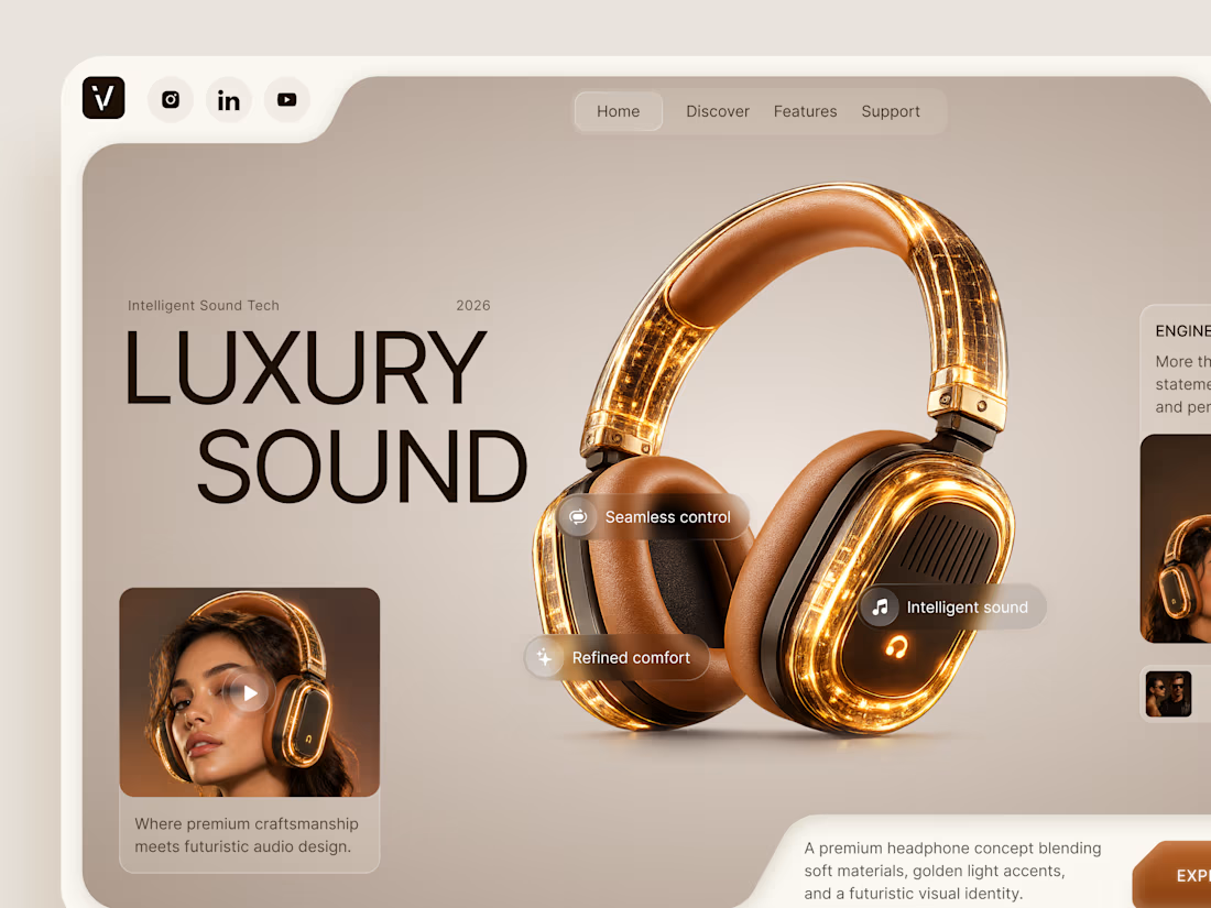
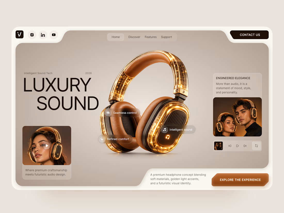
Luxury Sound — Premium Headphones Landing Page 🎧✨
A premium landing page concept for a luxury audio brand, built around a bold headphone design and a refined visual experience
The design combines warm neutral tones, glowing details, oversized product visuals, and minimal typography to create a futuristic yet elegant feel
Special attention was given to:
• Product-first composition
• Premium visual direction
• Feature highlights
• Lifestyle imagery
• Clear CTA placement
• Responsive mobile experience
The result is a clean, immersive product experience that makes the headphones feel like more than tech — they become part of the lifestyle 🔥



The amber glow on the headphones against that warm beige is lovely. How does the mobile menu handle the product image?

Jordan Reid - Sportswear Brand Identity
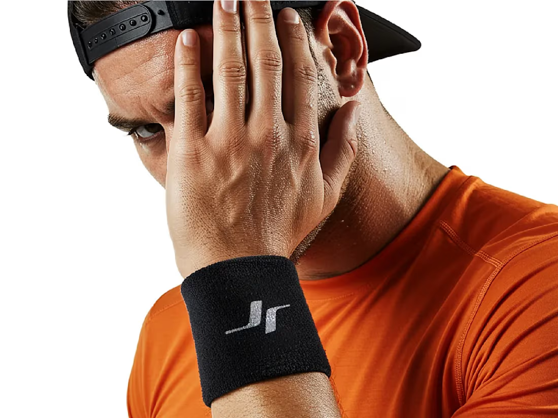




Like the logo direction


I've helped 100+ founders make brand decisions. The most expensive one is always naming a second product separately.
Intuit paid $12B for Mailchimp, spent years keeping it visually apart from TurboTax, and is now paying again with a global rebrand to reconnect them.
Every separate product name is a brand you'll eventually have to pay to reunite. The bill arrives when you try to cross-sell and your customers can't see the connection.
Before you name product two: write one sentence on how it makes product one more valuable to the same buyer. If you can, it's a capability, not a brand.
thebrightmethod.substack.com
Every Product Name Is a Future Invoice
The second logo always costs more

Great job Daniel congratulations 🎉🎉❤️❤️