The network for creativity
Join 1.25M professional creatives like you
Connect with clients, get discovered, and run your business 100% commission-free
Creatives on Contra have earned over $150M and we are just getting started
Back to feedPost

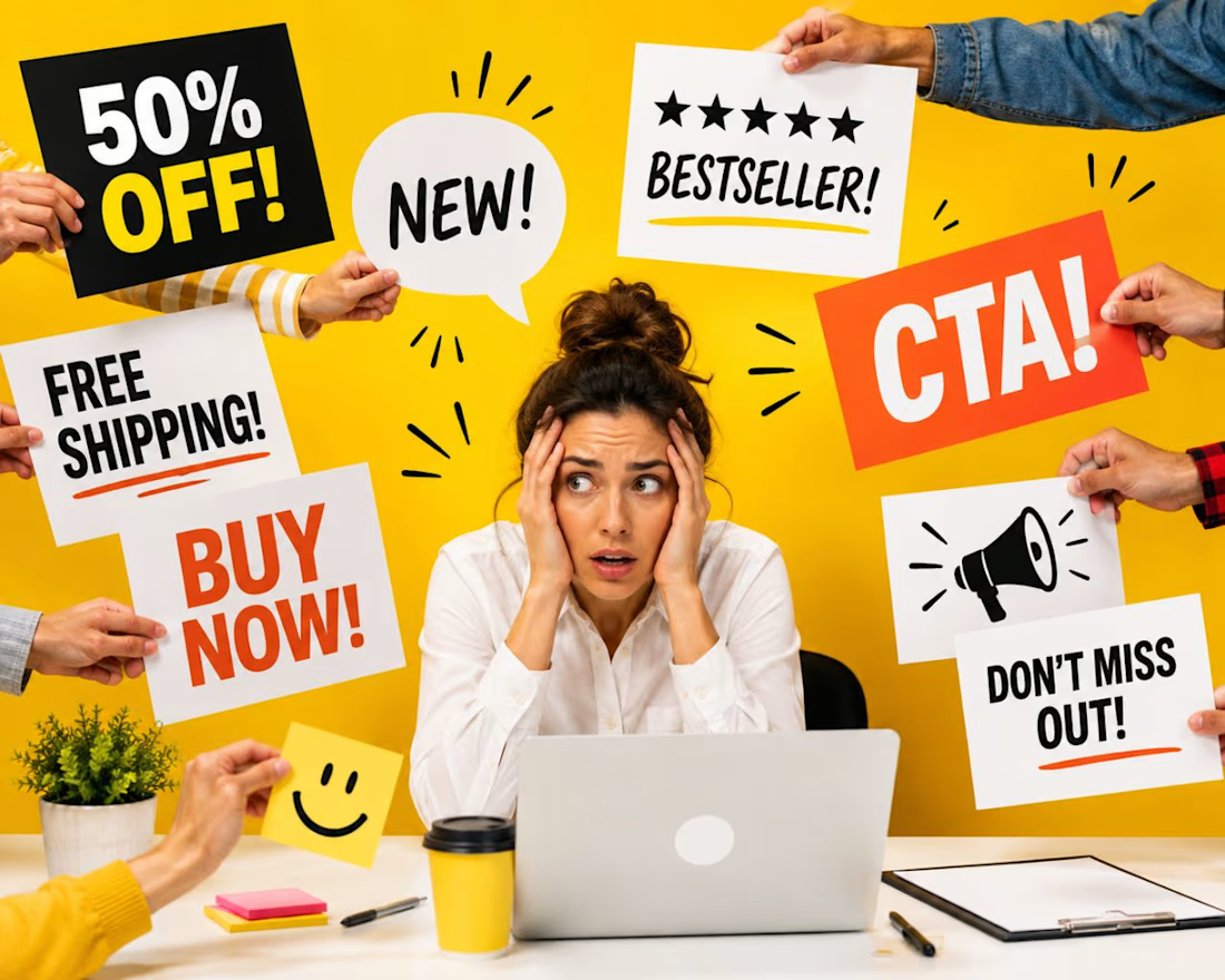
One of the easiest ways to ruin a design?
Make everything important.
Make the logo bigger.
Make the headline bolder.
Highlight the discount.
Make the CTA pop.
Add the reviews.
Don’t forget “Free Shipping.”
Oh, and the product needs more attention too.
At some point, the design stops communicating and starts negotiating.
Every element is fighting for the same 2 seconds of attention.
And when everything is shouting, nothing is leading.
I think one of the most underrated design skills is not knowing how to make something stand out.
It’s knowing what should NOT stand out.
Because visual hierarchy is ultimately a decision about priority:
What should I notice first?
What should I understand second?
What do I need to believe?
And what should I do next?
This becomes especially obvious in advertising, where attention is limited and every extra message competes with the one that might actually make someone care.
Sometimes the best design decision isn’t adding another element.
It’s having the confidence to let one idea win.
Designers: what’s the one thing you’re most often asked to “make bigger” that absolutely does not need to be bigger?
#GraphicDesign #DesignThinking #VisualDesign #CreativeStrategy #PerformanceCreative
The network for creativity
Join 1.25M professional creatives like you
Connect with clients, get discovered, and run your business 100% commission-free
Creatives on Contra have earned over $150M and we are just getting started
Trending
retrofuturism
Share your favorite designs from the past exploring the distant future. Or your own take on the aesthetic 🚀
halftone
Dots. Texture. Grain. Let's see your designs using the halftone technique.

Midjourney
Creatives are showing off what they're making with Midjourney.
colorgrade
Video editors sound off: How do you enhance the mood of your video in color grading?
Related posts

How do you keep a brand's promise of calm intact once real users start clicking through checkout?
Mudita builds minimalist devices around one idea: technology that harmonizes with your life instead of competing for your attention. The brandbook lays that promise out in detail - tone, restraint, what the brand should never feel like. My job was carrying that same discipline into the product itself.
I worked across the checkout flow, the storefront and category browsing, and the product page above the fold - three surfaces where small frictions had quietly built up against the brand's own case for calm. The brandbook gave the rules. The UI work was making sure those rules survived contact with a real cart and a real user.
For the case study visuals, I used AI for the first time to produce product footage 🤖 - wind moving through a scene, an object drifting in place. Higgsfield was genuinely a good way to learn that workflow fast.
Full case study - actual before/after breakdowns - is up on Behance 🔗, linked below.
Genuinely curious where people land on this: generating production assets with AI is fast, and honestly kind of fun as a workflow - but there's real pushback that it's taking work away from people who used to shoot this stuff. Where do you fall on that?


The checkout flow detail is what stands out to me, that's usually where a brand's calm promise turns into three different button behaviors fighting each other. On your AI question, I think it matters less whether it's fast and more who's checking the output against the brand's...

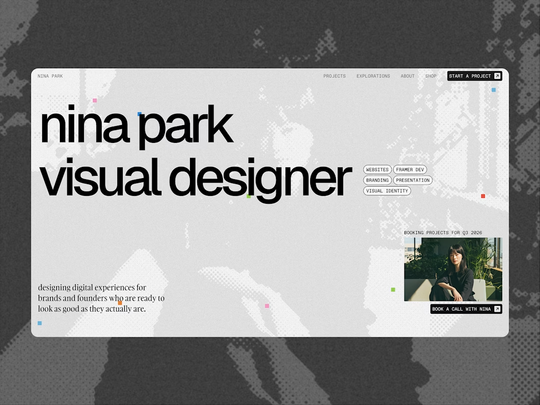
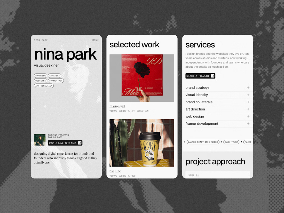
After a great response on my portfolio last week I decided to turn it into a
@framer template, and its completely FREE!
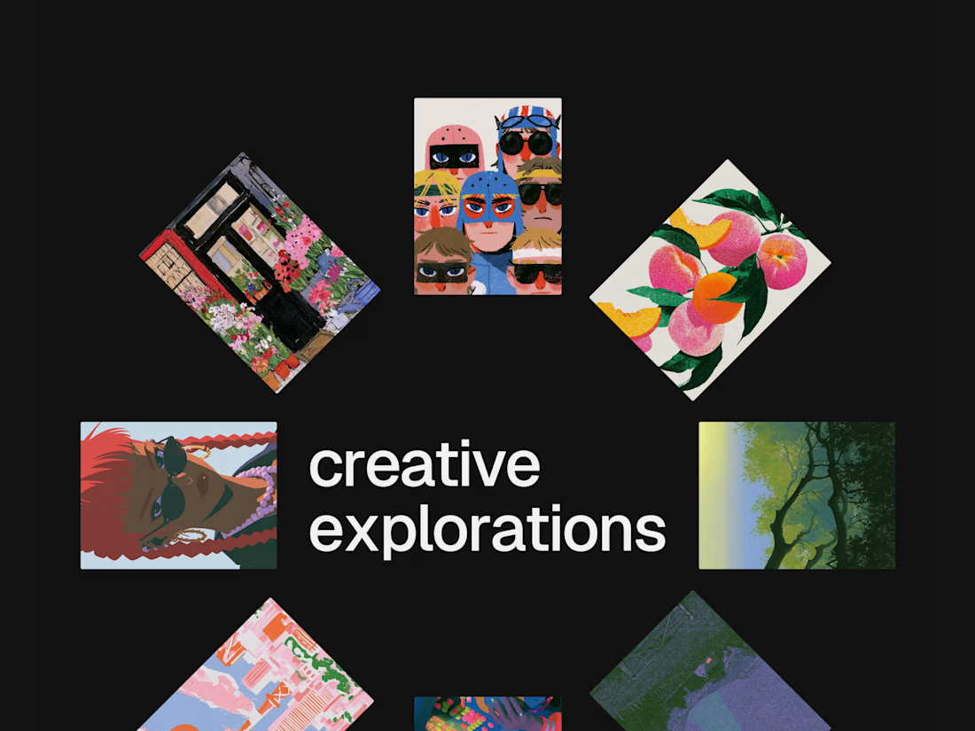
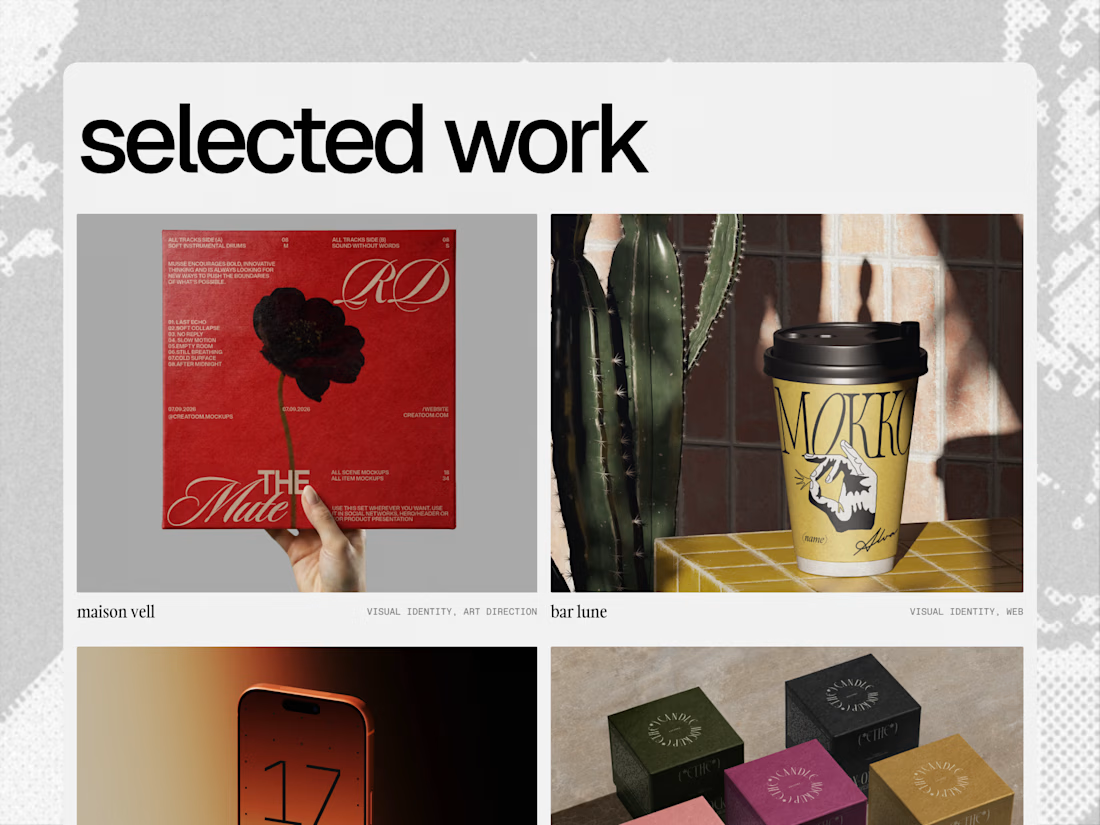
It's a modern, type-led portfolio with smooth scroll transitions in every section and a clean, confident aesthetic that's built to look professional. Easy to customise, easy to make your own.
See it live
Check it out, experiment, break it apart, and make it yours. Happy building! and if you use it, I'd love for you to leave a review :)
Check it out in the Framer marketplace - https://www.framer.com/community/marketplace/templates/nina-park/


Love this!

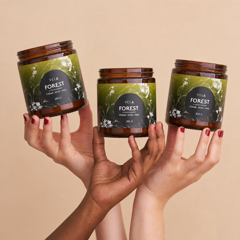
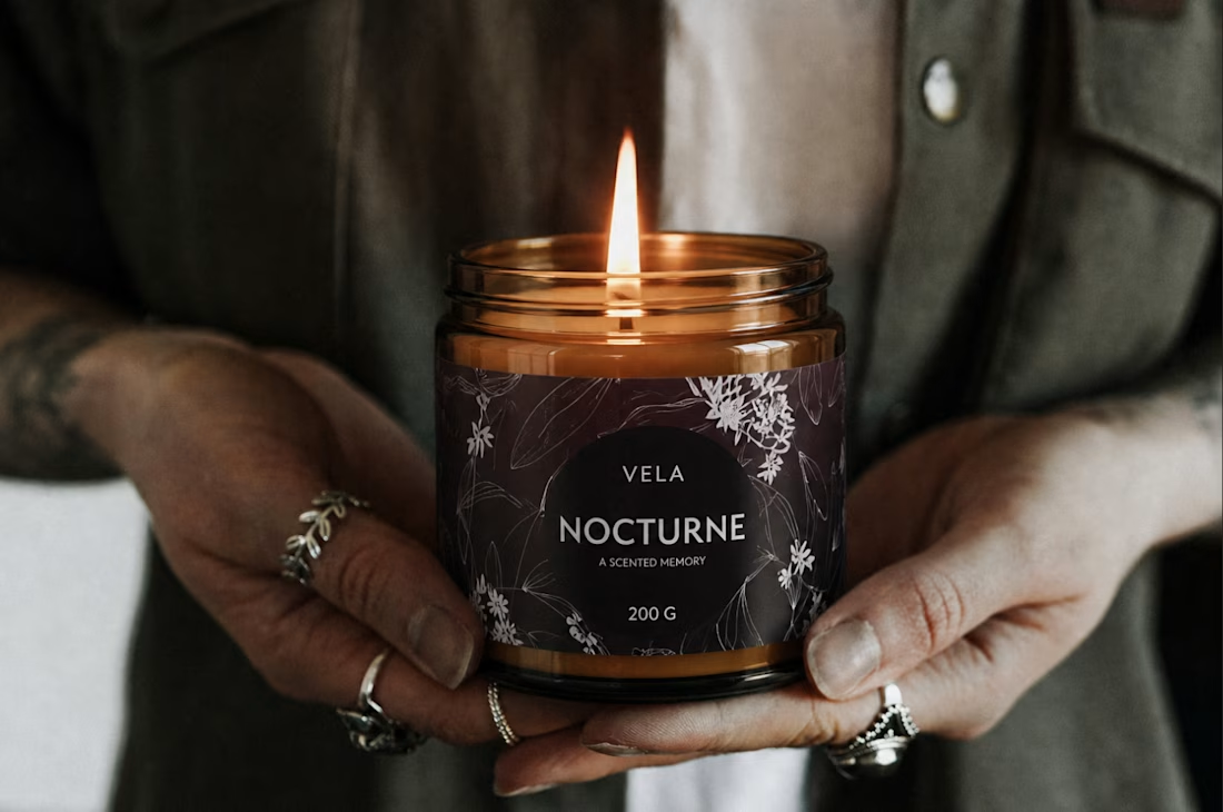
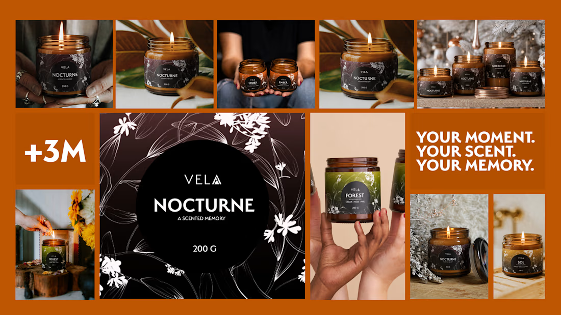
brand identity design for VELA — a luxury candle brand built around one idea: a candle burns for a few hours, but the memory lasts considerably longer.
this project includes full packaging design, botanical illustration, brand identity, and campaign visuals — all designed to turn everyday moments into unforgettable memories.
scent is the fastest way back to a feeling. VELA was designed to take you there.
if you're looking for a brand designer or packaging designer for your next project — I'm open for freelance & full-time work. link in bio.



Beautiful work!