The network for creativity
Join 1.25M professional creatives like you
Connect with clients, get discovered, and run your business 100% commission-free
Creatives on Contra have earned over $150M and we are just getting started
Back to feedPost
I designed Velour, a fashion app, and the first thing I made wasn't a screen. It was a list of six problems. 🧵
Before designing anything, I wrote down what makes shopping apps forgettable. Generic feeds, no point of view, discovery that feels like a search bar instead of a magazine. Then every screen became an answer to one.
What shaped it:
A home feed that reads like a curated editorial, not an endless grid
Minimal and high contrast, so the clothes carry the colour and the interface stays quiet 🖤
Discovery, checkout, and tracking as one continuous feel, not three apps stitched together
The design gets easy once the problem is honest. Most weak products skip that step.
Full case study is on my profile; I think you'll love it. ✨:
Diagnose before you design, or let the problems surface?
#productdesigner #mobiledesigner #ux #designsystems


Amazing.

Thanks!

Always diagnose first. Skipping the problem definition phase is exactly why so many modern shopping apps look like identical. What were the specific six problems you initially wrote down?
Honestly, this made my day. Most people just look at the screens and scroll on, so it's nice when someone asks about the thinking. 🙌
Here's what I actually scribbled down before opening Figma, the six things that kept bugging me about fashion apps:
1. Discovery that throws...
The network for creativity
Join 1.25M professional creatives like you
Connect with clients, get discovered, and run your business 100% commission-free
Creatives on Contra have earned over $150M and we are just getting started











Related posts


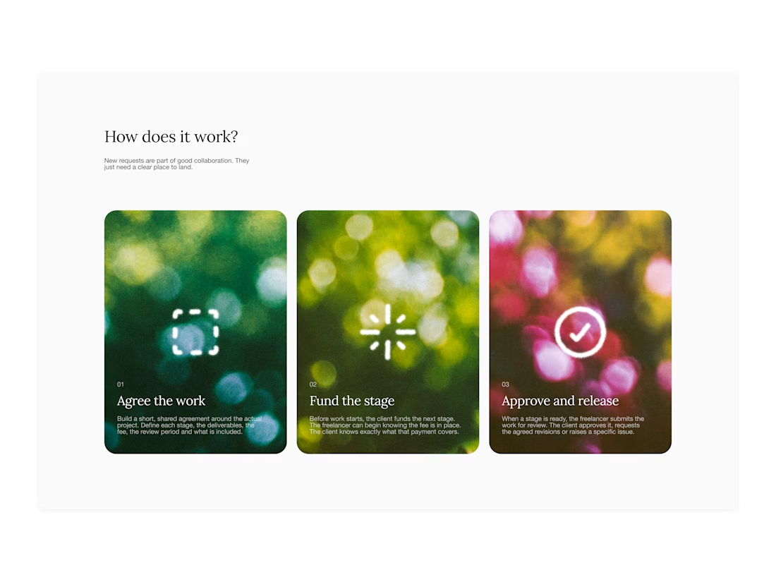

Your web sections always have such strong art direction. Great to see the brand carried right into the layout.


✈️ What if booking a flight was actually fun?
I wanted to make the whole experience feel less like filling out a form and more like playing with an interface.
Turn your sound ON and give it a watch 🎧🔊.

THIS IS GREAT


Hiring: UX / Product Designer (remote, ongoing)
I run Novatur Design, a product design studio based in Malta. We work with startups through to enterprise clients such as The Daily Mail, across a range of industries from EV to Crypto, Fintech to IoT.
I’m looking for an all-round UX / product designer who can take a problem from user flows through to polished hi-fi UI. Figma, auto layout and design systems should be second nature.
This is ongoing contractor work on a monthly basis, not a one-off project. If it works well on both sides, there’s potential for it to go full time.
Remote, so you don’t need to be in Malta. Individual designers only, no agencies please.
If you’re interested, the application takes about 6 minutes:
https://tally.so/r/yXZ2dB
Ralph

Love the variety of industries you work with. Sounds like an amazing opportunity for the right designer.