The network for creativity
Join 1.25M professional creatives like you
Connect with clients, get discovered, and run your business 100% commission-free
Creatives on Contra have earned over $150M and we are just getting started
Back to feedPost

I designed Velour, a fashion app, and the first thing I made wasn't a screen. It was a list of six problems. 🧵
Before designing anything, I wrote down what makes shopping apps forgettable. Generic feeds, no point of view, discovery that feels like a search bar instead of a magazine. Then every screen became an answer to one.
What shaped it:
A home feed that reads like a curated editorial, not an endless grid
Minimal and high contrast, so the clothes carry the colour and the interface stays quiet 🖤
Discovery, checkout, and tracking as one continuous feel, not three apps stitched together
The design gets easy once the problem is honest. Most weak products skip that step.
Full case study is on my profile; I think you'll love it. ✨:
Diagnose before you design, or let the problems surface?
#productdesigner #mobiledesigner #ux #designsystems



Amazing.
Thanks!

Always diagnose first. Skipping the problem definition phase is exactly why so many modern shopping apps look like identical. What were the specific six problems you initially wrote down?
Honestly, this made my day. Most people just look at the screens and scroll on, so it's nice when someone asks about the thinking. 🙌
Here's what I actually scribbled down before opening Figma, the six things that kept bugging me about fashion apps:
1. Discovery that throws...
The network for creativity
Join 1.25M professional creatives like you
Connect with clients, get discovered, and run your business 100% commission-free
Creatives on Contra have earned over $150M and we are just getting started
Related posts

Not everything I build lives in Framer.
This one's a code project: I rebuilt Payy's React marketing site — a stablecoin payments company — from the front-end up. New typography system, a reusable motion foundation (scroll reveals, animated stats, page transitions), a handful of custom components, and a footer with proper parallax. All hand-written, no UI framework doing the heavy lifting.
I ran the whole build through Claude Code, which is where 15 years of front-end experience actually pays off — I'm not prompting and hoping. I know what good motion feels like, how to keep things performant and accessible, and where the real work is. The AI moves fast; the engineering judgment is mine. I also work fluently with MCPs like the Figma MCP, so I can pull straight from design files into clean, accurate code.
If you've got a Figma design that needs to become a real, performant site — in React, not just Framer — that's squarely my lane. Happy to talk through what you're building.

Clean UI👏


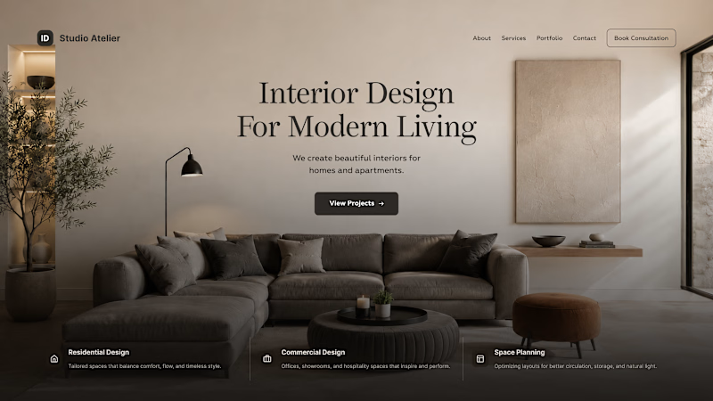
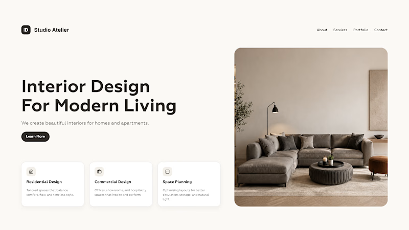
Same content. Two different perceptions. Using the same copy and imagery, two different homepage concepts were created.
Option 1 - Clean, structured, functional
Option 2 - Editorial, atmospheric, premium
The same content can create a completely different perception of a brand depending on composition, typography, spacing, and visual hierarchy.
Which version would you choose, and what emotions does each one evoke for you?

112 voted
78%
32 voted
22%
144 votes
Closed




Template #3 coming along nicely. Almost finished all pages design and animation prototypes.
For some reason I am still doing most of prototyping not directly in framer but directly in claude code

Cool 😍




Trending

Claude
Claude has entered the design space. How are you using Claude Design?

Contra University
Learn from expert creatives how to earn more using next-gen AI tools.
fifaworldcup2026
The World Cup is here and the whole world's watching. How are you designing for the world stage?
creativeaiflow
Creative AI workflows are evolving. What tools do you use, and what are their strengths and weaknesses?
freelancerlife
Freelancer life is wins, pivots, and everything in between. What’s yours right now?


