The network for creativity
Join 1.25M professional creatives like you
Connect with clients, get discovered, and run your business 100% commission-free
Creatives on Contra have earned over $150M and we are just getting started
Back to feedPost
Taste Test

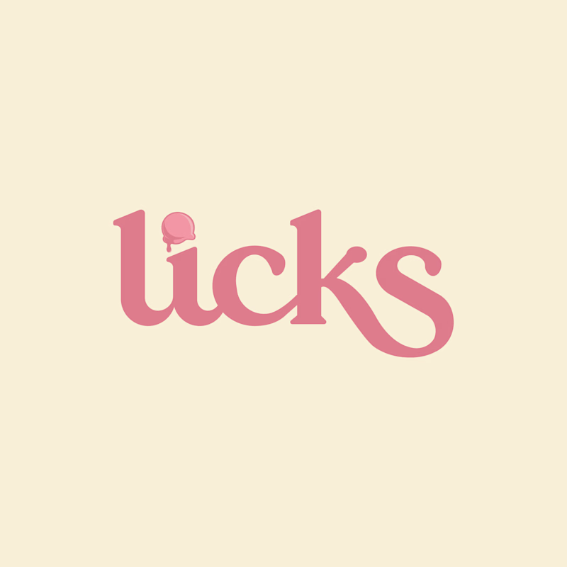
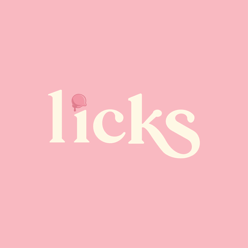
Which option do you guys prefer, A or B ? 🤔
This is a logo I designed for an ice cream shop, exploring two concepts based on the client’s brief. I’d love to hear your feedback and thoughts on both directions.
4 voted
67%
2 voted
33%
6 votes
Closed

B feels way more like an ice cream brand to me.
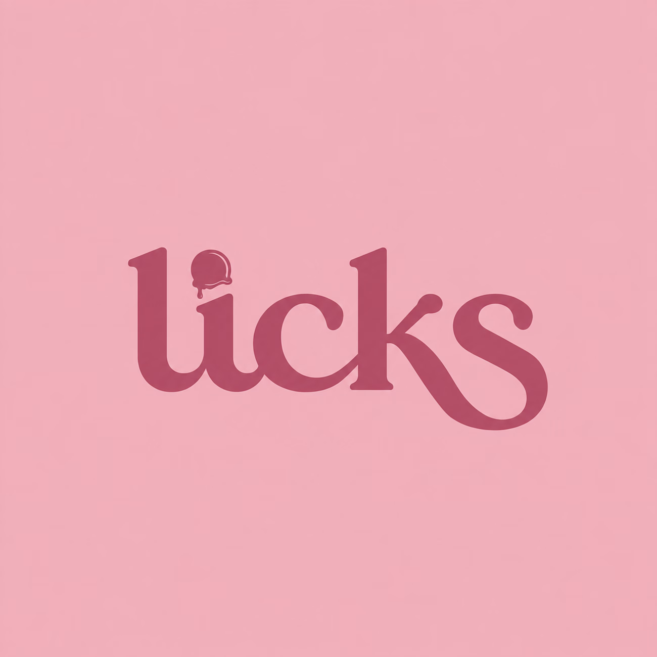
Looking at both, I had another variation in mind so I quickly mocked it up - curious what you think 👀

if i sit in 'logo/branding decision' i will choose option A for your main ice-cream shop. logo deliver stronger here
B still can be use in soft packaging or wall-design, pink make it feel soft, thus customer enjoy coming to your ice-cream shop
The network for creativity
Join 1.25M professional creatives like you
Connect with clients, get discovered, and run your business 100% commission-free
Creatives on Contra have earned over $150M and we are just getting started





Related posts


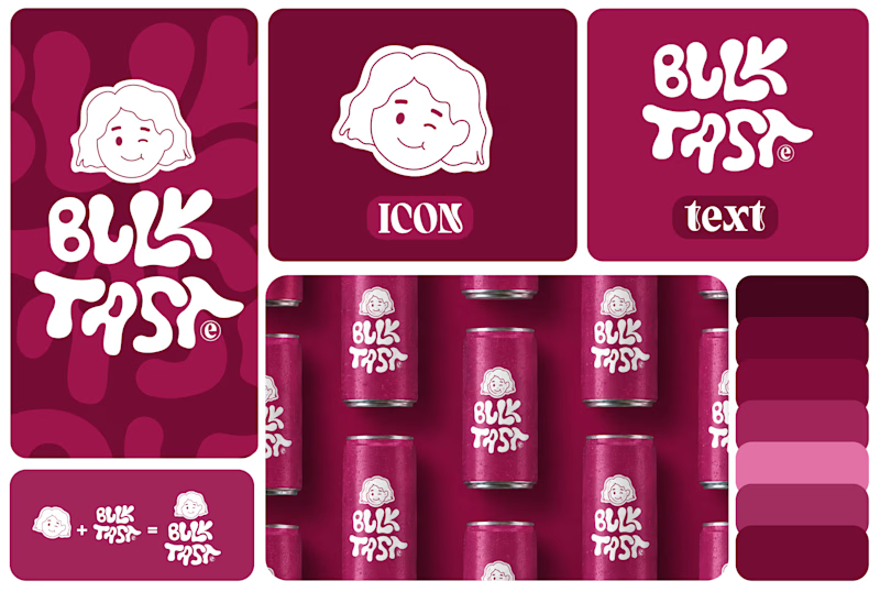
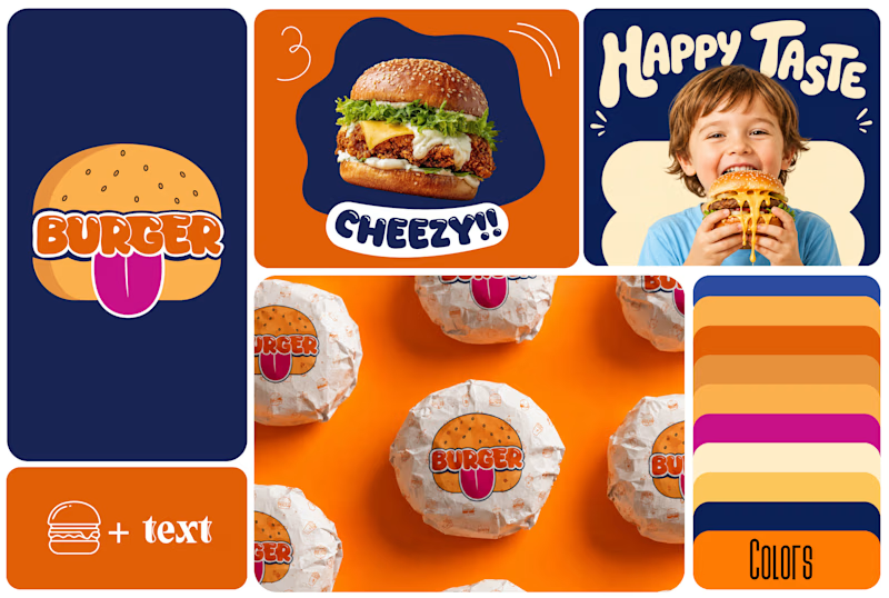
Which One Brand Identity Is looing good? A or B..
7 voted
50%
7 voted
50%
14 votes
Closed

Both look good, but I’d go with B. The colors and playful visuals feel more energetic. 🔥


The thing I keep relearning: a design is never finished because someone ran out of ideas. It's finished because someone decided to stop. Knowing when to stop is the hardest part.
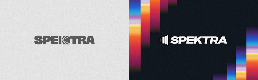


Damn.... Crazy colors 👏😍

Winder is a bold brand identity built around a geometric W-inspired symbol, combining sharp angles and forward movement to represent progress, speed, and direction.
The identity uses a striking red and deep burgundy palette, supported by clean typography and a consistent visual system across brand guidelines, digital applications, and product mockups.
Progress in Motion.




Great logo it feels it really has an identity 🎉🎉