The network for creativity
Join 1.25M professional creatives like you
Connect with clients, get discovered, and run your business 100% commission-free
Creatives on Contra have earned over $150M and we are just getting started
Back to feedPost


The network for creativity
Join 1.25M professional creatives like you
Connect with clients, get discovered, and run your business 100% commission-free
Creatives on Contra have earned over $150M and we are just getting started



Related posts


Niceee

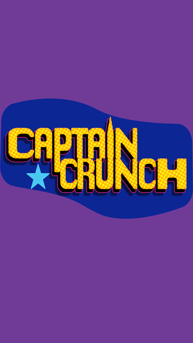
This is a concept cereal branding project aimed for kids age 4-10 with the idea that having breakfast is a quest. For this project i went with a hand drawn illustration and also made a custom logo for the brand.I chose colors which are not normally found in the cereal to make it stand out.
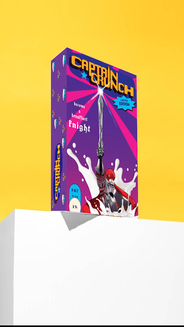
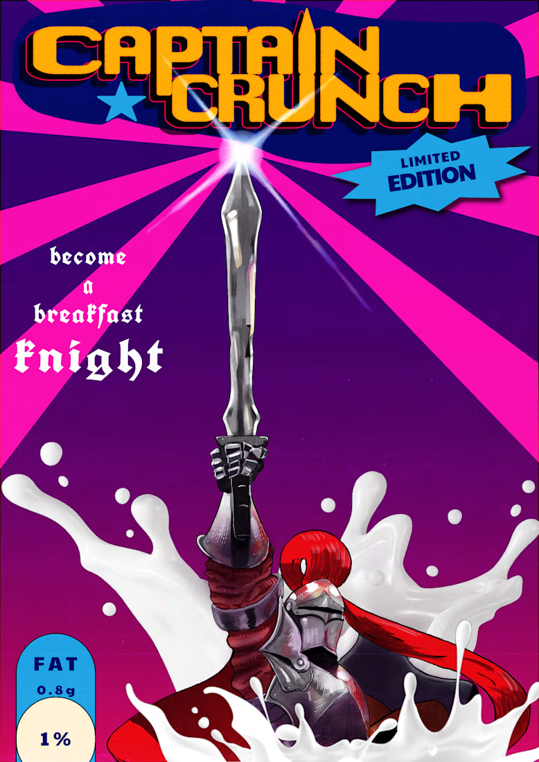
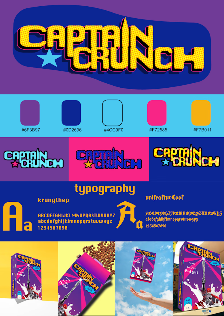


4 to 10 is a tough range to design for, the 4 year old and the 10 year old want totally different boxes

Le Temple was one of those projects where I got to work on everything, from the first logo sketches to the final e-commerce website.
I handled the branding, visual identity, art direction, and website design, making sure everything felt consistent and true to the brand.
Loved having the freedom to shape the whole thing, not just one part of it.


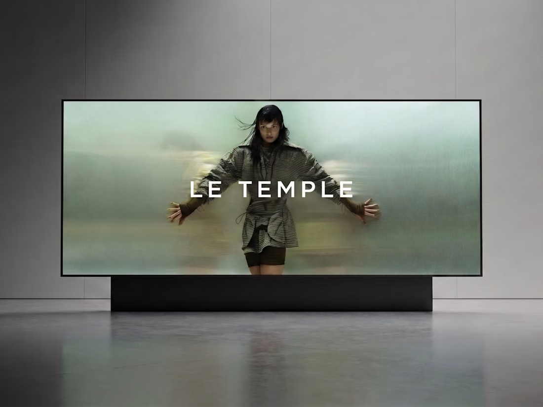

That motion-blurred campaign shot with the spaced-out wordmark sets the tone straight away. You can tell when one person owns both the brand and the site. Did you carry the blur into the Shopify store as well, on hover states or the hero?


