The network for creativity
Join 1.25M professional creatives like you
Connect with clients, get discovered, and run your business 100% commission-free
Creatives on Contra have earned over $150M and we are just getting started
Back to feedPost
A little milestone I’m excited to share — my portfolio is officially live on Contra. ✨
I’ve been working on building a portfolio that reflects the kind of design work I want to create more of — intentional, strategic and visually strong.
From social media and brand design to packaging and marketing creatives, I’m looking forward to working with brands that care about how they show up visually.
My Contra profile is now live.
If you’re a founder, business owner, or growing brand looking for a designer — let’s connect. 🤍
View my work → https://on.contra.com/C8PMzF
#Contra #FreelanceDesigner #BrandDesigner #SocialMediaDesigner #GraphicDesigner #BrandIdentity #PackagingDesign #SocialMediaDesign


Thank you so much! 😊 Excited to be part of the Contra community and looking forward to connecting and collaborating with fellow creatives
The network for creativity
Join 1.25M professional creatives like you
Connect with clients, get discovered, and run your business 100% commission-free
Creatives on Contra have earned over $150M and we are just getting started





Related posts

$10K earned on Contra. 🎉💸
Grateful for every client who took a chance on me. This is just the beginning. More great products, more real partnerships, more milestones to hit. 🙌
Thank you to everyone who's been part of it. Onward. 🚀
#10k #contraearnings #Freelance #Webflow #Framer #Webdesign


Congratulations nice job 🎉🎉

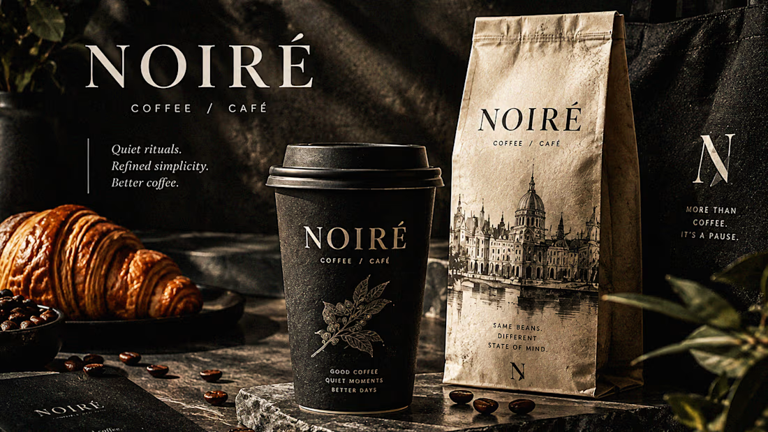
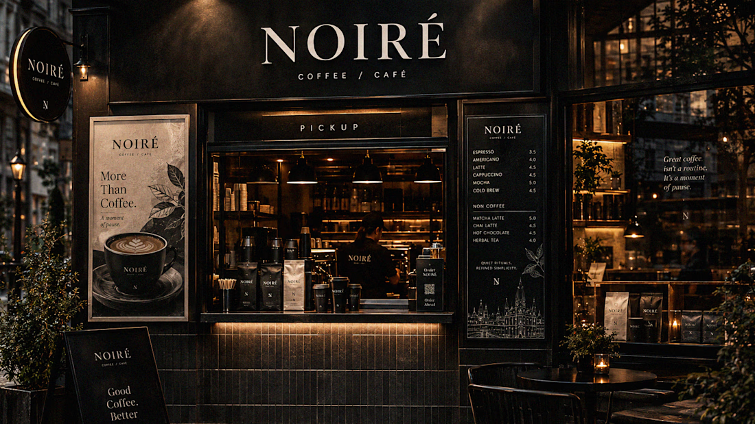
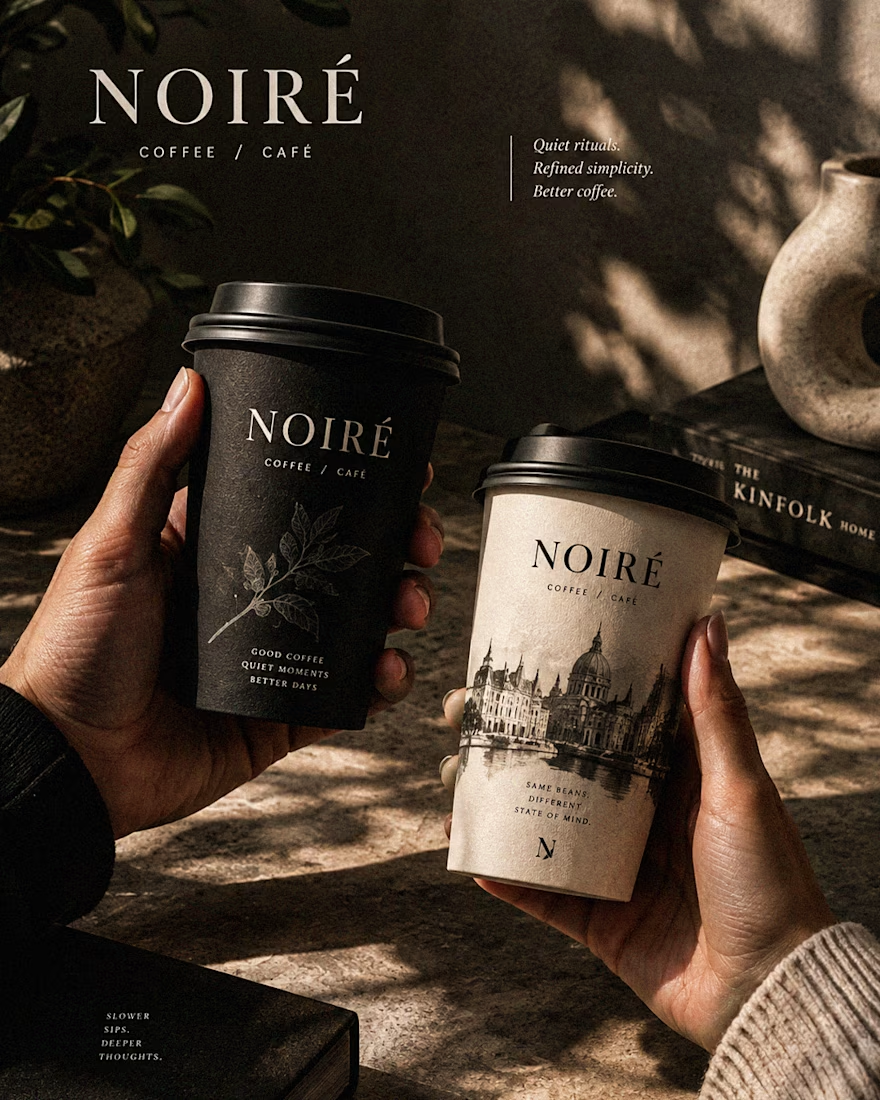
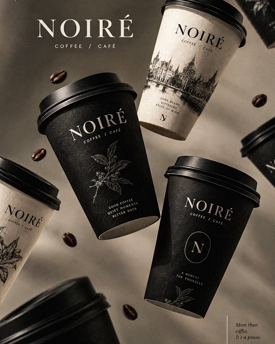
I Just Created NOIRÉ 🔥
A Coffee Brand Built Around the Pause.
NOIRÉ is a premium café brand built around a simple idea:
Great coffee should feel like a moment of pause, not another part of the
routine.
The project explores a complete visual identity, packaging
system, takeaway cups, coffee bags, tote bags, menu design, café applications and lifestyle campaign direction.
Instead of relying on the usual loud coffee aesthetics, I
built NOIRÉ around deep charcoal, warm ivory, soft graphite, refined
typography, subtle botanical illustrations and quiet editorial compositions.
The visual language is intentionally dark, tactile, and understated - giving every touchpoint the feeling of a slow morning, a quiet table, and coffee worth taking your time with.
From the cup in your hand to the café around you, every detail was designed to make the brand feel like a ritual.
Waiting for your thoughts in the comments 🙌🔥
branddesignertastetestBrand DesignGraphic DesignPackaging DesignAdobe IllustratorAdobe InDesignAdobe Photoshop




Okay, I finally joined the typography trend too. 👀
Had to try one myself - so here’s a little typography experiment I’ve been playing with.
Sometimes you just see a trend everywhere and think, okay… my turn. 😂
What do you think - should I make more of these?
Graphic DesignMotion DesignTypographyAdobe After EffectsAdobe Illustratortypographykinetictypographymotiongraphics


TOP!!