The network for creativity
Join 1.25M professional creatives like you
Connect with clients, get discovered, and run your business 100% commission-free
Creatives on Contra have earned over $150M and we are just getting started
Back to feedPost

nunu — A Quiet Botanical Skincare World
🌿 Brand and art direction for nunu, a minimal botanical skincare brand built around green oils, soft rituals, clean ingredients, and calm visual storytelling.


Nice!! 🙌
Thank you, Celia!

great job
thanks!!


Really love the calm direction here. It feels very natural and premium without trying too hard.

Good work🔥👏

that motion is very cool


that green is gorgeous

Fantastic Work, Polina🔥


Great identity and incredible presentation!

Nunu's color palette does most of the storytelling before you even read "quiet care for skin in balance", that green feels calm without being sleepy. How much of the direction came from the client's existing product formulation versus starting from a blank slate?

Beautiful design

Nicely executed, simple, clean, just what a skincare brand should feel like.

This looks so clean and beautiful, thanks for sharing your work!

The way nunu unfolds in that opening shot feels so unhurried, it matches the whole quiet care idea perfectly. Curious how the client reacted to going this minimal, did they need reassurance that restraint wouldn't read as boring?

I like the NUNU'S presentation


Great work👏🔥🔥

Simple, smart, and effective design 🔥

Great work


cooool

Nice💯

Strong logo and visuals 😍 nice work!

Incredible execution. 🔥

Wow Amazing Project😍

vibrant branding, loved it

Such a clean design! 😃

Awesome!


Great work
The network for creativity
Join 1.25M professional creatives like you
Connect with clients, get discovered, and run your business 100% commission-free
Creatives on Contra have earned over $150M and we are just getting started

Related posts


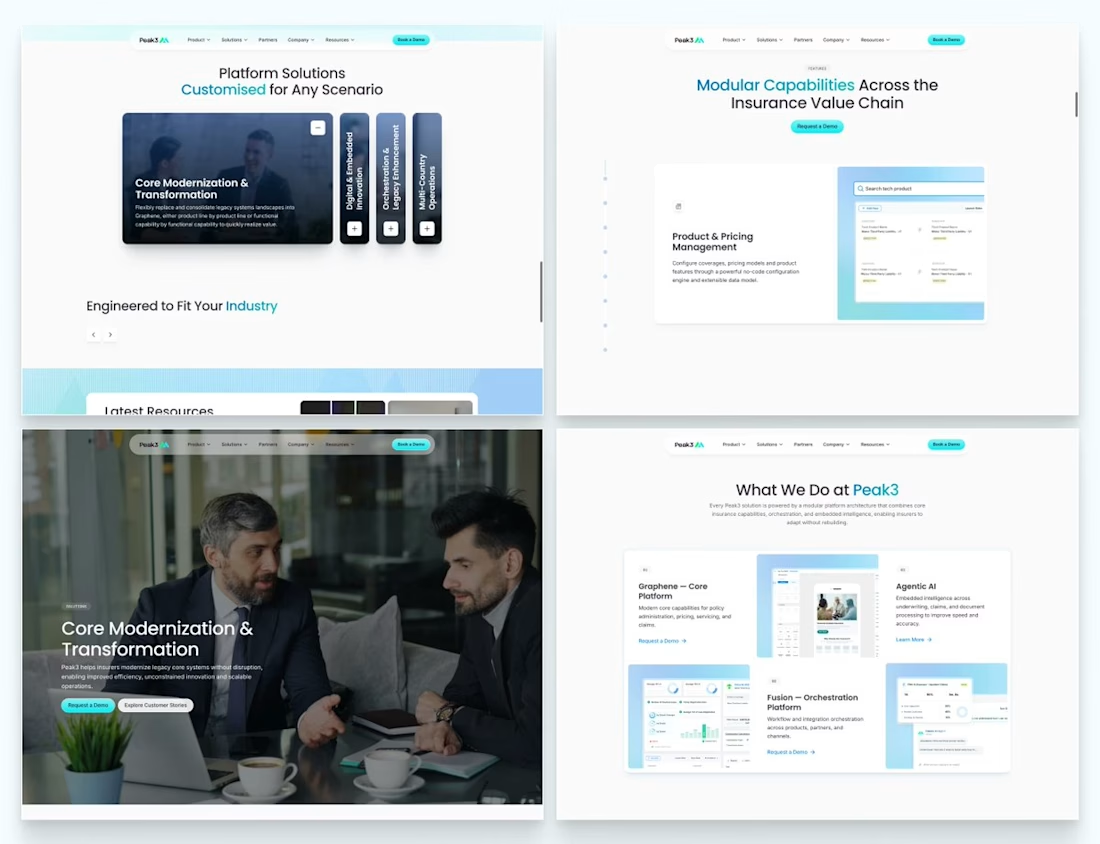
Our Peak3 website build covered 17 page templates and six CMS collections. At that scale, the questions about publishing deserve as much attention as the finished pages.
A blog post, a whitepaper and a careers entry need different information. Making them editable is only part of the design problem. The person adding the next entry also needs to understand what is missing and what happens when they publish it.
Here’s a hypothetical review I’d run before a CMS handoff: create a whitepaper entry, add the title and cover, then leave out the download file.
Does the editor flag the missing file? Can someone preview what the visitor will see? If the entry can still be published, does it create a download button that leads nowhere?
I’d use that test to decide which fields must be required and which incomplete states need an explanation.

Beautifully executed work

Pipely is an AI-powered sales platform designed to turn conversations into actionable outcomes. The experience brings together video calls, AI-generated insights, CRM updates, sales analytics, and follow-up drafts in one workspace.
View project on Dribble:
https://dribbble.com/shots/27795621-Dashboard-Sales-Call-Intelligence

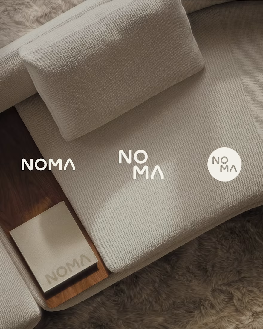
NOMA | Furniture Brand Identity
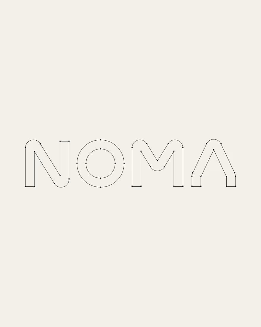
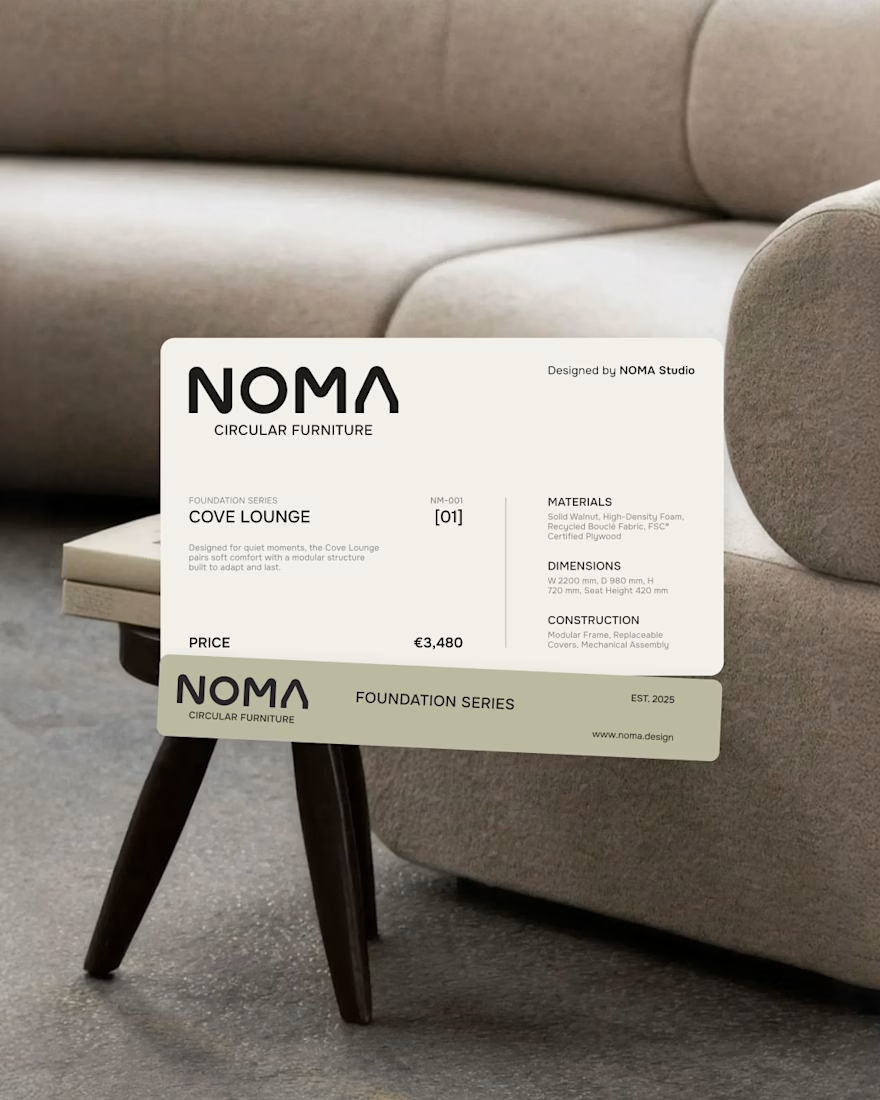
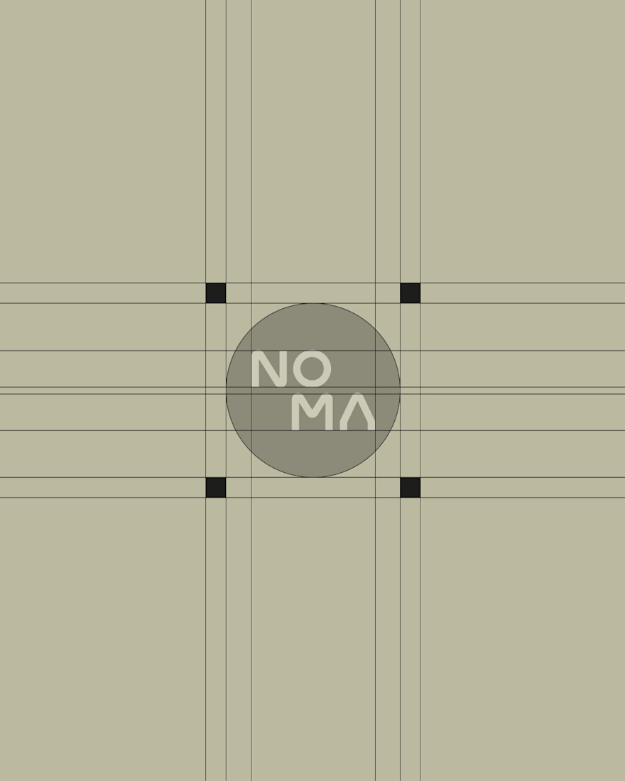
NOMA is a circular furniture brand creating adaptable objects for spaces that continuously change.


Challenges
View all


