The network for creativity
Join 1.25M professional creatives like you
Connect with clients, get discovered, and run your business 100% commission-free
Creatives on Contra have earned over $150M and we are just getting started
Back to feedPost
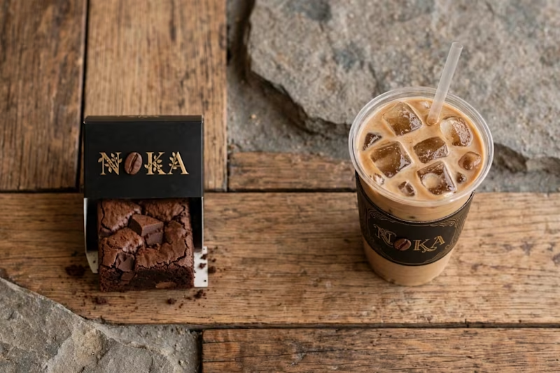
Taste Test

Every morning, we drink a coffee. Out of habit. Without really thinking about it.
I wanted to change that.
I wanted a coffee you drink because you want it. Not because you have to.
A coffee that wakes you up, but also makes you enjoy the moment.
A coffee you can drink in the morning, at noon, at night... anytime.
That's how NOKA was born.
NOKA is not just a coffee. It's a new concept.
So tell me, which team are you ?
Comment : SMOOTHIE or COFFEE ☕
NOKA - Christvie Vlife Collection

1 vote
Ends in 1d
The network for creativity
Join 1.25M professional creatives like you
Connect with clients, get discovered, and run your business 100% commission-free
Creatives on Contra have earned over $150M and we are just getting started


Related posts

Exploring a few different hero directions for Frame 18.
Which one would you go with, A or B, and why?
Would love to hear your thoughts before I finalize the design!
#webdesign #uiux #framer #websitedesign #designfeedback
9 voted
50%
9 voted
50%
18 votes
Closed

A for me. The portrait grid shows the range of work right away, though B has the stronger first impression.

We redesigned the UI Trax logo, and this time every part has a meaning.
The U is you, the client's business. The gold T is Trax, the technology we fit inside it like a key in a lock. The three pillars are Design, Build and Automate. The top bar is a roof over them: a software house.
The old logo was a red icon with a wordmark. It looked fine, but it had no story.
Which one would you trust with your project? Vote, and tell me why in the comments.
#Branding #BeforeAndAfter #UITrax
0 voted
0%

3 voted
100%

3 votes
Closed

Now — the UT badge tells the story better.

Same frame
Same scene,
Two different takes on color.
Which one looks better? Your call.
No AI used.
1 voted
25%
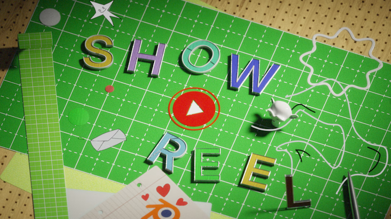
3 voted
75%
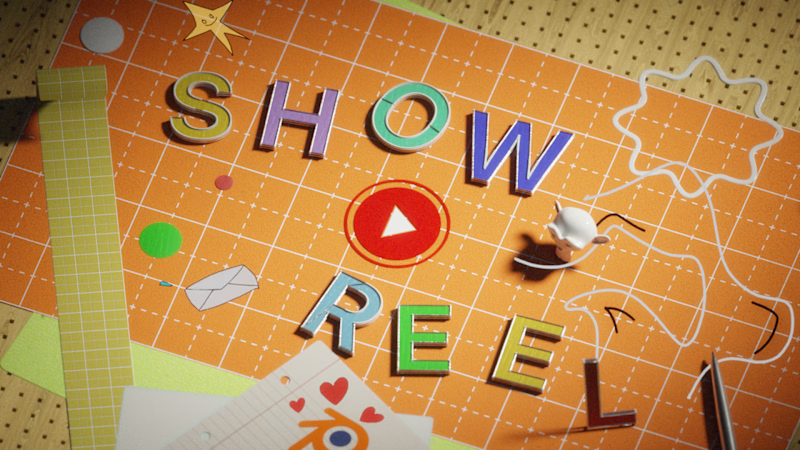
4 votes
Closed


orange feels warmer to me