The network for creativity
Join 1.25M professional creatives like you
Connect with clients, get discovered, and run your business 100% commission-free
Creatives on Contra have earned over $150M and we are just getting started
Back to feedPost

I personally love pixel so that might seem a little biased lol, but that looks amazing 🤩

One pixel grid. A whole brand.
For Appy, a London product studio for impact-driven startups, the wordmark, icons, 3D smile and Appy Pixel, its custom typeface, all come from the same grid.
Appy Pixel won Typography at the Online Design Awards.
Type first or symbol first: where do you start a rebrand?


The network for creativity
Join 1.25M professional creatives like you
Connect with clients, get discovered, and run your business 100% commission-free
Creatives on Contra have earned over $150M and we are just getting started



Related posts

Brand work for HauntChain
I'm loving building this brand and the results so far
A deFi platform with some gamification


That's cute ❤️


Is text on album covers really tacky?
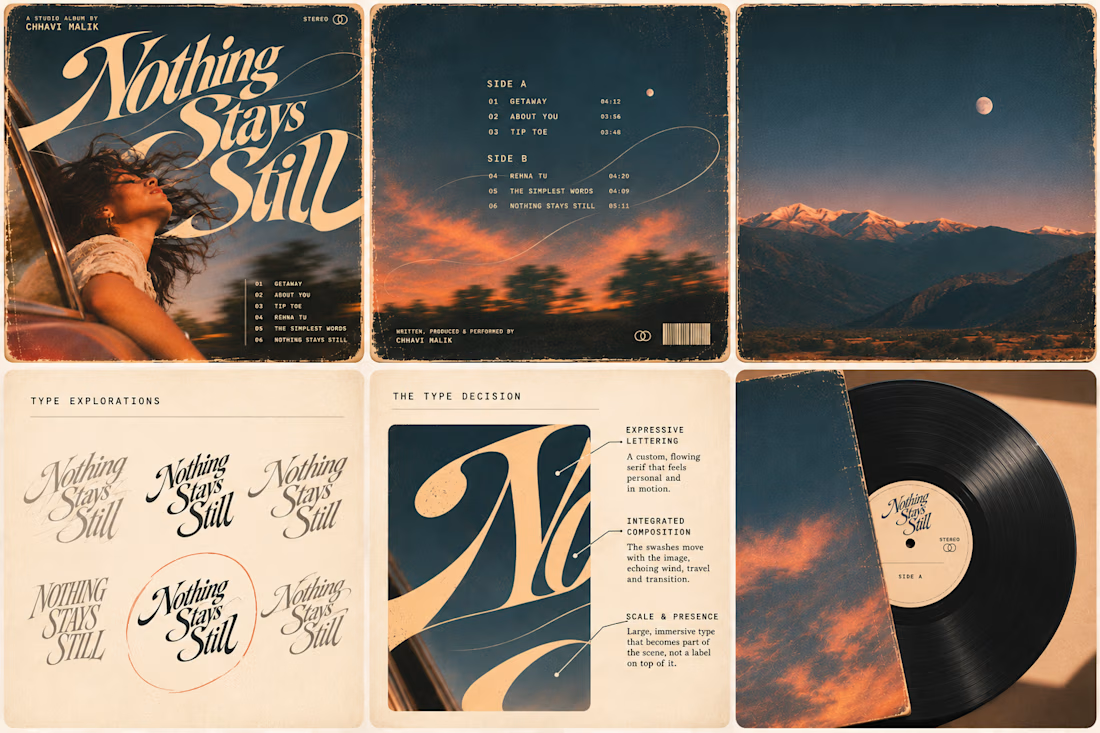
This question has been doing the rounds on X and I have to say, I'm firmly on the other side of that argument. I've always loved seeing typography become part of the artwork rather than just a title sitting on top of it.
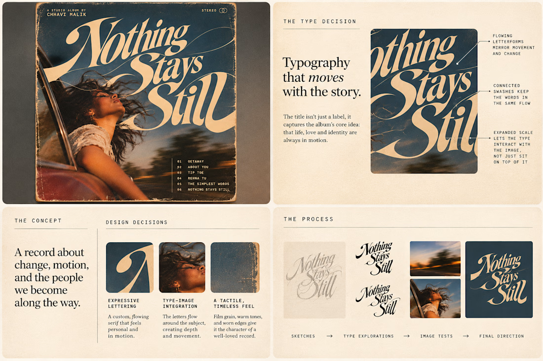
So I wanted to put that idea to the test with an imagined album called Nothing Stays Still, inspired by change, fleeting moments and everything in between:)
I played around with the lettering until it felt expressive, a little restless, and inseparable from the photograph.
Because I think badly considered typography is tacky. Typography itself? Give it a chance :)
What's an album cover where the type really makes it for you?



AI Health & Wellness Companion App
Vita is a concept mobile app that makes personal health feel calm, clear, and human. Instead of overwhelming users with charts and numbers, it uses a soft, glass morphic interface and gentle motion to turn daily health data into simple, actionable guidance.
AI VIsual DesignerMobile DesignUI DesignAdobe After EffectsClaudeFigmamobileappdesignhealthappmobileapp
