The network for creativity
Join 1.25M professional creatives like you
Connect with clients, get discovered, and run your business 100% commission-free
Creatives on Contra have earned over $150M and we are just getting started
Back to feedPost

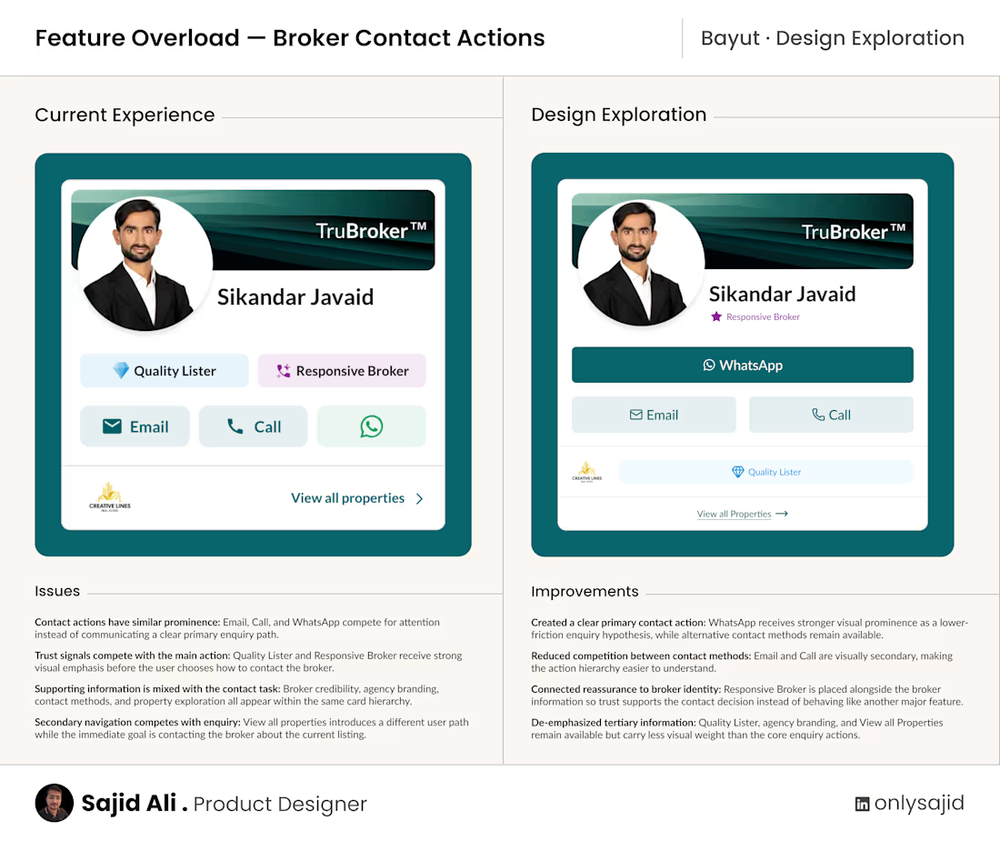
I explored Bayut’s broker contact card through the lens of Feature Overload.
The question I wanted to test was simple: When a user is ready to enquire about a property, is the next action obvious enough?
The current experience provides useful contact options, broker credibility signals, agency information, and additional navigation. But when several elements receive similar prominence, the user has to decide what deserves attention before deciding how to contact the broker.
In this design exploration, I created a clearer action hierarchy. WhatsApp is treated as the primary enquiry path, while Call and Email remain available as secondary alternatives. Broker responsiveness stays close to the broker identity, while Quality Lister, agency branding, and View all Properties are given lower visual prominence.
The goal wasn’t to remove useful functionality. It was to make contact primary, trust supportive, and secondary exploration tertiary.
Giving WhatsApp stronger prominence is a hypothesis, not a validated product decision. Actual channel usage, response rates, conversion data, user preferences, and business constraints would need to determine the final CTA hierarchy.
This is a design exploration based on the publicly visible experience, not a claim that Bayut’s current solution is wrong.

The network for creativity
Join 1.25M professional creatives like you
Connect with clients, get discovered, and run your business 100% commission-free
Creatives on Contra have earned over $150M and we are just getting started
Trending
retrofuturism
Share your favorite designs from the past exploring the distant future. Or your own take on the aesthetic 🚀
halftone
Dots. Texture. Grain. Let's see your designs using the halftone technique.

Midjourney
Creatives are showing off what they're making with Midjourney.
colorgrade
Video editors sound off: How do you enhance the mood of your video in color grading?





Related posts


This is such a standout piece.

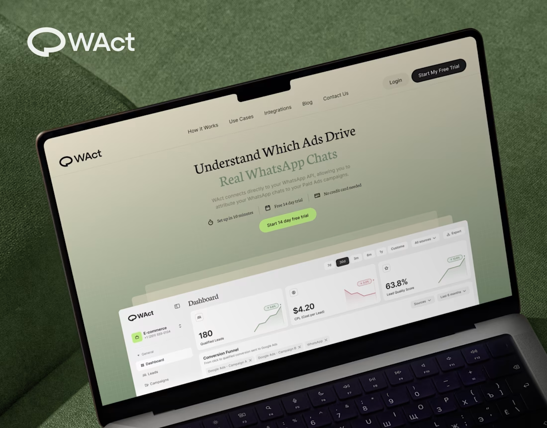
When designing WAct, the main challenge was to make complex analytics feel calm, approachable, and actionable.
Marketing tech platforms often suffer from visual noise: endless charts, aggressive contrast, and buried data.
For WAct, I took an editorial SaaS approach:
Visual Hierarchy: Kept the primary metric cards (CPL, Lead Quality Score) instantly readable at a glance.
Warm Aesthetic: Used a soft, olive-green gradient backdrop paired with editorial typography to make the brand stand out from generic blue dashboard templates.
Dashboard Logic: Structured the flow so users can track multi-channel ad conversions straight into WhatsApp chats without getting overwhelmed.
Building a complex B2B platform or analytics tool? Let’s connect and create a seamless UI/UX for your product.
🔗 Explore the full case study on Behance:
Check out WAct on Behance



this is nice

Currently deep in a full redesign of the Rootéra website 🌱 We've just signed on 5+ retail chains — 200+ points of sale — and we're only scaling up from here. Big steps ahead.




the red packaging looks so good