The network for creativity
Join 1.25M professional creatives like you
Connect with clients, get discovered, and run your business 100% commission-free
Creatives on Contra have earned over $150M and we are just getting started
Back to feedPost
Taste Test
Probably last post of this project!!
Which versions do you like?
Light or dark?
1 voted
17%
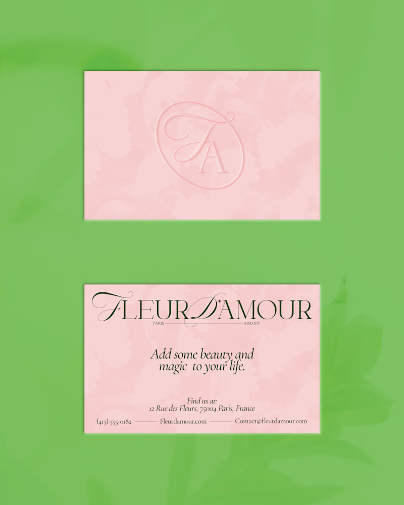
5 voted
83%
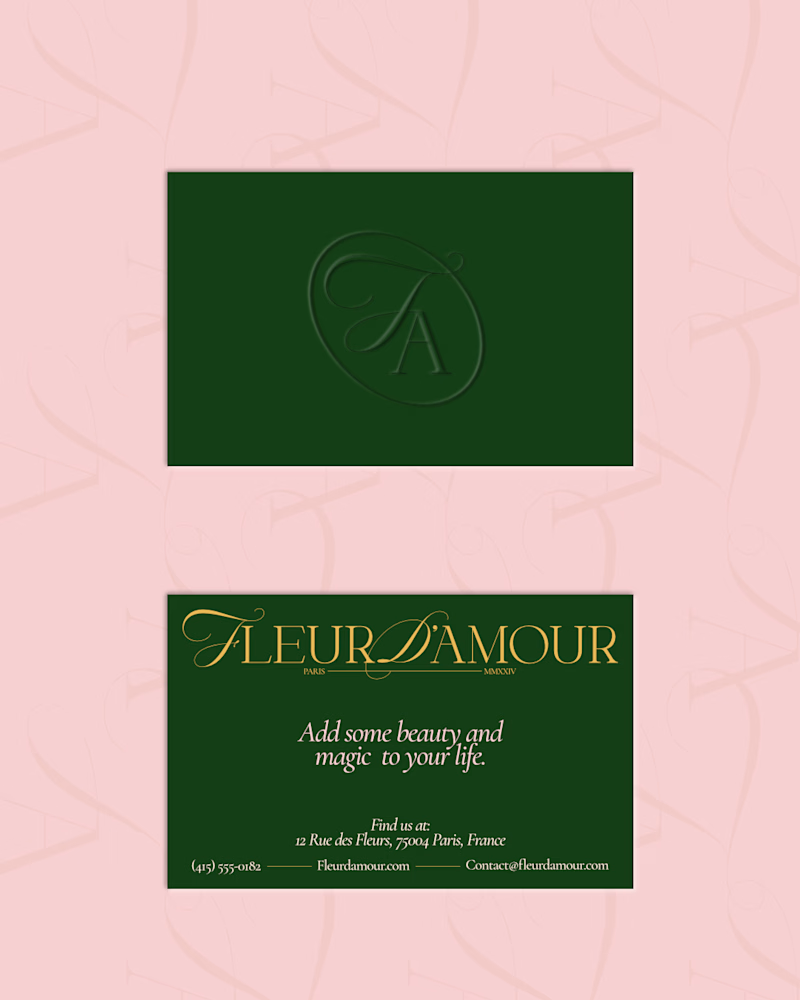
6 votes
Closed

The light and dark directions both carry the identity well, but the light version feels especially refined and versatile.

Yeah it's the winner for me too

nice color pallet
Thank youu!!

True!! That's a combo I like too.

Thank you so much!! Yeah it is a nice combo. I really appreciate the goat btw 😊
The network for creativity
Join 1.25M professional creatives like you
Connect with clients, get discovered, and run your business 100% commission-free
Creatives on Contra have earned over $150M and we are just getting started

Challenges
View all


Related posts

We're stuck 😅
Which one feels more premium and unique to you?
Comment 01 or 02 below your opinion will genuinely help us lock this in.
7 voted
33%
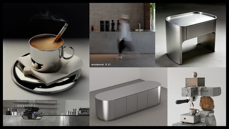
14 voted
67%
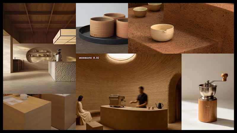
21 votes
Closed




Outstanding 😊


“Or similar” leaves a lot to the imagination.
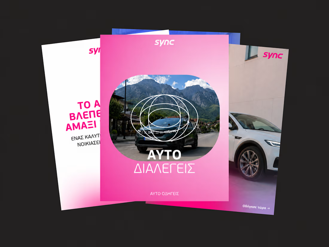
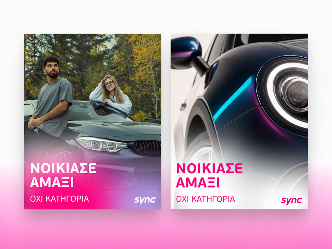
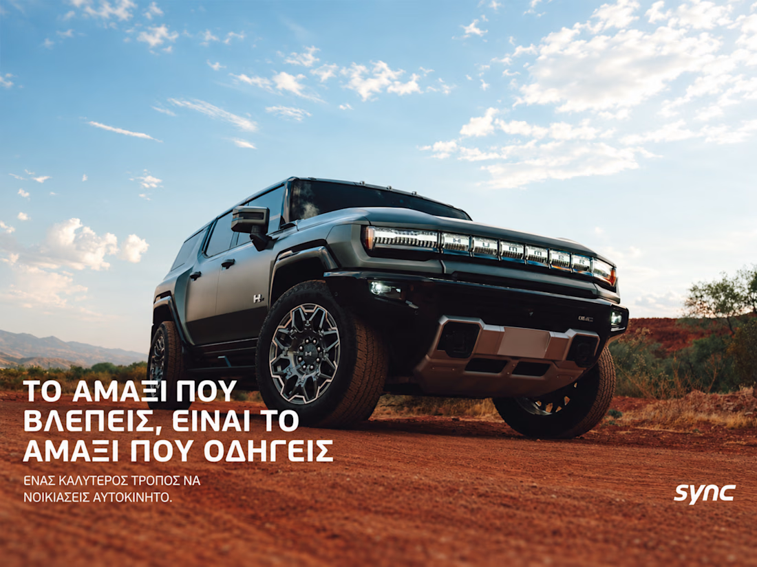
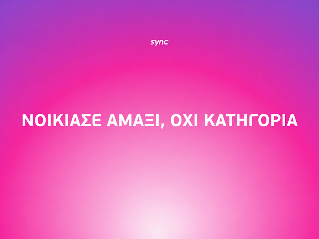
A few billboard designs I made for Sync as part of the rebrand. The campaign centres on a simple promise: the car you see is the car you drive.
I kept that message big and direct, with the cars up close and enough pink to make you look twice.

The way the oversized promise carries through the pink palette is really effective—the close-up crops make the car feel immediate without losing the campaign idea.