The network for creativity
Join 1.25M professional creatives like you
Connect with clients, get discovered, and run your business 100% commission-free
Creatives on Contra have earned over $150M and we are just getting started
Back to feedPost
Taste Test
Which Home Screen Feels Better? 👀
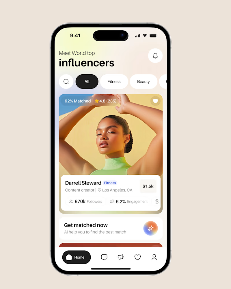
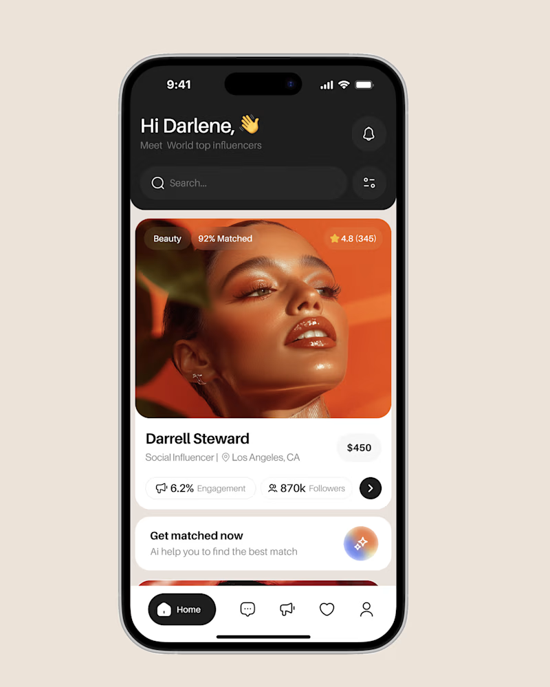
I'm exploring two directions for an Influencer Discovery Platform and would love your feedback.
Version A (Left)
Light and clean visual style
Minimal distractions
Focused on readability and accessibility
Creates a fresh and welcoming experience
Version B (Right)
Dark mode experience
More premium and immersive feel
Strong visual contrast
Emphasizes content and personality
'd love to know:
Which screen would you choose? (A or B)
What was the first thing that caught your attention?
Which version feels more trustworthy for discovering influencers?
Any usability or visual improvements you'd suggest?
Your feedback will help shape the next iteration of the product. Thanks for taking a look! 🚀

60 voted
64%
34 voted
36%
94 votes
Closed

A Clean light
You’re welcome

A. feels cohesive
and you delivered so well! is there a complete case study out yet?

Yes! 🙌 The full case study is already available. You can check it out here: https://dribbble.com/shots/27489560-Flux-AI-Powered-Influencer-Marketing-Platform .
I'd love to hear your thoughts after you've had a look!

Elite product design and research work!

I voted b, but both look great!

B: Dark, Premium

A feels more premium

Will go for A

I lean heavily toward Version B the dark, moody visual style gives the creator profiles a much more premium and cinematic feel. Do you plan on adding a dark/light mode toggle in the actual settings, or just sticking to one fixed style?

A feels cleaner and more trustworthy, while B feels more premium and exciting. If the goal is engagement and personality, I'd choose B. If the goal is simplicity and accessibility, A has the edge.

Clean

Is hard to choose
A is really nice

It's dark premium for me.

A: Clean, light

A feels more fluid
You’re welcome


A understood the assignment!

Clean looks clean

But I liked both 🥲

clear and light feels good to eyes

Dark, Premium

Version A

I like the dark and premium more

Looks great

The dark one looks sleek and has amazing visuals as well!

Nice one 👏

dark mode feel better!


The Clean, light is perfect and clean.
The network for creativity
Join 1.25M professional creatives like you
Connect with clients, get discovered, and run your business 100% commission-free
Creatives on Contra have earned over $150M and we are just getting started
Related posts

Day 3 — Premium Improvements ✨
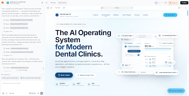
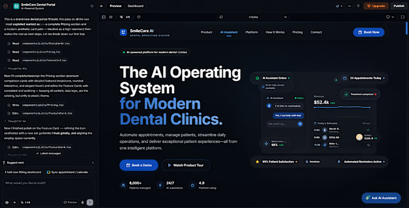
Spent today polishing the UI to make the experience feel cleaner, more premium, and more refined.
Would you rather use:
☀️ Light Mode
🌙 Dark Mode
Vote below 👇


12 voted
60%
8 voted
40%
20 votes
Closed

make it double in your web , the website will give choice people about it


How do you turn a brand mascot into a visual system people actually remember?
🐆 Our lynx represents sharp thinking, curiosity, and attention to detail.
For this motion experiment, we pushed the mark into a softer, unexpected direction - rebuilding it with different textures.
Same identity, different emotion.
Which texture fits the Lynksen identity best - flowers, grass, or something else? 👇✨



I personally love the soft blue and white version the most. Nice to scale it into the brand campaign or ad video 😃

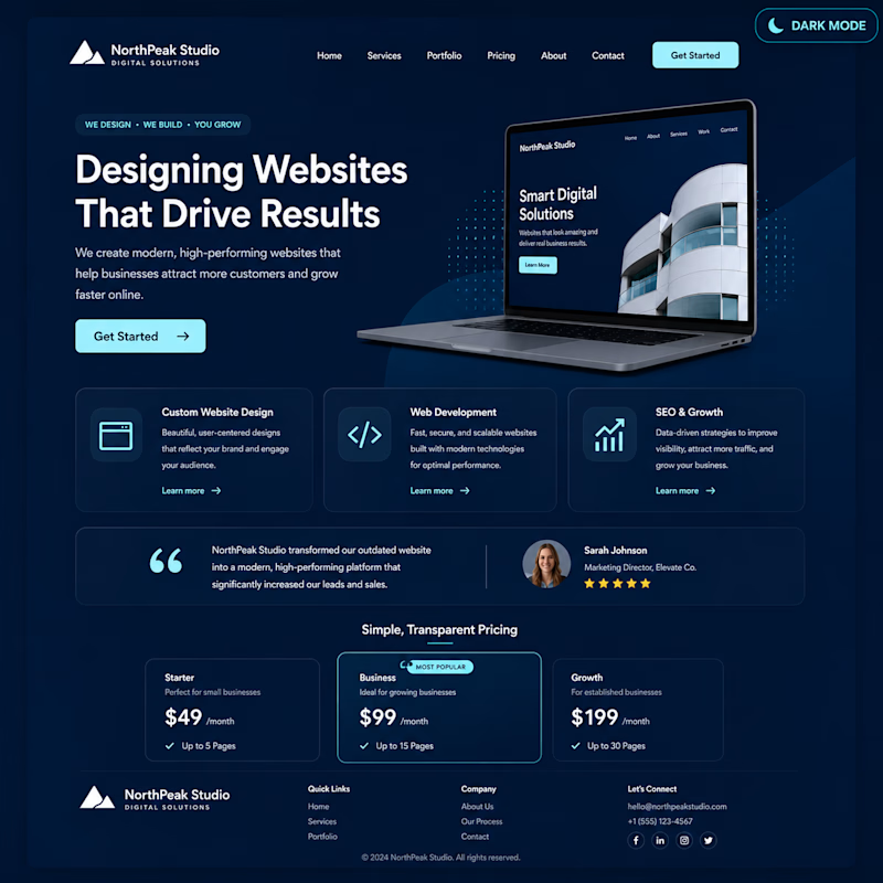
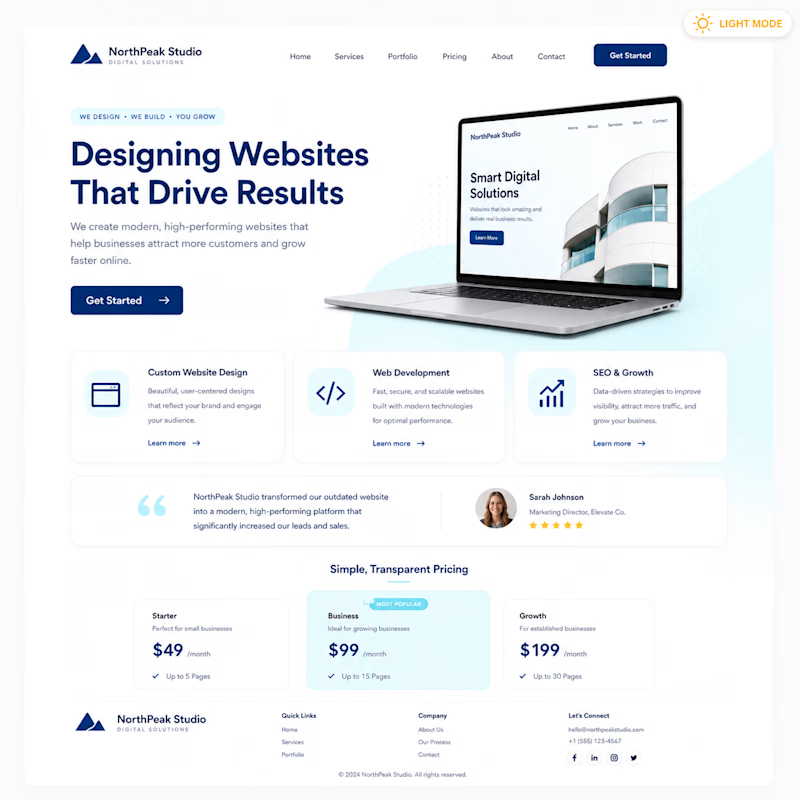
Light Mode vs Dark Mode
👀 Quick Design Vote!
Same website.
Same content.
Different style.
🅰️ Light Mode
🅱️ Dark Mode
Which one feels more premium?
👇 Vote below!
#UIDesign #WebsiteDesign #CreativeCommunity #UXDesign #WebDesign #Figma #Contra


10 voted
43%
13 voted
57%
23 votes
Closed
Dark mode
Challenges
View all



Trending

Claude
Claude has entered the design space. How are you using Claude Design?

Contra University
Learn from expert creatives how to earn more using next-gen AI tools.
fifaworldcup2026
The World Cup is here and the whole world's watching. How are you designing for the world stage?
creativeaiflow
Creative AI workflows are evolving. What tools do you use, and what are their strengths and weaknesses?
freelancerlife
Freelancer life is wins, pivots, and everything in between. What’s yours right now?