The network for creativity
Join 1.25M professional creatives like you
Connect with clients, get discovered, and run your business 100% commission-free
Creatives on Contra have earned over $150M and we are just getting started
Back to feedPost

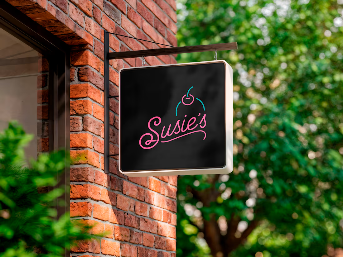
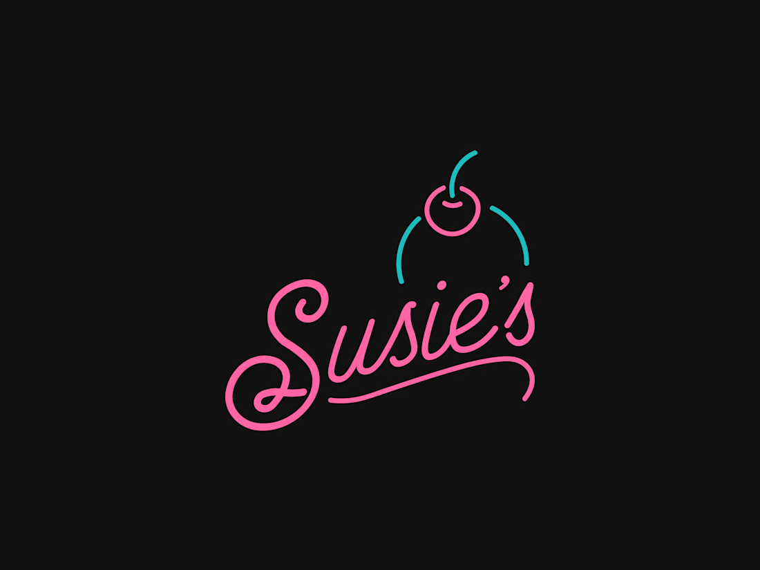
This one never made it across the finish line, but it’s still one of my favorite identity concepts I’ve worked on.
I created this direction for Susie’s, building the mark around a custom script wordmark and a simple cherry illustration that gave the brand a little personality without losing its polish. The final client direction went somewhere else, which is just part of the process, but I’ve always loved how this one came together.
Not every good idea gets chosen. Some are still worth sharing.



love the detail! it feels perfect paired with the typeface you selected.
The network for creativity
Join 1.25M professional creatives like you
Connect with clients, get discovered, and run your business 100% commission-free
Creatives on Contra have earned over $150M and we are just getting started











Related posts

The team is cooking
Motion design for the logo we are making for Nation e-commerce


Wou

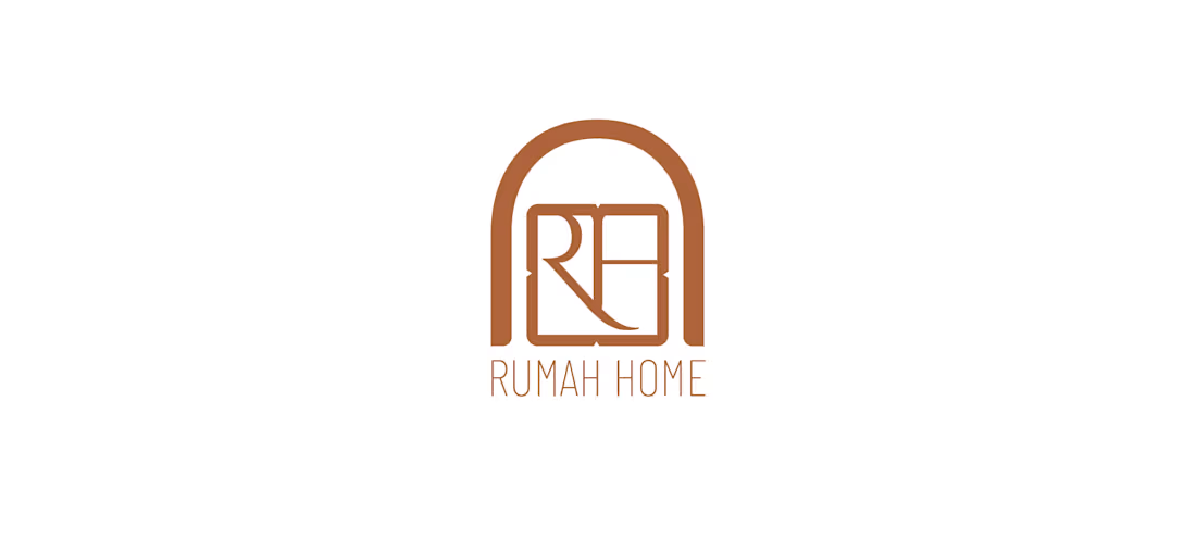
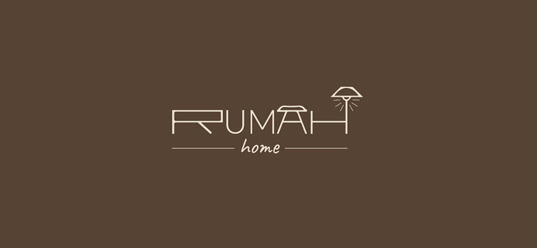
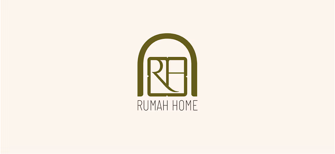
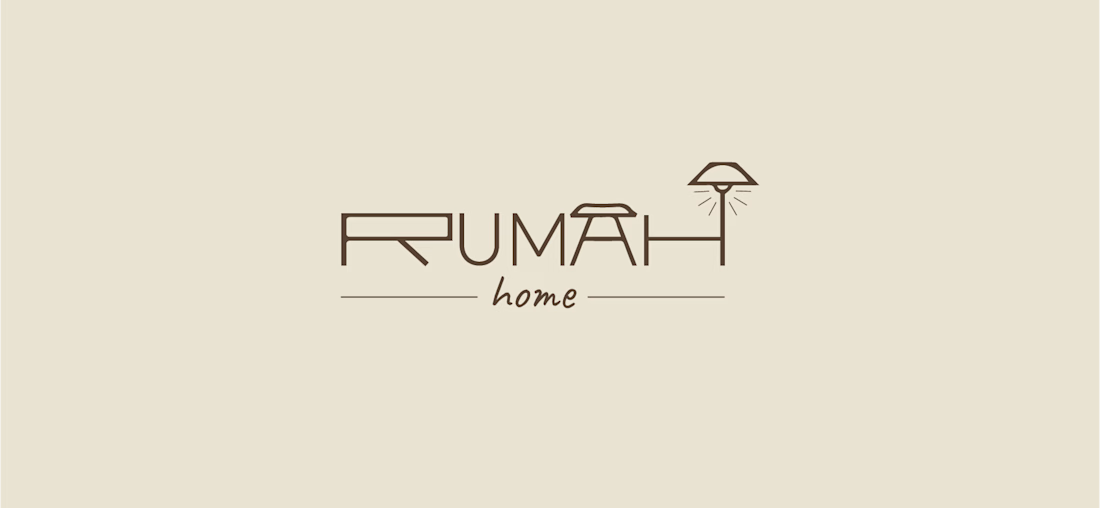
Made these 2 concepts for a furniture shop, Rumah Home, a boutique store specialising in Indonesian-inspired furniture and homewares. “Rumah” means “house” in Indonesian, so the idea was to make the name itself feel like home.
Concept 1: An arched doorway frames an interlocked R and H, with sharp geometric details softened by a rounded shape. The olive and terracotta tones nod to Indonesian timber, clay and handcrafted pieces.
Concept 2: The letters turn into furniture: a bedside table, a seat and a lamp. Fine linework keeps it modern, and the handwritten “home” adds warmth.

Beautiful concept! The arched doorway idea is so clever - it instantly makes the word "Rumah" feel like a home. Concept 1 feels more premium and clean to me, the arch with the monogram is very memorable. Great storytelling behind the logo.


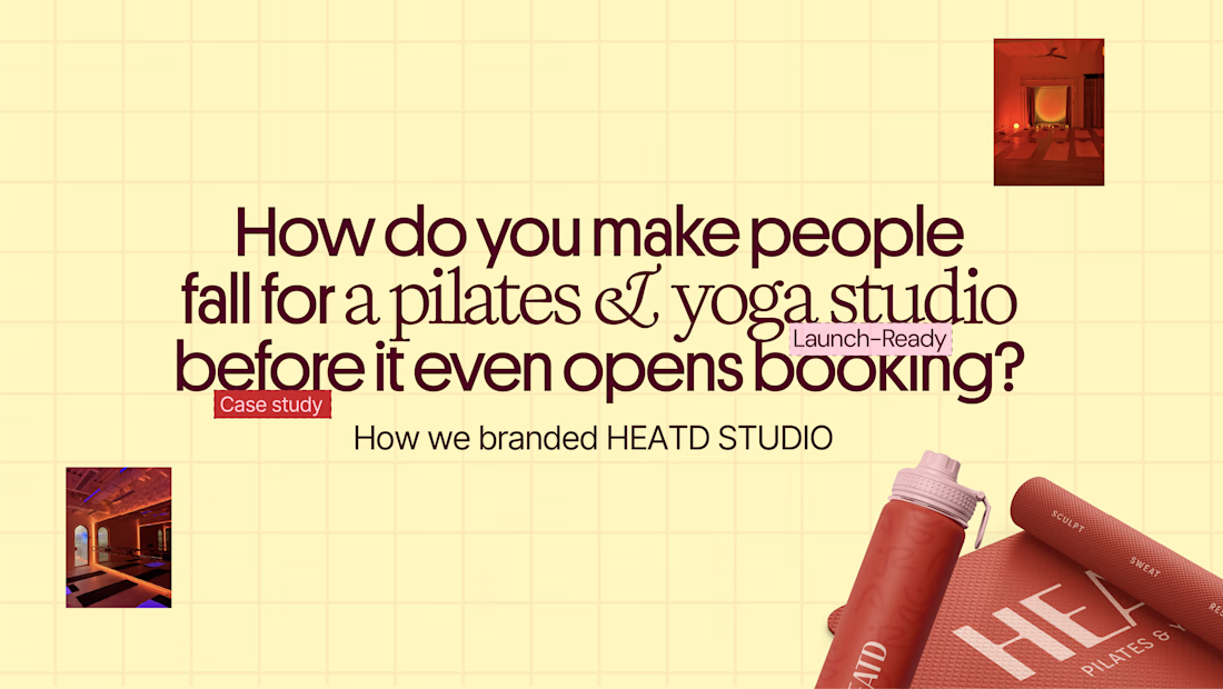
HEATD is a heated Pilates and yoga studio in Mableton, Georgia. The name already said it all, so we made one decision from day one: the heat would be the whole brand 🔥
Amazing project and amazing team.
Collab with @gerbzagency
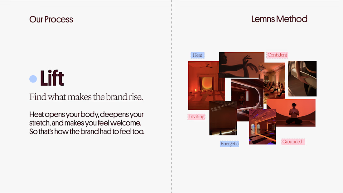
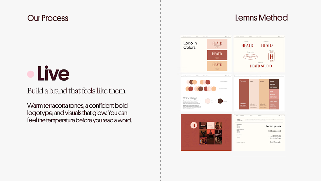
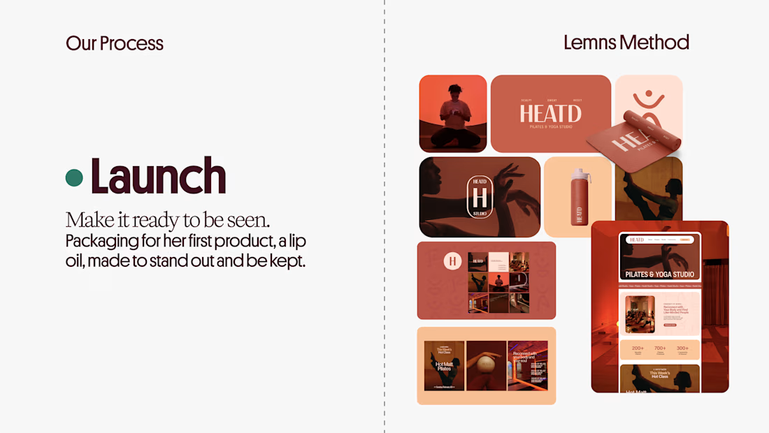

Curious how the terracotta palette got settled here: did the colour come first and the type follow, or the other way round? The heat idea reads as much through the warm tones as through the name itself.