The network for creativity
Join 1.25M professional creatives like you
Connect with clients, get discovered, and run your business 100% commission-free
Creatives on Contra have earned over $150M and we are just getting started
Back to feedPost


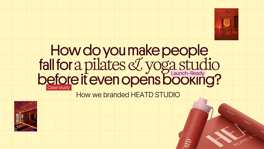
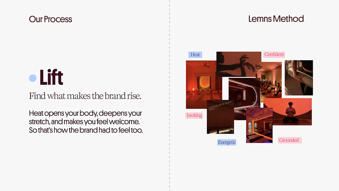
HEATD is a heated Pilates and yoga studio in Mableton, Georgia. The name already said it all, so we made one decision from day one: the heat would be the whole brand 🔥
Amazing project and amazing team.
Collab with @gerbzagency



Thanks Aminul so much for your nice words🙏🏼

Love those warm red tones, Raneem! Which serif did you use?
Thanks Thayline✨
which serif you're asking about?
On the yellow page :))
Oh yes it's Kalice

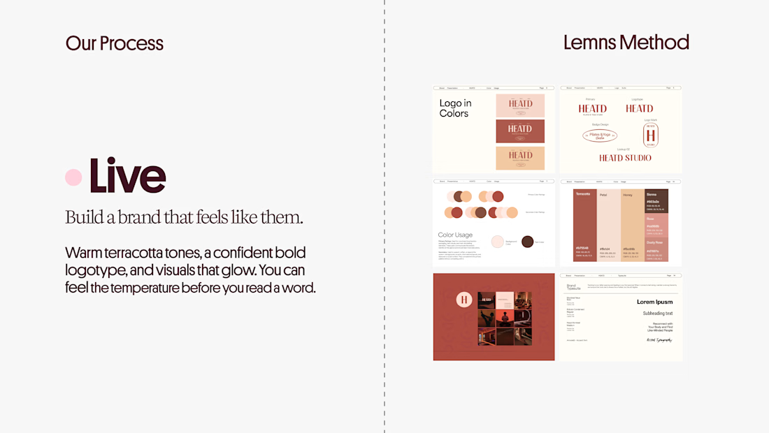
Curious how the terracotta palette got settled here: did the colour come first and the type follow, or the other way round? The heat idea reads as much through the warm tones as through the name itself.
Hi Artur, colour came first. I usually start with the palette, and here the client specifically asked for terracotta, a balanced tone that’s neither too saturated nor too muted. The type followed from there. Glad the warmth reads through both the tones and the name, that was the goal.
That makes sense, a client-led terracotta gives the typography a clear anchor to follow. Good call keeping it balanced rather than pushing the saturation.

This is very clean and nice, nice work
Hey Dim, thank you so much 🙏🏼

Wow I love this
Thanks Daniil 🙏🏼

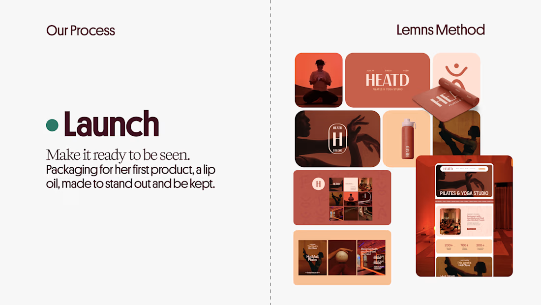
Love how they carried the heat concept through the whole brand 🔥 The terracotta colors work so well!
Thank you, Kishan! 🔥 Keeping the heat in every single touchpoint was the most fun part of building it. Glad the terracotta landed!

Nice work
Thanks Malik🙏🏼
You’re welcome, Raneem! I really like how you approach branding and launch design. I build websites for businesses, and I can see a good opportunity for our services to complement each other. I’d love to connect and explore a possible partnership where we could work together on client projects. 😊

HEATD is such a great name for a heated studio, the branding almost designed itself. The Lift, Live, Launch process pages with that terracotta warmth read like a case study in making people fall for a studio before booking even opens.
Thank you, Timothy! Falling for it before booking opens is the whole point 🙏🏼

Making the heat the whole brand was a good call. The terracotta palette fits it perfectly.
The network for creativity
Join 1.25M professional creatives like you
Connect with clients, get discovered, and run your business 100% commission-free
Creatives on Contra have earned over $150M and we are just getting started











Related posts

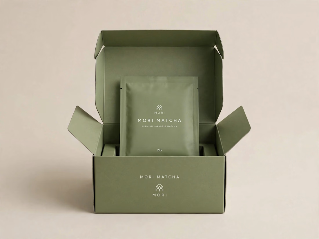
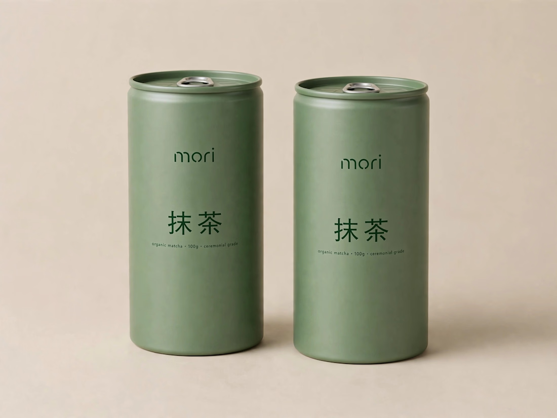
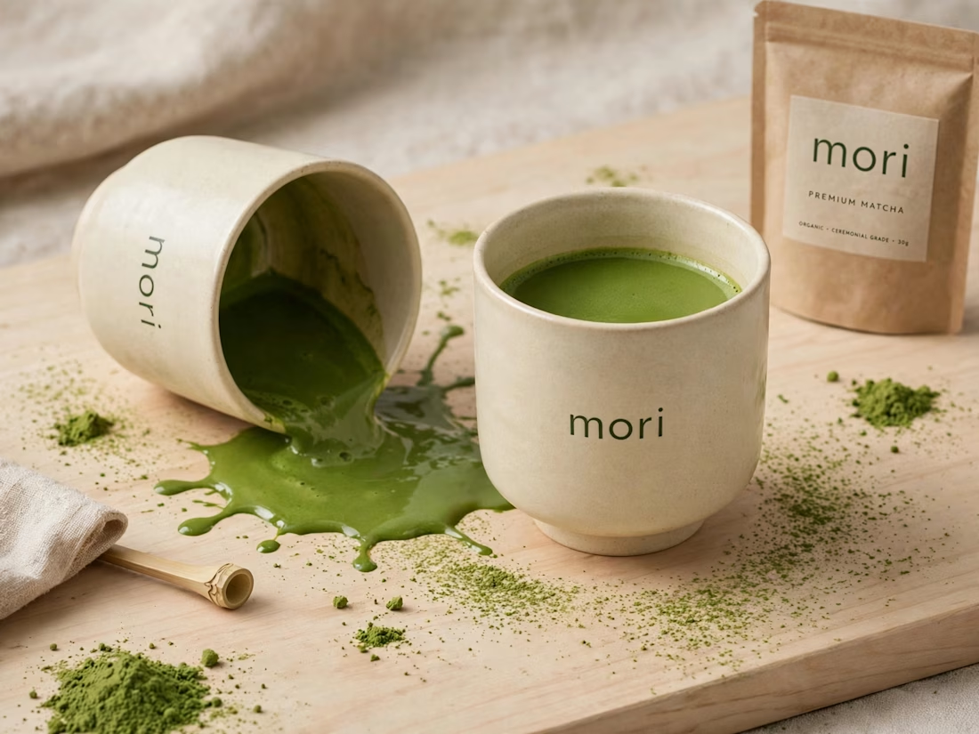
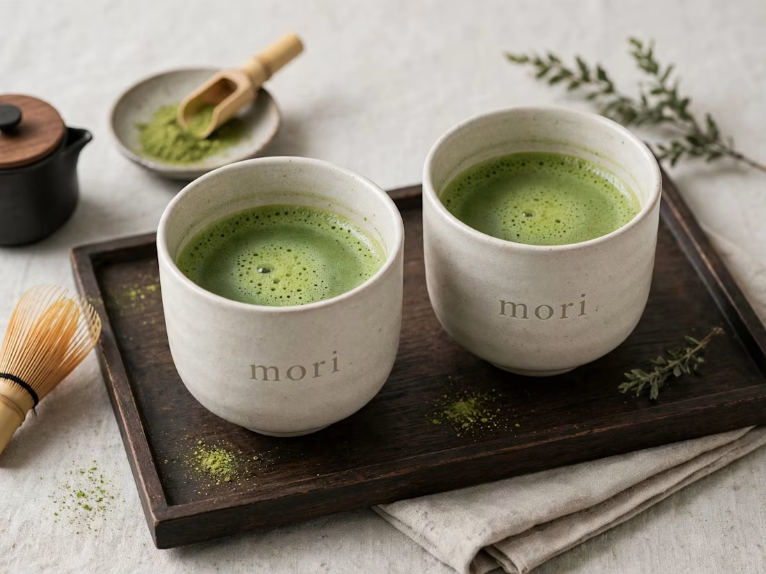
more visuals from my latest project — mori matcha 🍵
explored minimal Japanese packaging with earthy greens and calm typography.
focusing on premium ceramic cups and clean can design.
#branddesign #packagingdesign #visualidentity #brandstrategy #matcha #minimaldesign #japanesedesign #figma #mockup #branding


A little peek at the brand work we did for Elio Mortgage.
A warm, approachable identity full of warm vibrant colors paired with soft sun rising inspired gradients, inner glows and custom illustrations & more. Loved this direction!
Full case study coming soon, from process to final identity.
Plenty of logo explorations to share too!


That color palette takes the whole identity to a different level!! I loove it.

Brand Expressions -- Olivir


Thats so crazy!!!!!! Seeing this I feel we humans are still far better than AI