The network for creativity
Join 1.25M professional creatives like you
Connect with clients, get discovered, and run your business 100% commission-free
Creatives on Contra have earned over $150M and we are just getting started
Back to feedPost

Team sections force a trade-off. Photography carries credibility, but it usually breaks a tightly drawn visual system.
Heron's runs two states. The default is a crosshatched pen portrait, which keeps the section inside the same drafting language as the plans and elevations used across the site. On hover the card inverts to black, registration crosshairs appear at the corners, and the illustration resolves into a black and white photograph.
The move also carries meaning for this audience. Drawing resolving into built reality is the basic sequence of architectural practice, so the interaction reads as native rather than decorative.
At rest the grid holds as a system. On interaction it delivers the credibility a team section exists to provide.


cool
The network for creativity
Join 1.25M professional creatives like you
Connect with clients, get discovered, and run your business 100% commission-free
Creatives on Contra have earned over $150M and we are just getting started



Related posts

Bondri has been featured by 6 different curators in the past month and I’m still a bit in disbelief.😮
I put a lot of care into every detail of this one, from the illustrations to the packaging to how the day and night variants talk to each other. Seeing it recognized like this means a lot.
What makes you stop and really look at a project when you’re scrolling?
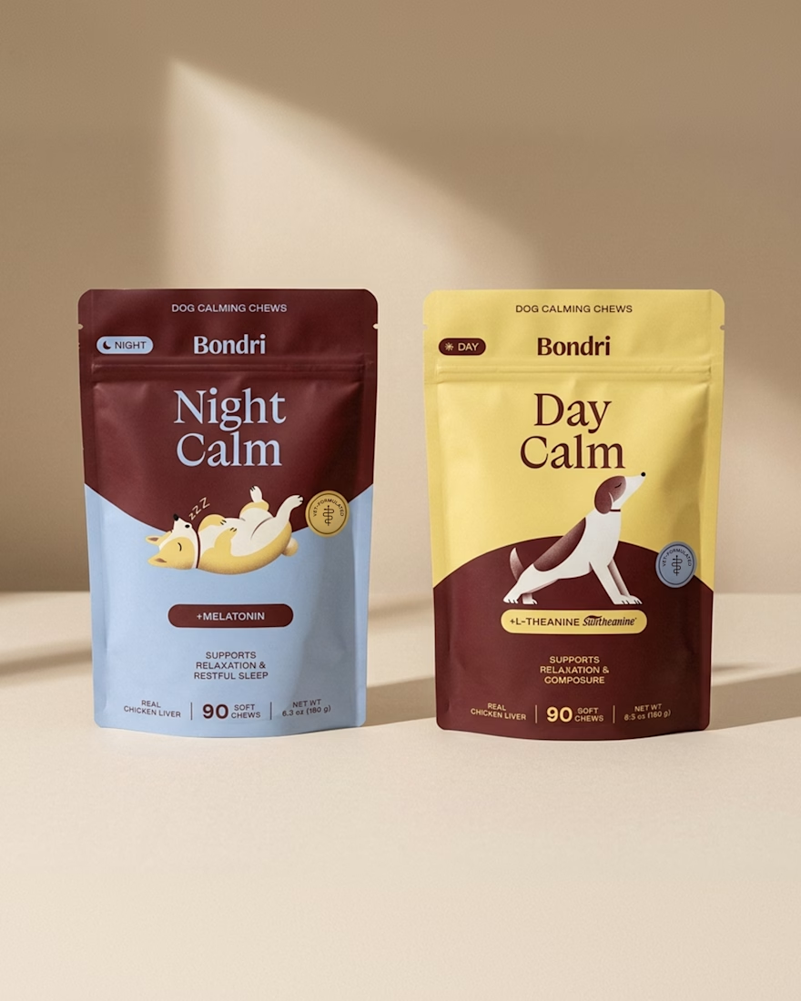
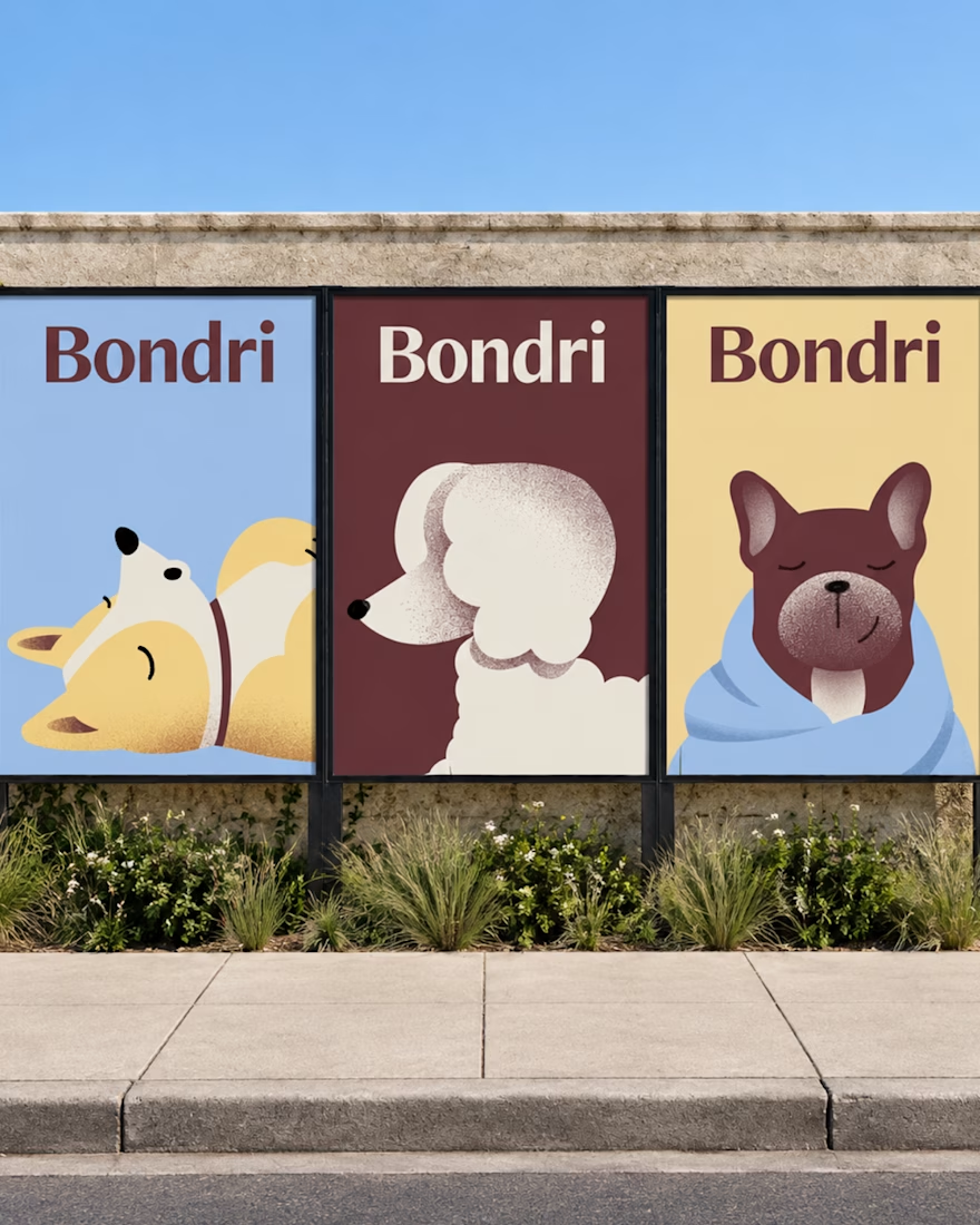
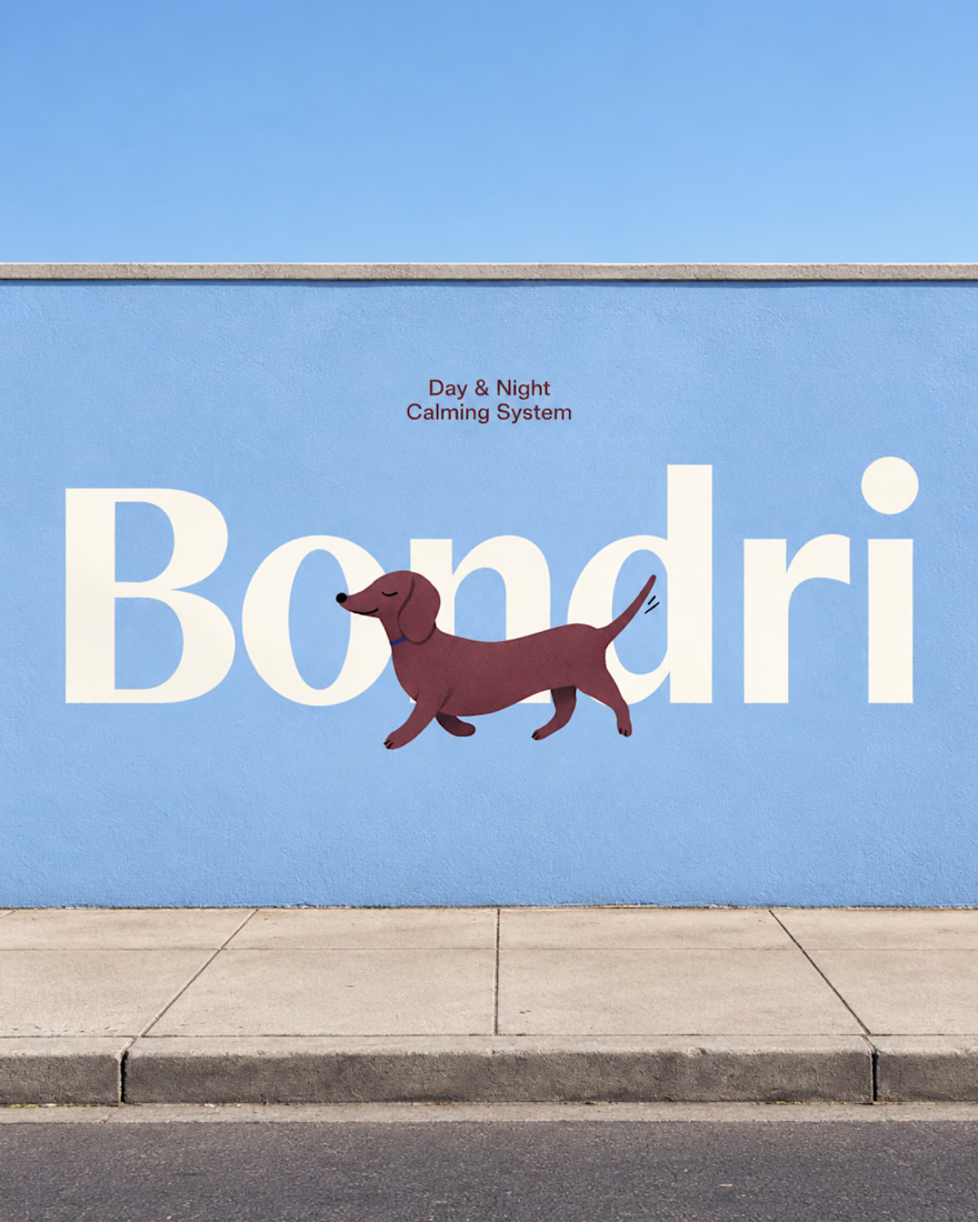

I think it’s the little details that make a project stand out. When everything feels intentional and tells a story, it naturally makes you want to stop and take a closer look. Love how much thought went into this! 👏
Well-done Chantal

Final direction picked! I love when brands use custom illustration as the main way to communicate with their audience.
Direction discovery should not take more than one week and it should be full of personality! Ready to upgrade your brand?
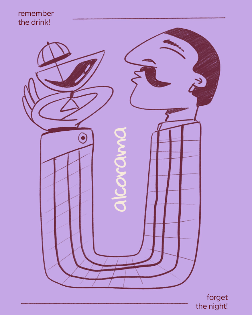


Amazing work!

Halden - Landing Page Concepts
Halden sells to grid operators, and there were two good ways to pitch it: tell them what's coming, or show them everything happening now. Rather than pick one on instinct, I designed the landing page as an A/B test so real traffic decides.
The two pages share one 12-column grid, the same section order, type system and components. Each variant changes only its message, its hero visual and its light color, so any difference in demo requests comes from the pitch and not the layout.
The work was building a system flexible enough to carry two different stories without either one feeling like the backup version.
Forecasting (act before demand spikes) vs metering (see and bill every kilowatt)
Primary metric: Demo requests from the hero CTA
4 voted
57%
3 voted
43%
7 votes
Closed

I'd pick Forecasting. "From meter reading to early action" tells a grid operator what they get in one line. Did you write both hero lines before designing the visuals?