The network for creativity
Join 1.25M professional creatives like you
Connect with clients, get discovered, and run your business 100% commission-free
Creatives on Contra have earned over $150M and we are just getting started
Back to feedPost

There’s something beautiful about people who can turn the ordinary into something worth noticing.
You make us look twice at things we usually walk past, and that’s a rare kind of creativity.
We need more people who don't just create good design but teach the rest of us to see the world a little differently.
Really love this perspective!

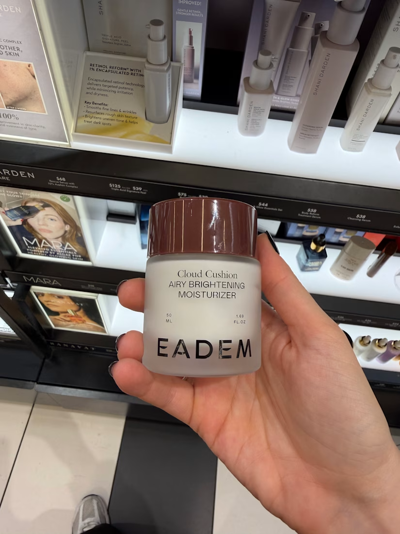
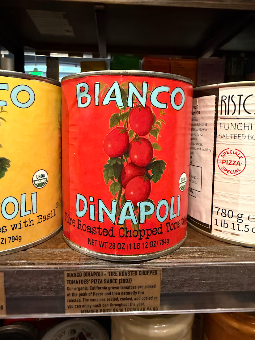
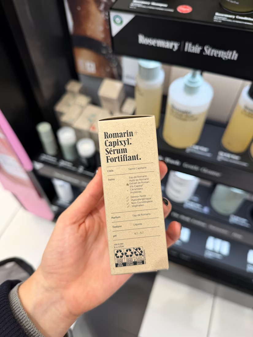
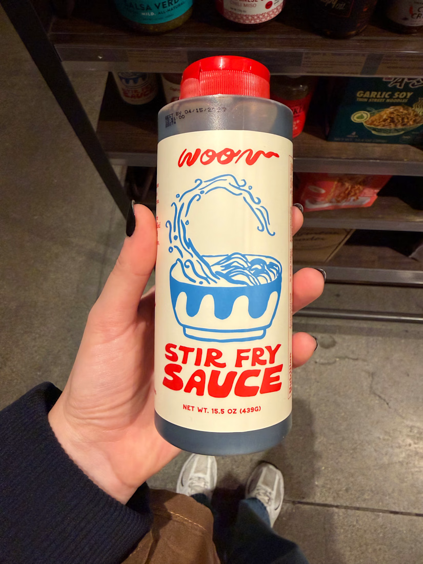
I have a weird habit. Whenever I travel, I spend HOURS in pharmacies and supermarkets 🥫🧴
But I’m not shopping, I’m studying. Typography, paper finish, how much white space the brand dares to leave, how the label wraps around the bottles.
The best packaging lessons I’ve had...
The network for creativity
Join 1.25M professional creatives like you
Connect with clients, get discovered, and run your business 100% commission-free
Creatives on Contra have earned over $150M and we are just getting started





Related posts

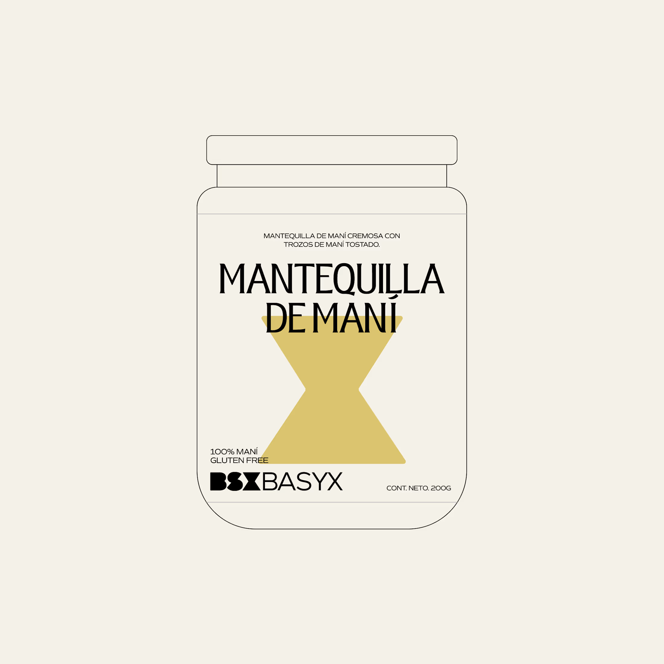
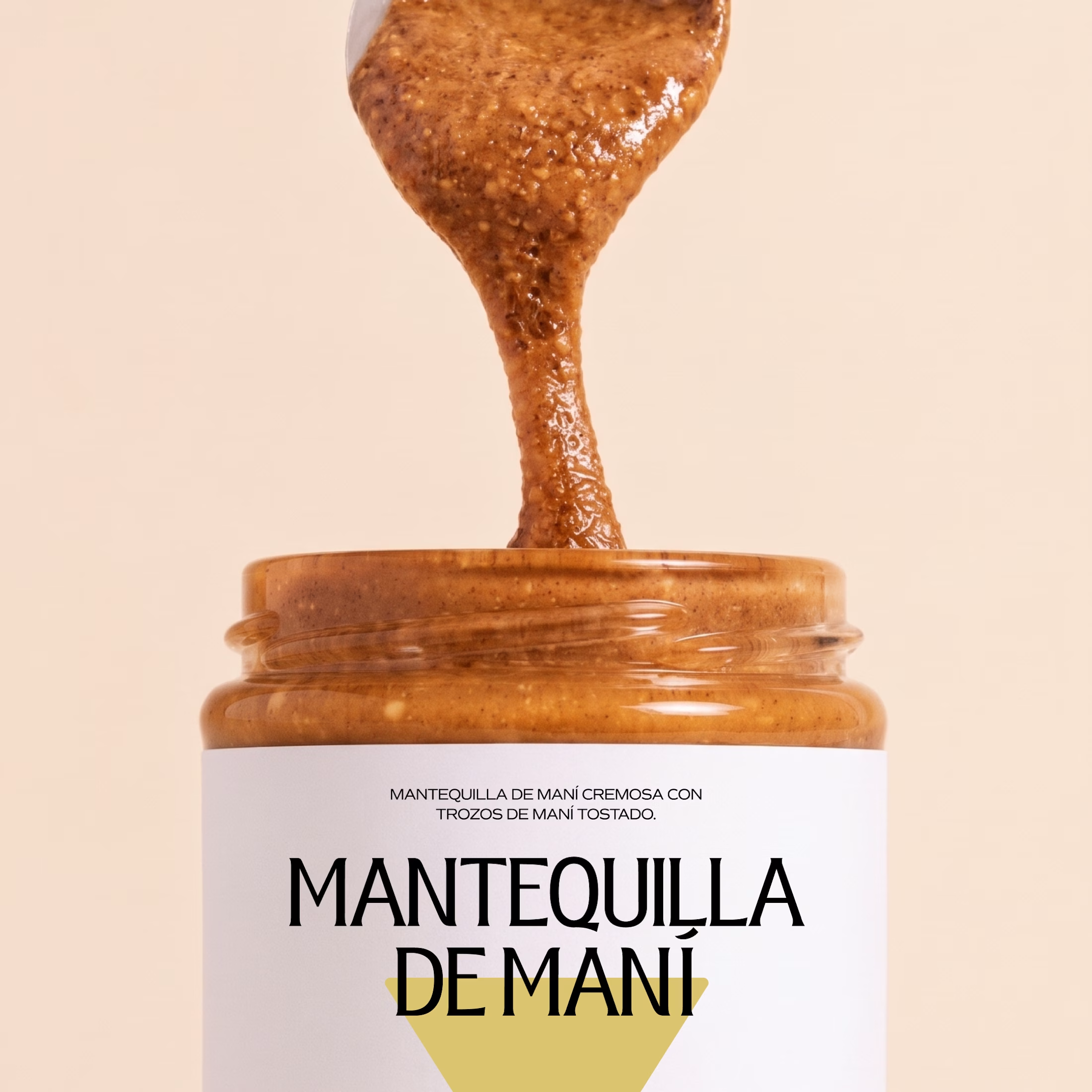
Minimal packaging is not less work. It’s MORE decisions 🤍
On a recent project, I spent a whole day on one thing: the spacing between two phrases in a label. Nobody will ever notice it. But everyone will feel it.
When there is nothing else on the label, every small adjustment has to carry the brand.
Do you also lose hours on details no client will ever mention? 😅

So true. A whole day on the spacing between two phrases sounds about right, and it's exactly why good packaging just feels right.

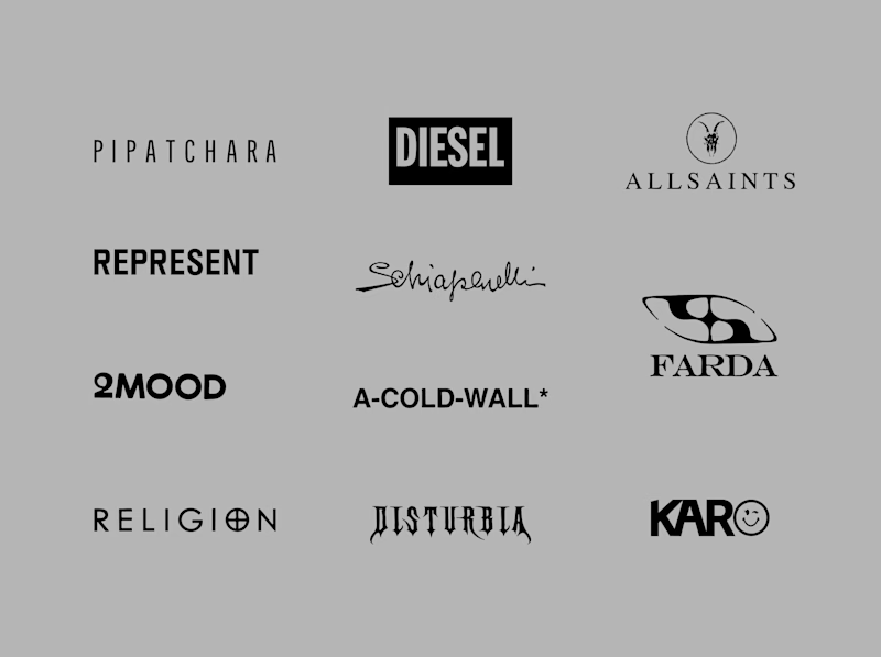
Another category comparison, and this one's going to make you look twice.
The fashion category needed a fresh point of view. Most established players relied on functional wordmarks and relatively restrained visual identities.
With Ru’asā, we took a different route. We challenged those conventions and built an identity designed to stand apart, be remembered and give the brand a world of its own.
Distinctive by design. Unconventional by nature.
Which would you choose?
Familiar category conventions
A fresh point of view
1 voted
11%
8 voted
89%
9 votes
Closed


Motion wins


Good design tells you where to look first.
Visual hierarchy isn’t just about making some elements bigger than others.
It’s about creating a clear path through the design — so the viewer knows what matters, what comes next, and where to take action.
01 – Main message
The first thing your eye should understand.
02 – Supporting content
Information that adds context without competing with the main message.
03 – Visual focus
Imagery, contrast, spacing, or composition that guides attention.
04 – Action
A clear next step that feels natural within the hierarchy.
When everything is competing for attention, nothing feels important.
Good design creates focus, flow, and intention.
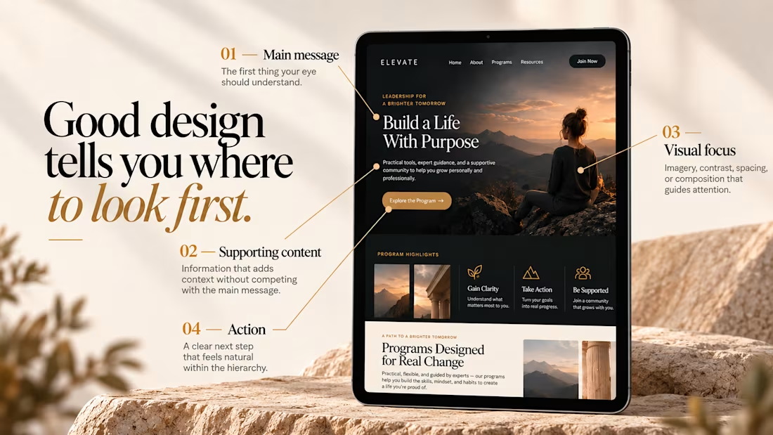
"Where to look first" is the simplest way to explain hierarchy to clients. Clear breakdown, Serge.