The network for creativity
Join 1.25M professional creatives like you
Connect with clients, get discovered, and run your business 100% commission-free
Creatives on Contra have earned over $150M and we are just getting started
Back to feedPost

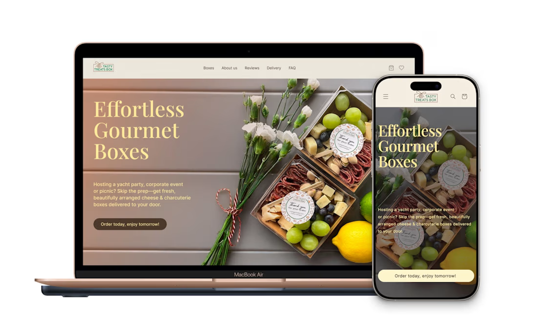
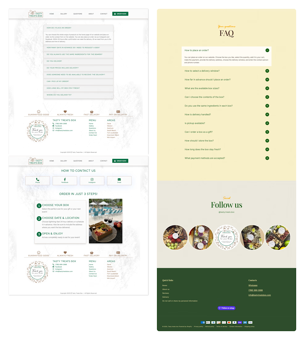
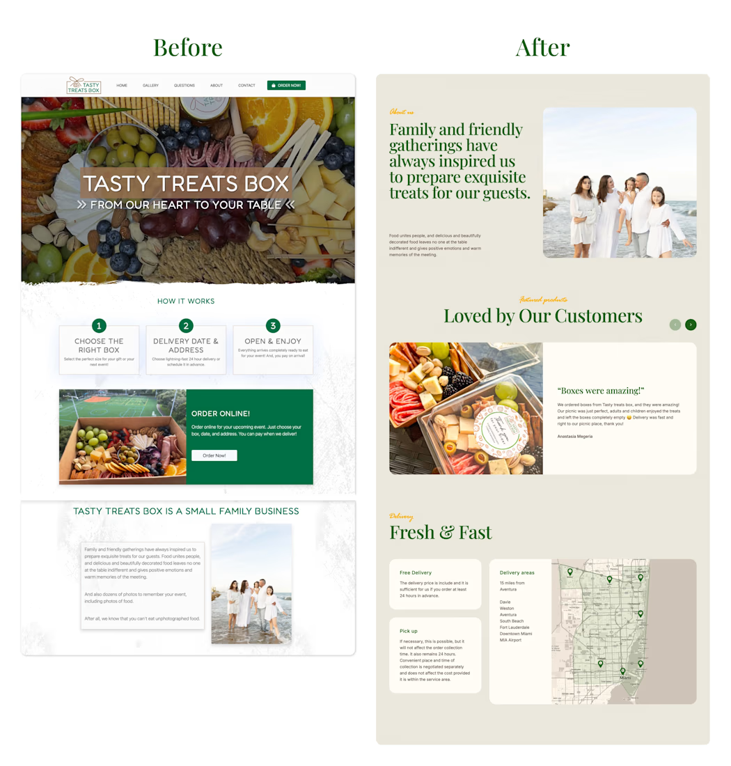
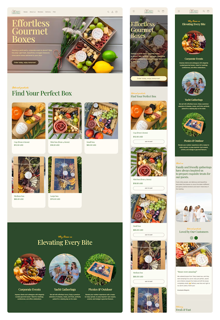
E-commerce Website Redesign for Tasty Treats Box.
Complete redesign and relaunch of an e-commerce site for a Miami-based gourmet box service.
• UX Audit – Assessed original structure and user flow
• Competitor Research – Identified best practices in the niche
• Content Strategy – Refined product structure, wrote SEO- optimized copy
• Design – Created a fresh, cohesive look & feel with brand consistency

The network for creativity
Join 1.25M professional creatives like you
Connect with clients, get discovered, and run your business 100% commission-free
Creatives on Contra have earned over $150M and we are just getting started





Related posts


A calm, editorial landing page for an architecture studio, built around daylight and materials. We'd love to hear your thoughts! 🏛️


The warm timber slats against the pale page feel calm. Did you build the motion in Jitter?


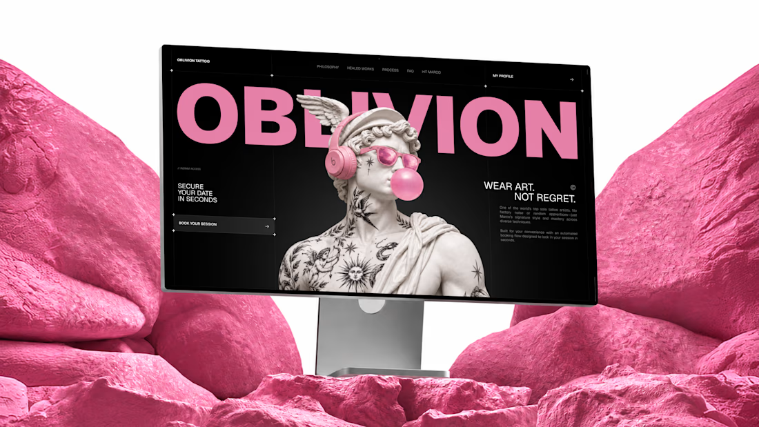
I built OBLIVION Tattoo service for the @Lovable #lovablechallenge
OBLIVION is a private tattoo studio in Kraków, Poland, run by one artist.
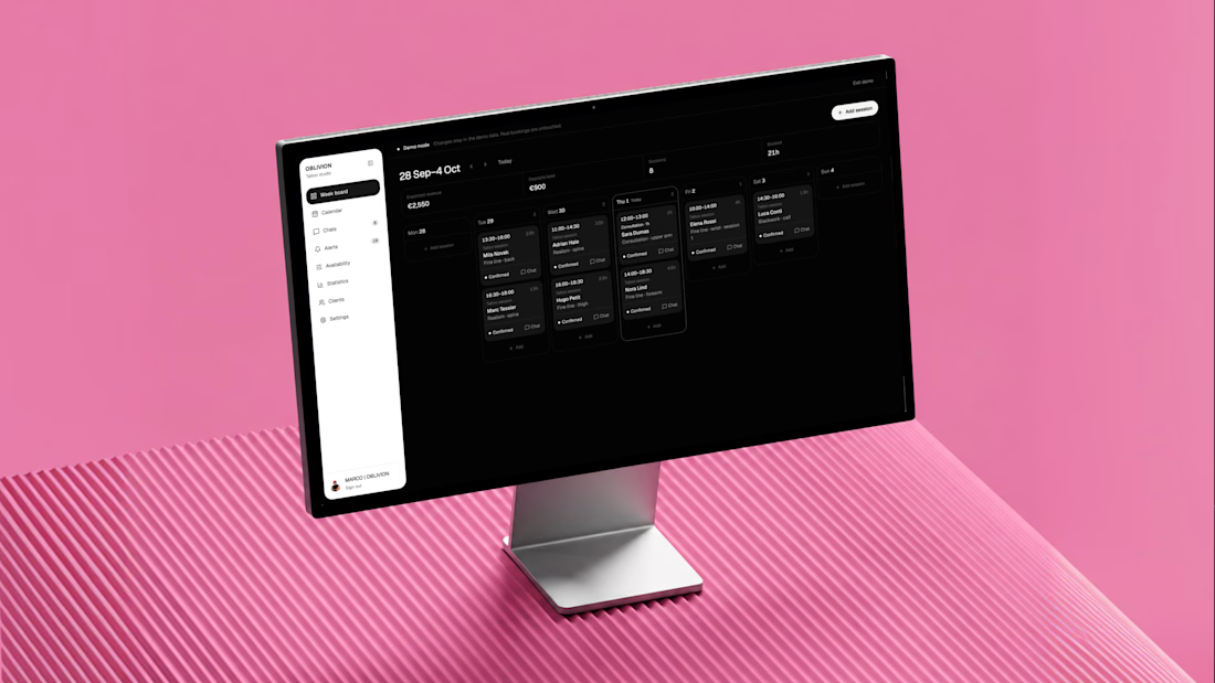
As a solo artist, Marco handles every inquiry, reference, estimate, booking, and schedule change himself.
OBLIVION turns complex tattoo inquiries into confirmed appointments by collecting the full client brief, estimating the work, finding real availability, and keeping the entire booking in one connected artist workspace.
One system, three jobs:
1) Attract — custom animated landing page
https://oblivion-tattoo.lovable.app/
2) Book — guided tattoo booking flow
https://oblivion-tattoo.lovable.app/booking
3) Manage — demo artist admin panel
https://oblivion-tattoo.lovable.app/demo
*The public demo admin resets after refresh. The real admin is private, fully persistent, and connected to live bookings, clients, chats, availability, and studio data.
A smoother booking experience for the client, and far less manual work for the artist.



A beautiful Shopify store can still be frustrating to use if the navigation isn't clear.
Here are 5 common mistakes I look out for:
1. Too many menu items
More options don't always make browsing easier.
2. Unclear categories
Customers shouldn't have to guess where a product belongs.
3. Hiding important pages
Key collections and shopping paths should be easy to discover.
4. Ignoring mobile navigation
A menu that works on desktop may not work well on a small screen.
5. No clear product path
Customers should be able to move naturally from browsing → finding a product → shopping.
Good navigation isn't about adding more links.
It's about making the right things easier to find.
What would you check first when reviewing a Shopify store's navigation?
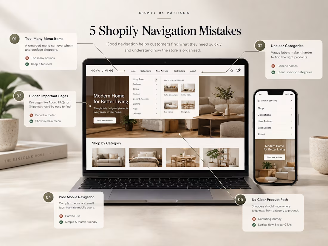

Clear navigation makes the shopping journey much easier.


