The network for creativity
Join 1.25M professional creatives like you
Connect with clients, get discovered, and run your business 100% commission-free
Creatives on Contra have earned over $150M and we are just getting started
Back to feedPost
Taste Test
Taste test time 🍷
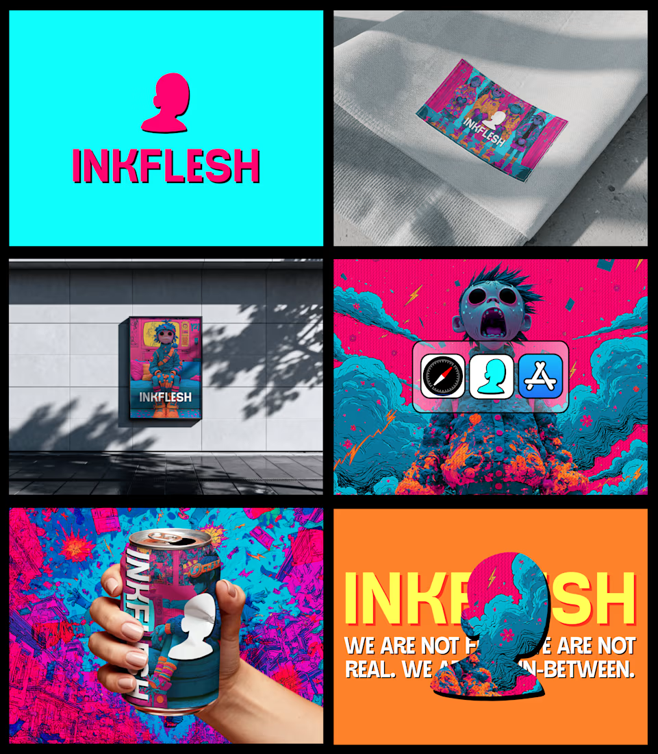
Some logo explorations for a brand identity I’m working on.
Different directions, different energies… not sure which one is “the one” yet.
Which one would you go for and why?
53 voted
59%
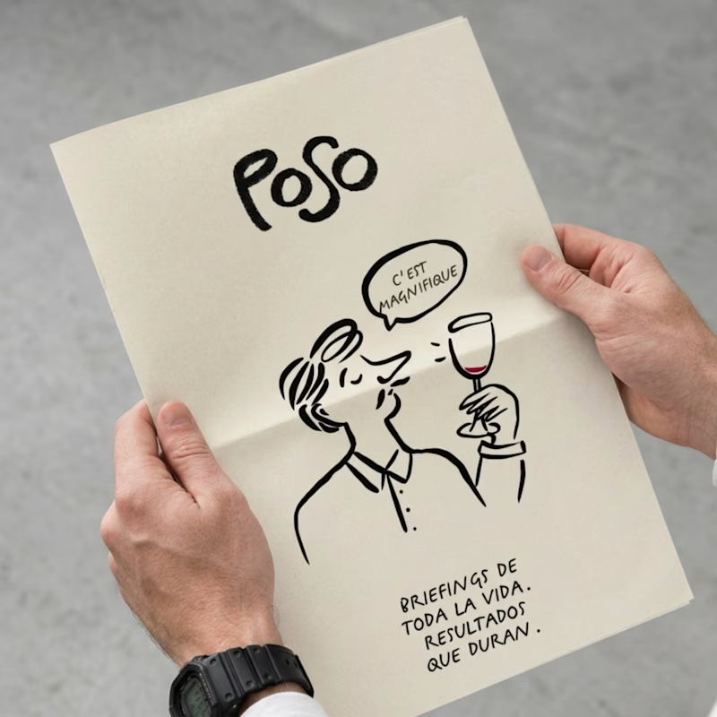
37 voted
41%
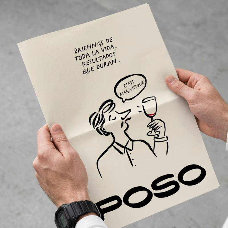
90 votes
Closed
Wonderfull👍👍👍

Thank you! 🙏
All in for bold typo 🔥
Love that energy 🔥 thank you!

Bold one for sure!, The brand logo in the bottom allows you to read and pay more attention to the design.
That’s an interesting point on how it guides attention. I agree, it really lets the other elements stand out. Thank you!

The playful version goes so well with the illustrations style and overall feels much more unique! Good job looks great!
Thank you so much! That’s a really nice observation, glad it comes through.

thank you!

I like better the Playful version, here's why: the hierarchy is better structured on the Playful version, the brand name - despite not being the bigger element - is clearly the most important one thanks to the boldness of its lines, and you can read each element in order from...
Yes, I agree. One integrates with the elements, while the other stands out, and in this layout, the hierarchy favors the playful one. Thanks for sharing!

Nice!
thanks!

What an eye-catching concept! Super useful and innovative design.
Thank you so much, I really appreciate it!

The playful version looks cool👍
Thank you! 🙌

bold
Thanks!

Well, I picked Playful because from what i can already see in the imagery, i percieve this is a brand that holds up relaxation, leisure or fun as a primary activity and for that, using a playful typography would further give life to the brand's idea (if that's the idea anyway)...LOL
Haha love this take 😄 that’s a part of the direction, so great to hear it comes across.
Thank you! Appreciate it!

I love the playful one 🙌
Thank you so much!

I like playful version since I feel the playful one has a better layout.

This is beautiful!

I guess voting's done, but Playful all the way!

Option B has so much more personality! Great work!
The network for creativity
Join 1.25M professional creatives like you
Connect with clients, get discovered, and run your business 100% commission-free
Creatives on Contra have earned over $150M and we are just getting started
Related posts


nice design!



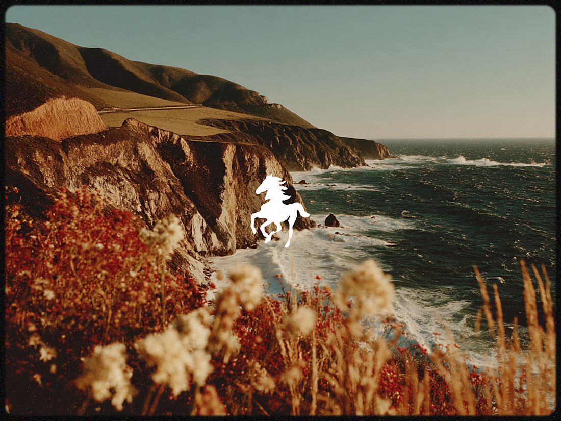
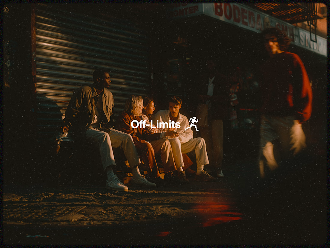
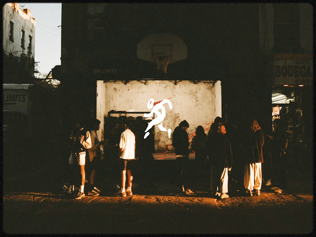

I really like the visuals and the exclusive community vibe they give

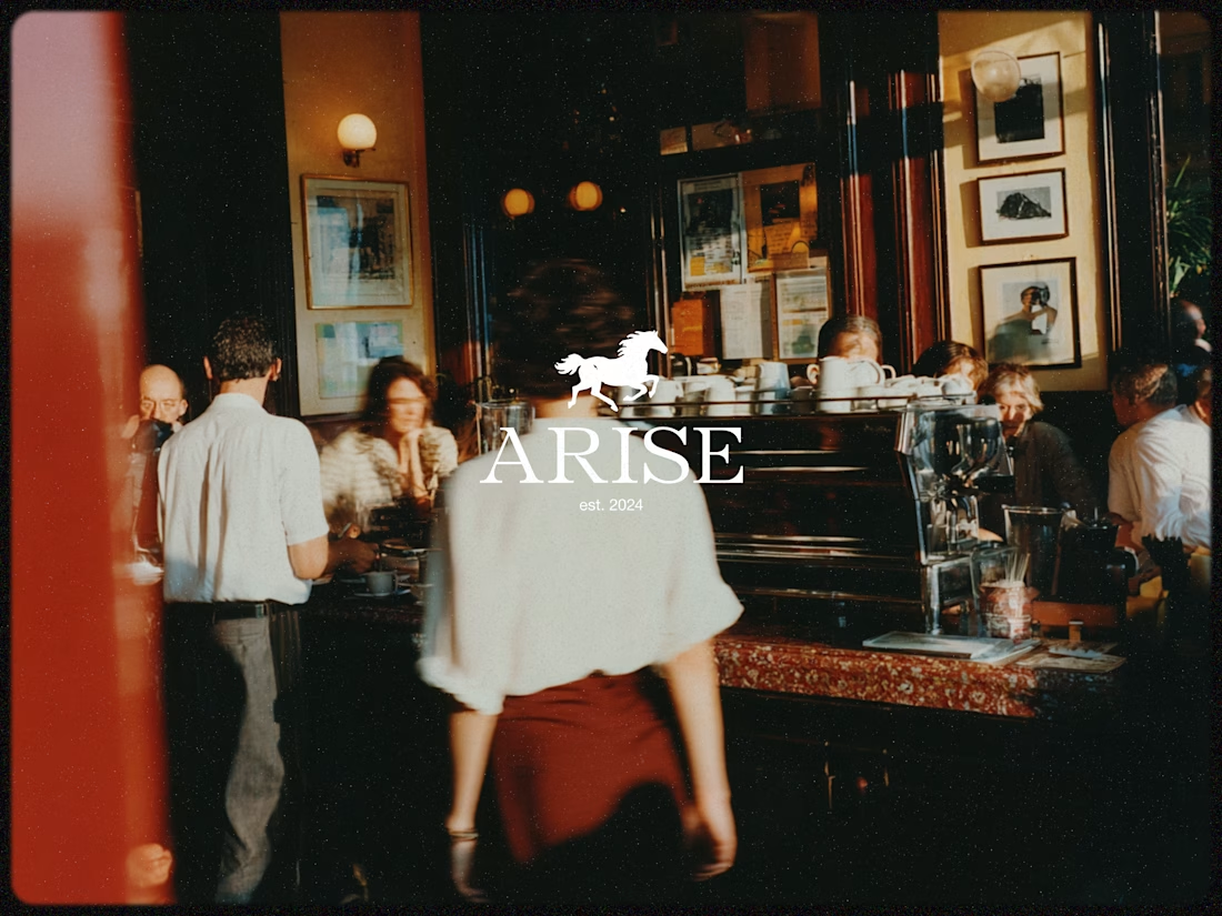
2 hero design directions for the client to explore. Each pushes a completely different visual energy and brand perception. Curious to see which direction resonates more with you.
2 voted
15%

11 voted
85%
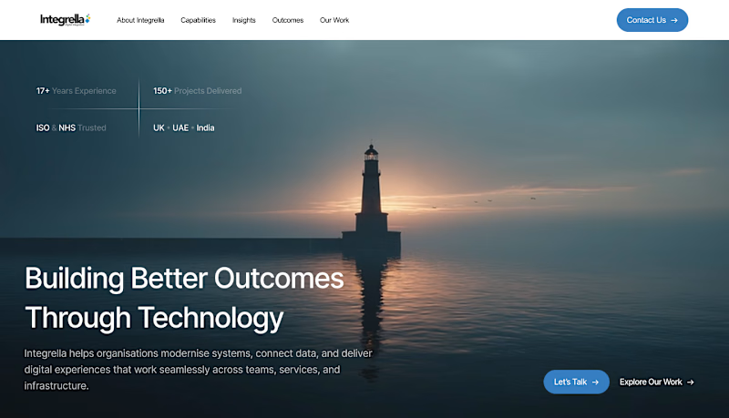
13 votes
Closed







Trending

Claude
Claude has entered the design space. How are you using Claude Design?

Contra University
Learn from expert creatives how to earn more using next-gen AI tools.
creativeaiflow
Creative AI workflows are evolving. What tools do you use, and what are their strengths and weaknesses?
portfolioreview
The best portfolios tell a story, not just show a grid. Share yours for feedback.
freelancerlife
Freelancer life is wins, pivots, and everything in between. What’s yours right now?