The network for creativity
Join 1.25M professional creatives like you
Connect with clients, get discovered, and run your business 100% commission-free
Creatives on Contra have earned over $150M and we are just getting started
Back to feedPost

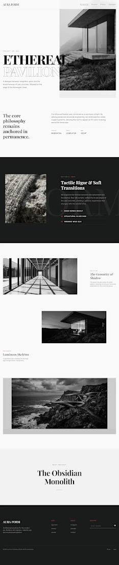
Aura Form – Architecture Studio Website Mockup 🚀
I designed this website concept for Aura Form, an architectural studio focused on modern, minimal spaces. The goal was to make it feel bold, artistic, and high-end, so it feels less like a website and more like a gallery walkthrough.
=> Designed the full project page from hero to next-project section
=> Added sections for materials, gallery images and project details
=> Used a black, white and stone colour palette to match the architecture style
=> Kept the layout spacious and clean, so the photography does the talking


The network for creativity
Join 1.25M professional creatives like you
Connect with clients, get discovered, and run your business 100% commission-free
Creatives on Contra have earned over $150M and we are just getting started



Related posts

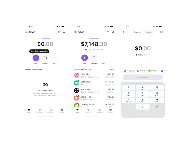
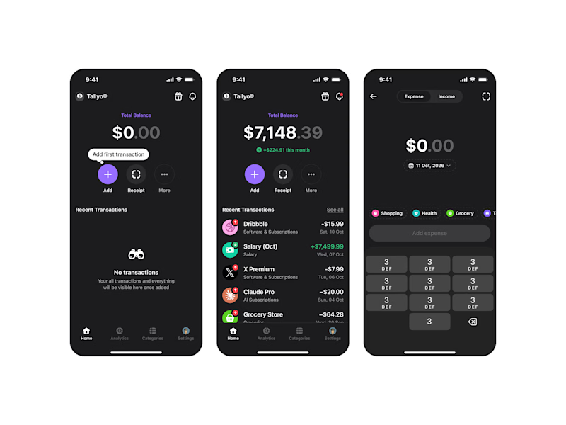
🚀 Just completed the UX/UI design and website redesign for Spartan SEM!
The goal was to bring their refreshed brand identity to life with a modern, conversion-focused website and a better user experience.
Really enjoyed working with the team and seeing the design go live!


This is amazing


Dark!

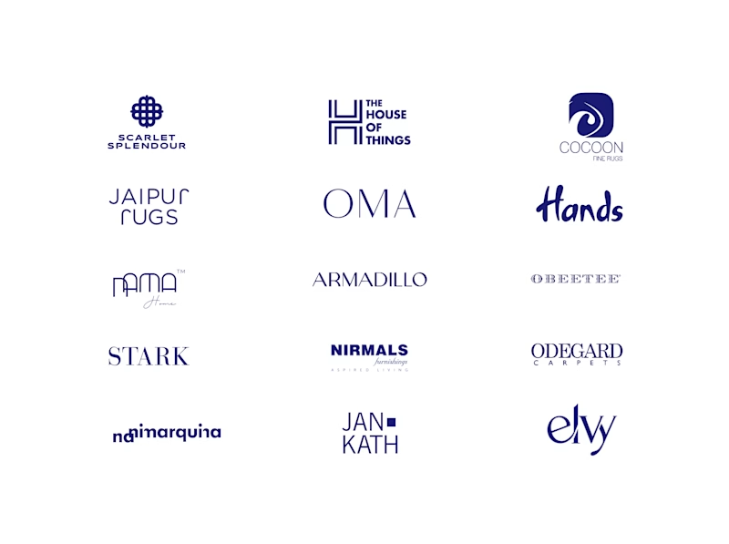
A little look at how Nazariya Living stands apart from its category.
On one side, familiar visual conventions. On the other, an identity with its own character, rooted in stories worth keeping.
We chose not to blend in. :)
Which side catches your eye?

3 voted
30%
7 voted
70%
10 votes
Closed

That side with all the competitor logos in one grid is the slide I'd steal for a client presentation. Nothing explains "why this direction" faster than showing the sea of sameness first. The navy seal wins easily after that.