The network for creativity
Join 1.25M professional creatives like you
Connect with clients, get discovered, and run your business 100% commission-free
Creatives on Contra have earned over $150M and we are just getting started
Back to feedPost

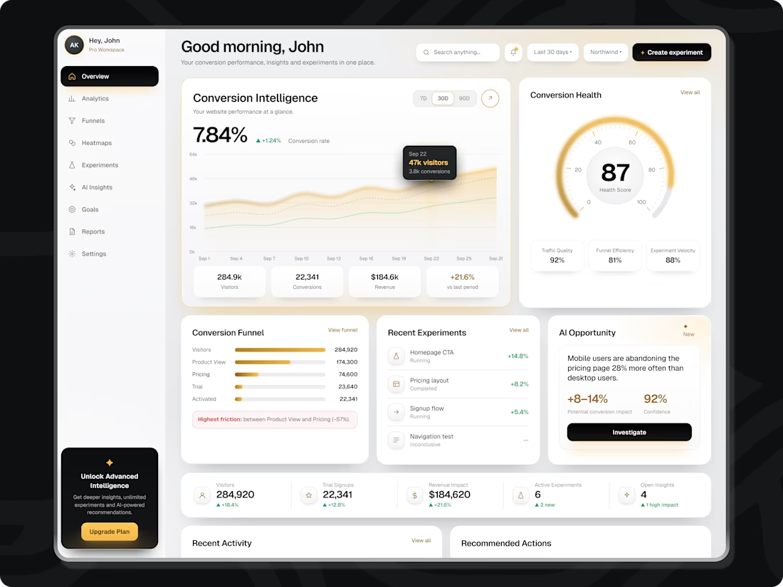
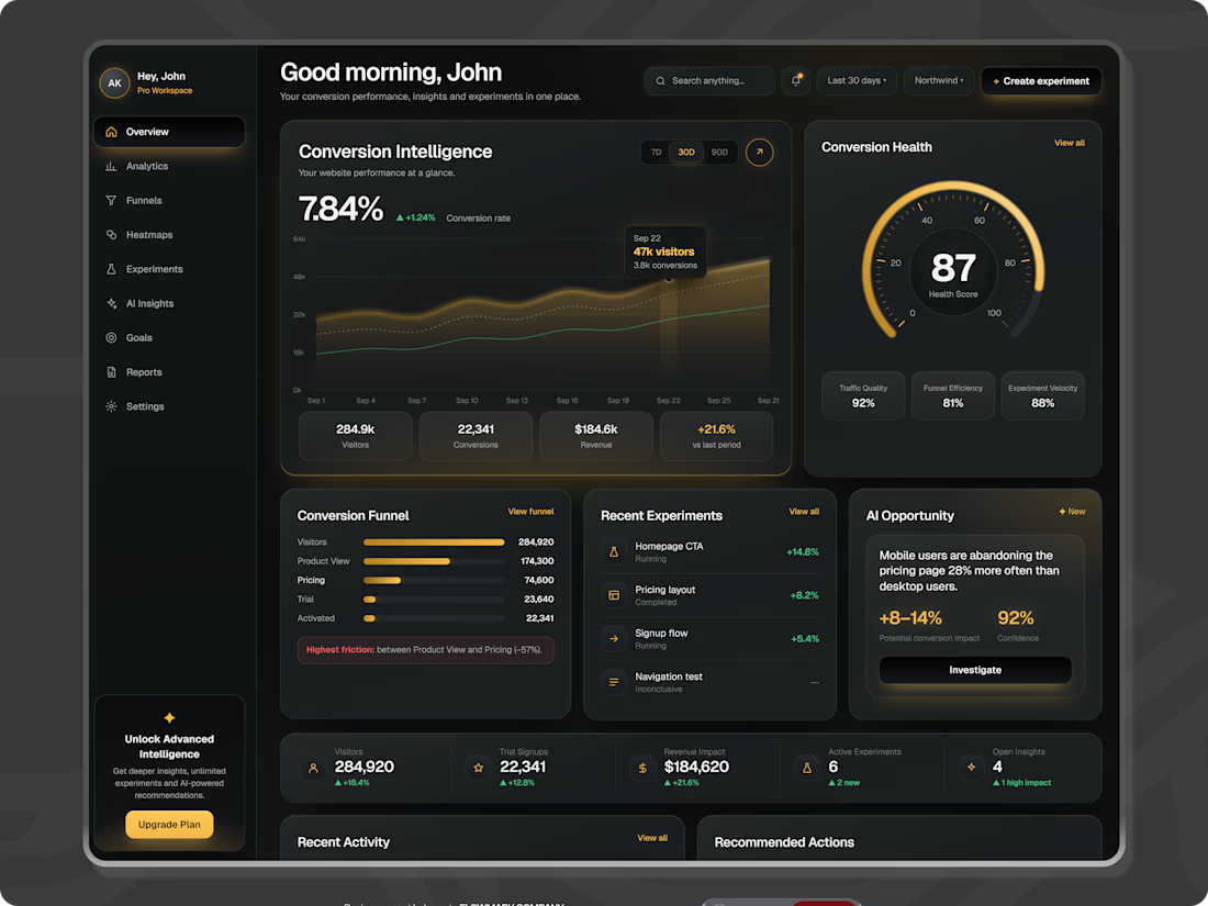
I’m currently designing Flowmark, a dashboard for a SaaS client who’s happy for me to share the project and its process.
The challenge: help teams understand why website visitors leave without signing up and identify what to try next.
Instead of stopping at charts, Flowmark highlights the biggest funnel drop-off, explains likely causes, and suggests an experiment. It then tracks the result through to revenue.
The visual direction is dark and editorial, with a warm gold accent to bring important insights and next steps into focus. I created the animation with Figma Motion.
I’ll be sharing more as the project develops. What would make your analytics easier to act on?

The network for creativity
Join 1.25M professional creatives like you
Connect with clients, get discovered, and run your business 100% commission-free
Creatives on Contra have earned over $150M and we are just getting started





Related posts

Meriot personal portfolio Website Homepage showcase
A portfolio website designed to turn personal expertise into a strong digital presence.
The goal was to create a website that communicates experience, personality, expertise, and credibility within the first few seconds.
I focused on:
Clear positioning and personal branding
Strong visual hierarchy
Editorial-style typography
Project-focused storytelling
UX/Product Design service presentation
Testimonials and social proof
Clear CTA for potential clients
Responsive, conversion-focused layouts
The visual direction combines minimal typography, bold imagery, dark/light sections, and subtle interactions to give the portfolio a distinctive personality without making it difficult to navigate.


Top notch execution

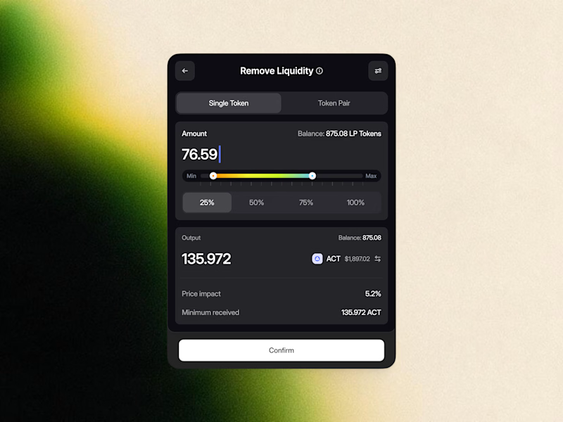
Remove Liquidity component cards for a recent Web3 design project—what would be the best direction for readability and focus? Dark Mode or Light Mode? ⚡️
12 voted
40%
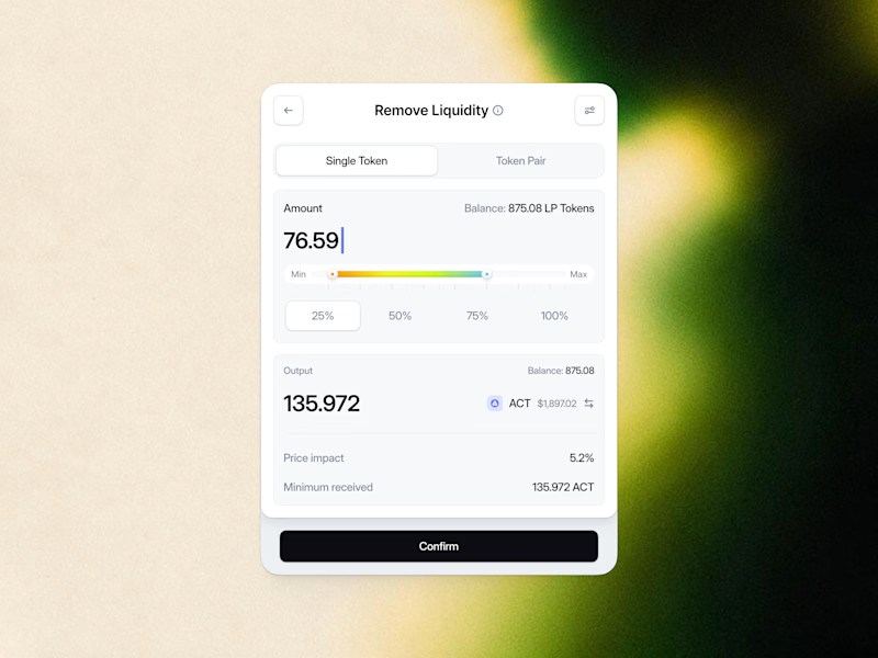
18 voted
60%
30 votes
Closed

White one need bit more darker bg on elements to make them visible like the dark more does.

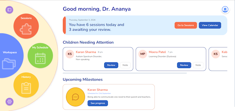
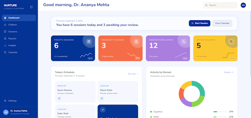
Which dashboard works better for an Occupational therapist?
2 voted
40%
3 voted
60%
5 votes
Closed
Dashboard should be for how much data can be scanned in the shortest time possible.
Bright Colors are distraction here.