The network for creativity
Join 1.25M professional creatives like you
Connect with clients, get discovered, and run your business 100% commission-free
Creatives on Contra have earned over $150M and we are just getting started
Back to feedPost

Most brand guidelines fail because they're designed to explain, not express.
The purpose of brand guidelines is simple: help founders and designers understand how to use the identity consistently long after launch.
But when guidelines become pages of text inside a generic template, they lose their effectiveness.
Great brand guidelines don't just explain the identity. They demonstrate it.
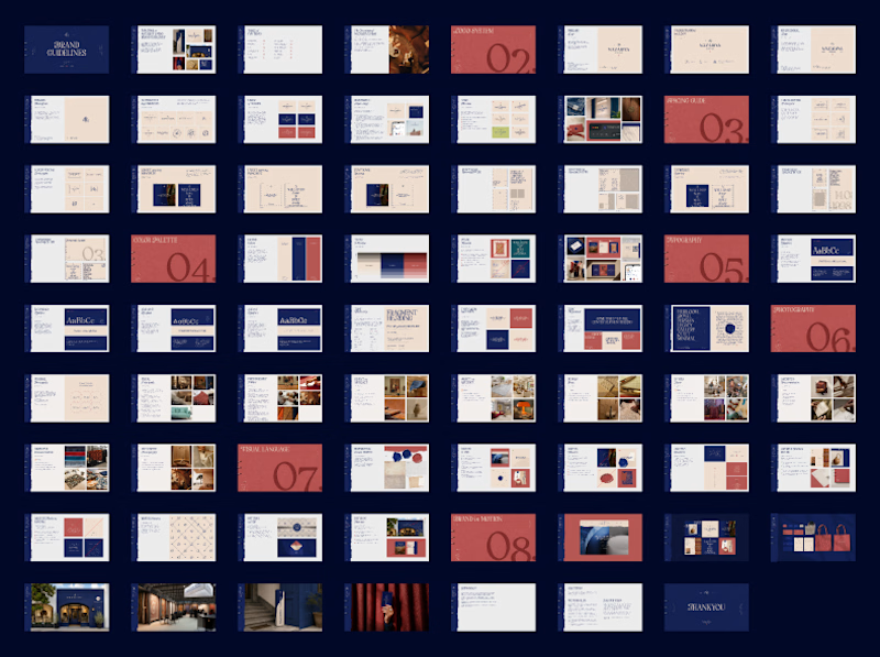
For this client, we built comprehensive guidelines covering:
1. Logo System
2. Spacing & Usage
3. Colour Palette
4. Typography System
5. Photography Direction
5. Visual Language
7. Brand in Action
What makes these guidelines effective isn't just the information they contain. It's how that information comes to life through the brand's own visual language.
The guidelines themselves should be an expression of the identity they're built to protect.
That's the standard we aim to deliver for every brand we build.
P.S. Building a brand that's impossible to confuse and refuses to follow category conventions?
We'd love to help you set the standard. Reach out and let's build something distinctive💫




The network for creativity
Join 1.25M professional creatives like you
Connect with clients, get discovered, and run your business 100% commission-free
Creatives on Contra have earned over $150M and we are just getting started








Related posts


Same brand. Same palette. Two completely different proposals for a real estate developer.
A: An isotype built from blocks. Geometric, precise, the language of construction. It says we build.
B: Custom lettering with movement. Warmer, more editorial. It says we build places you’d want to live in.
36 voted
51%

35 voted
49%

71 votes
Closed

My vote is B, Milagros. Custom lettering with movement has real editorial warmth, which suits a developer selling places people actually want to live in.

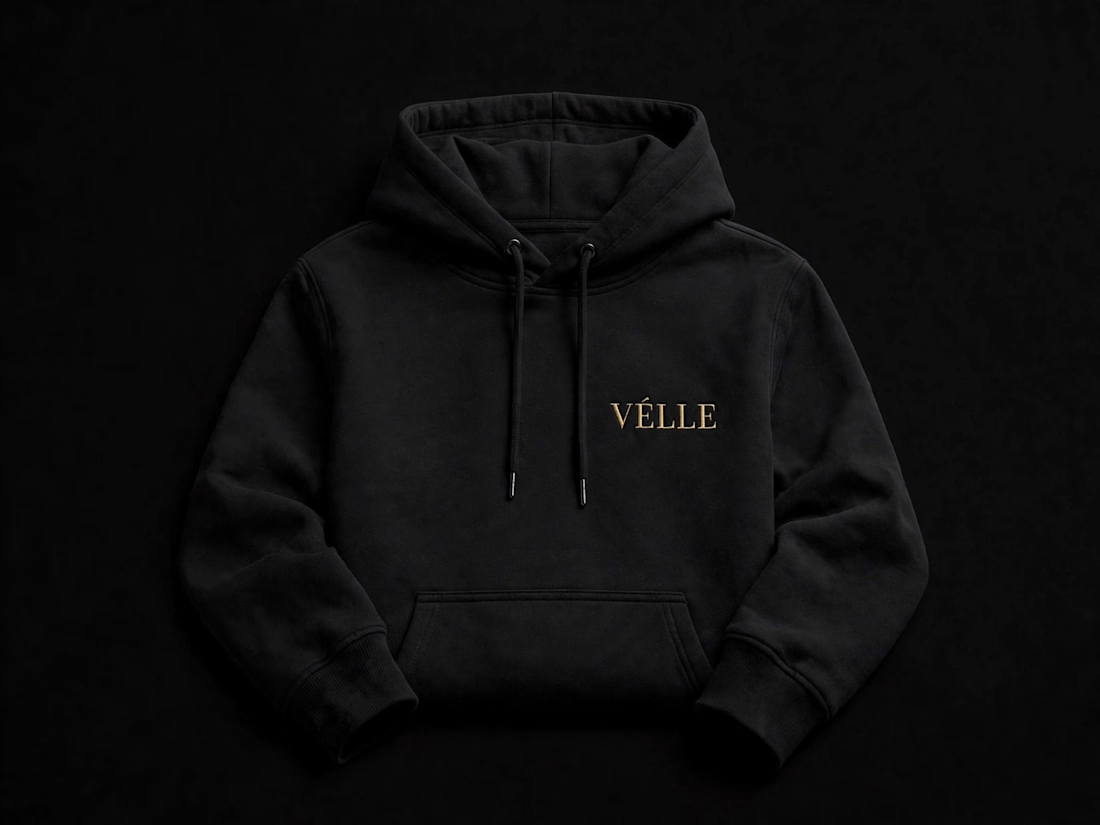
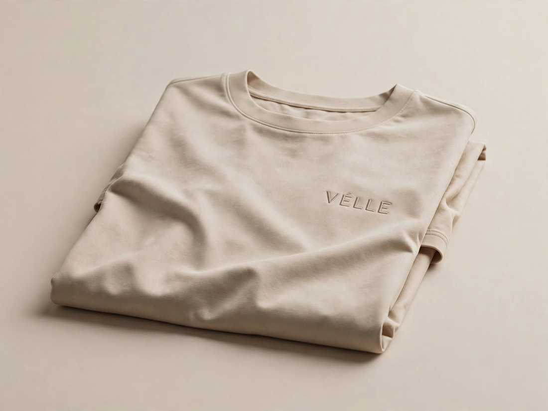
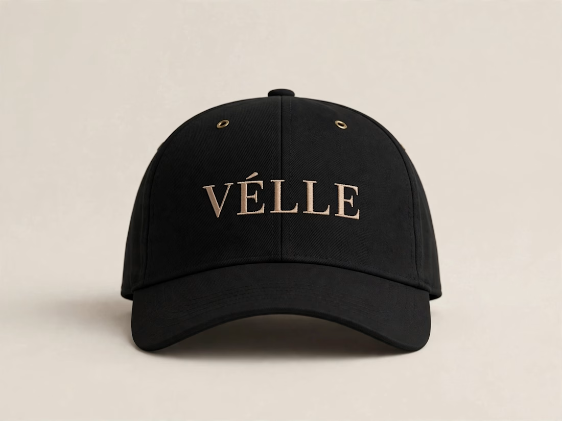
VÉLLE - Minimal Luxury Fashion Brand Identity
A conceptual fashion brand built on quiet luxury and timeless essentials.
What I did:
→ Logo Design (Primary + Secondary)
→ Brand Identity & Color System
→ Product Mockups (T-Shirt, Cap, Tote Bag)
Concept: Less is more. Clean serif typography with subtle accent for premium feel.
Palette: Beige #E8DDD0 / Black #0A0A0A
Full case study on Behance: behance.net/gallery/257321557
Open for freelance projects - DM for fashion branding.


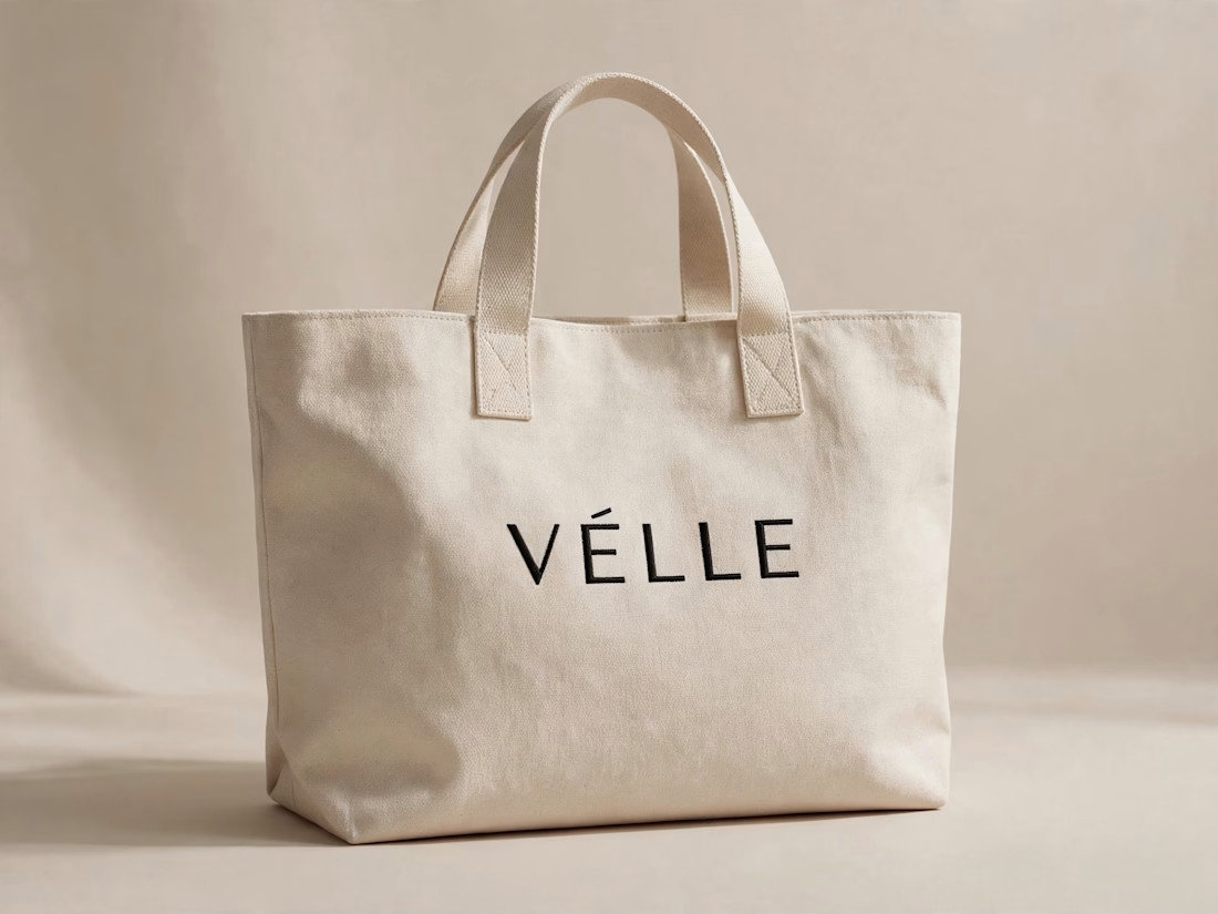

love the minimal direction on this. VÉLLE feels expensive but not loud, the tote and cap mockups are so good

New logo & brand identity under 1 week for Get Stuff Digital ✨