The network for creativity
Join 1.25M professional creatives like you
Connect with clients, get discovered, and run your business 100% commission-free
Creatives on Contra have earned over $150M and we are just getting started
Back to feedPost
Taste Test


Same brand. Same palette. Two completely different proposals for a real estate developer.
A: An isotype built from blocks. Geometric, precise, the language of construction. It says we build.
B: Custom lettering with movement. Warmer, more editorial. It says we build places you’d want to live in.


16 votes
Ends in 1d

Option A looks more scalable because if you look from distance the logo still becomes recognizable. And also it can be used as only Logomark when space is not enough.

I feel option B was better to me❤️

Love this breakdown! For a real estate developer, I’d lean towards Option B — the “we build places you'd want to live in” narrative sells emotion, not just construction. Option A is strong and precise, but B feels more human and premium for residential. Both are solid though, great exploration!

Option A is unique against Option B!!

B feels more cleaner!
The network for creativity
Join 1.25M professional creatives like you
Connect with clients, get discovered, and run your business 100% commission-free
Creatives on Contra have earned over $150M and we are just getting started







Related posts


New case study is live.
Kallay Studios is a visual media company specializing in architecture, real estate, and commercial projects. The original brief called for a well-structured grid system to convey professionalism and a design-oriented approach. Inspired by the grid overlays commonly seen in video cameras, this element became central to the design system and is consistently showcased across various applications to reinforce the brand concept.
A more in-depth description can be found in the project case study.
Long story short, I had a blast developing this visual system and seeing how the concept blended well with the overall identity.

The camera grid concept works well.

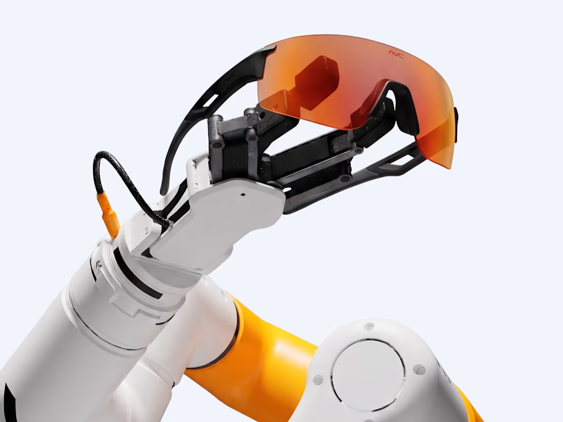
A personal brand concept exploring the future of AI-powered performance eyewear.
I wanted to create something that blends sports, technology, and futuristic aesthetics into one cohesive visual identity.
From the eyewear design and product visuals to art direction, 3D renders, and motion every detail was developed to give AVC its own distinctive character.
Not just another pair of sports glasses. A vision of what next-generation wearable technology could look like.
More explorations coming soon.


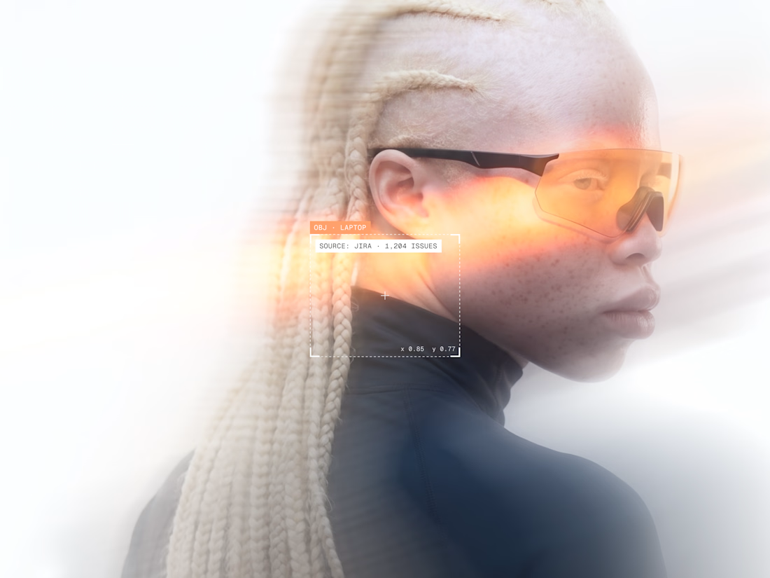
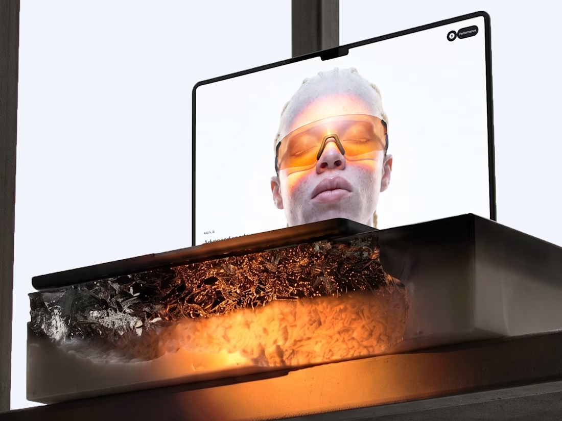

Blending sports and tech into eyewear is a tough positioning, but the system holds together — the renders, art direction, and product visuals all speak the same visual language rather than competing. Where the execution lands next will be in the packaging and retail touches; if...