The network for creativity
Join 1.25M professional creatives like you
Connect with clients, get discovered, and run your business 100% commission-free
Creatives on Contra have earned over $150M and we are just getting started
Back to feedPost
A look at VIAFIDE, a brand built from the ground up.
This project spanned research and strategy through naming, positioning, messaging, and the full visual identity.
Built around the idea of “A trusted path forward,” every part of the brand was developed to create a clear, credible, and cohesive identity from the very beginning.

love that initial logo animation, something about the stroke effects feel instantly trustworthy & in touch with humanity.

Thank you! Trust was really at the heart of the identity, so I love that it comes through in those details 🤍

Full builds like this rarely get shown end to end, most people only post the logo reveal. Was 'a trusted path forward' something the client brought in, or did it come out of your positioning work?
Thank you! That came out of the naming and positioning work. I developed VIAFIDE from via (way/path) + fide(bonafide/trust/faith), so trust was already embedded in the name itself. That thinking naturally carried through into the visual identity.

Nice work, Sydelle
Thank you!

Naming a brand around a feeling like trusted path forward before the visual identity even starts is the right order of operations, most projects skip straight to logo exploration and the identity ends up hollow. Would love to see how the messaging pillars translated into the actual visual system.


the green check inside the V is a smart little touch
The network for creativity
Join 1.25M professional creatives like you
Connect with clients, get discovered, and run your business 100% commission-free
Creatives on Contra have earned over $150M and we are just getting started


Related posts

A flower that inflates arrives in the mail.
Next month, a phone made of shell.
STILL LIFE SERVICE. Case study dropping soon.
Which object earns your shelf? Reply below.
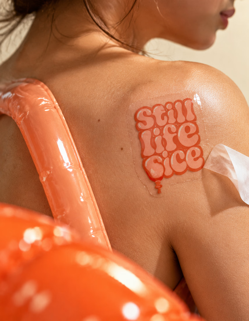

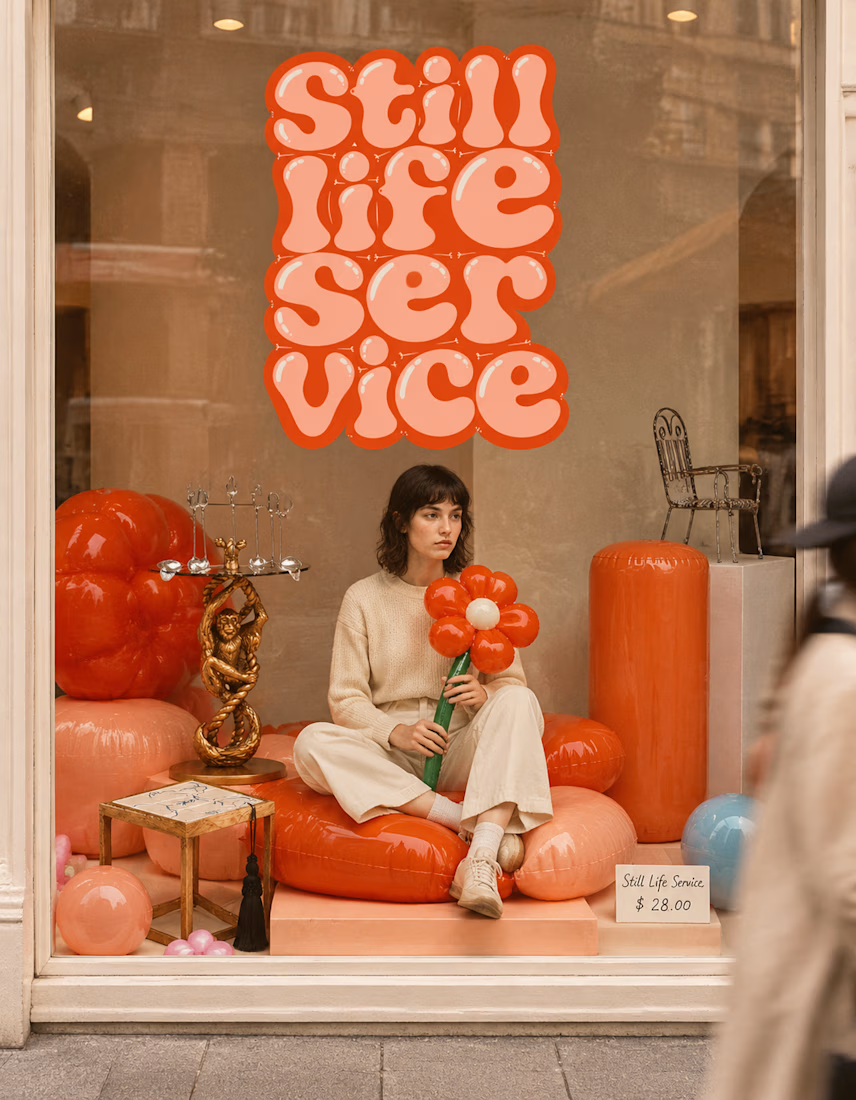

The inflatable flower. Only houseplant I'm guaranteed not to kill. Also, a new object every month is a sneaky good retention hook, people will stay subscribed just to see what's next.

HuroPay Branding for Fintech
We built its identity to feel the same way: fast, clear and human.
Need a branding? DM Now...
#branding #brandidentity #logo


Congrates!!









