The network for creativity
Join 1.25M professional creatives like you
Connect with clients, get discovered, and run your business 100% commission-free
Creatives on Contra have earned over $150M and we are just getting started
Back to feedPost


The network for creativity
Join 1.25M professional creatives like you
Connect with clients, get discovered, and run your business 100% commission-free
Creatives on Contra have earned over $150M and we are just getting started



Related posts

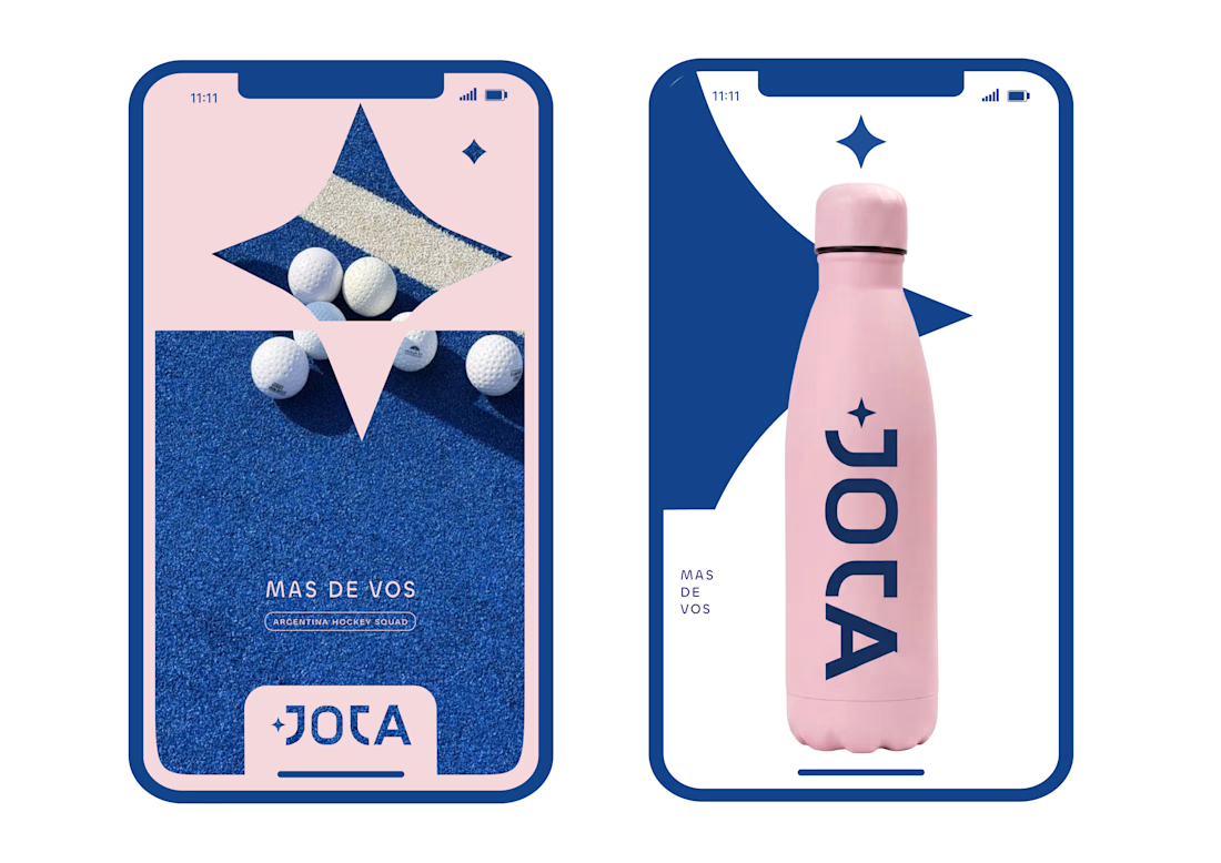
JOTA is an Argentine field hockey brand built for players who play with personality. The founder reached out to rethink how the brand shows up beyond the stick itself.


Wow project

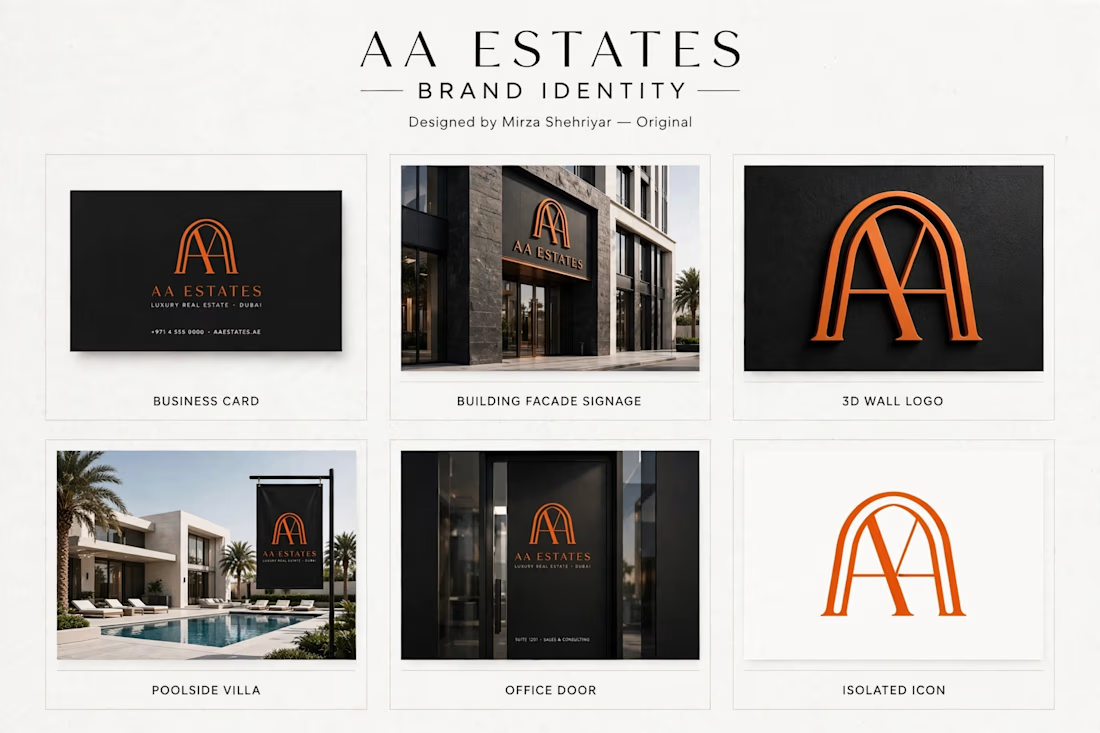
Luxury logo for Dubai real estate brand.
I designed this AA monogram inspired by Islamic arch architecture.
Clean, premium look for high-end properties.
What you see:
Business card, building signage, 3D logo, villa flag mockups.
Made this for my portfolio - open for custom work.
Designed by Mirza Shehriyar



This is a very strong portfolio piece. The clean, minimal typography paired with that bold monogram creates a very sophisticated look. Great job on this.

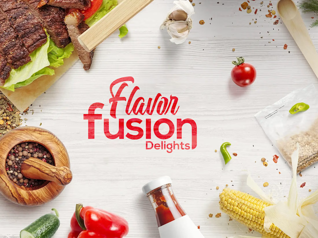
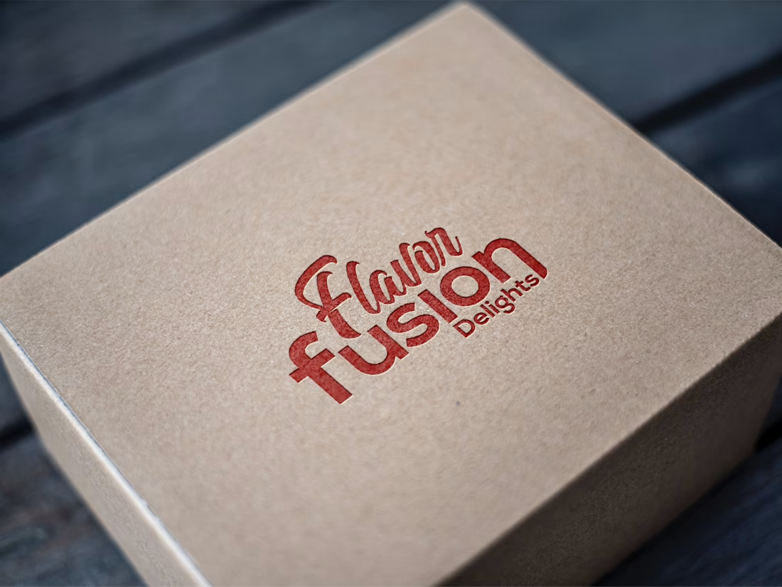
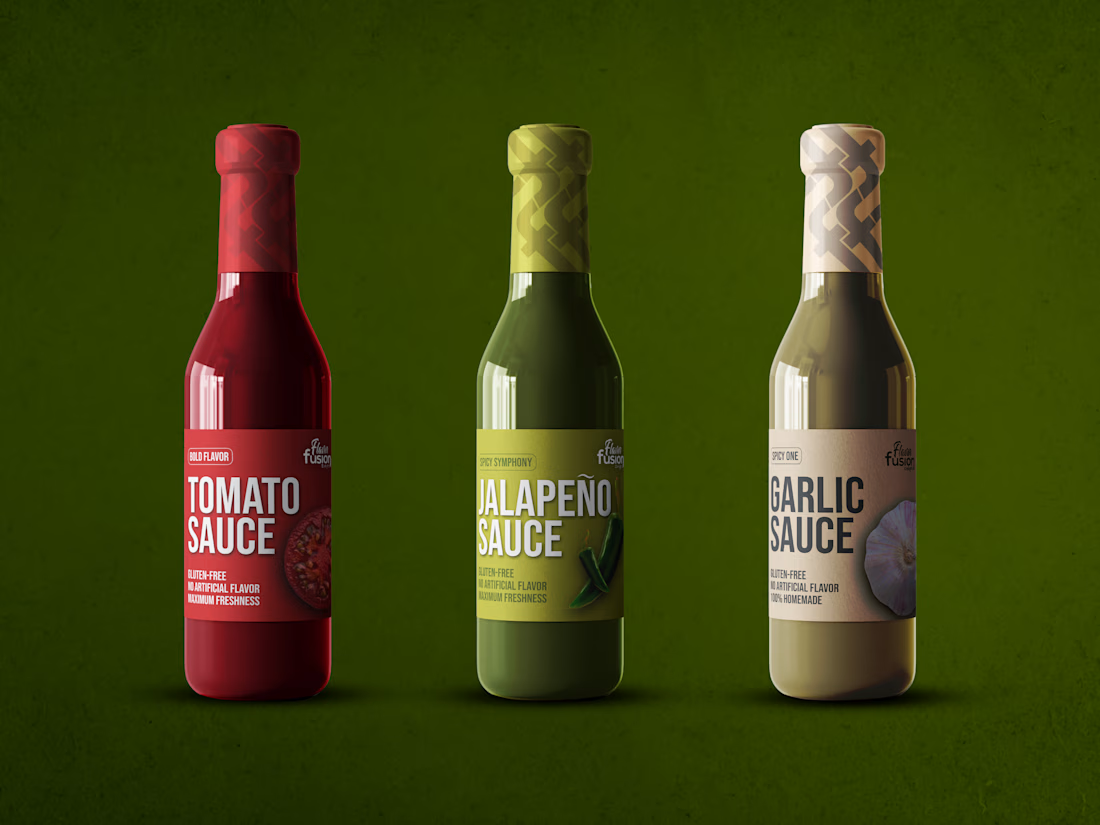
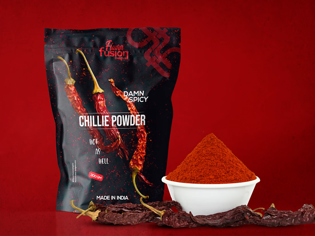
Packaging & Brand Identity Design for Flavor Fusion Delights 🌶️✨
A vibrant, appetite-appealing visual identity and packaging system designed for a premium sauce and spice brand.
The Design Strategy: Bold, clean typography paired with high-contrast color palettes (deep reds, forest greens, and warm tones) to ensure maximum shelf impact.
Open for new branding and visual identity projects on Contra. Check out my profile for services and availability! 🤝