The network for creativity
Join 1.25M professional creatives like you
Connect with clients, get discovered, and run your business 100% commission-free
Creatives on Contra have earned over $150M and we are just getting started
Back to feedPost

Introducing Memoripress
Most of us have thousands of photos on our phones, but rarely do anything with them.
Memoripress helps turn those photos into printed photo books. It's not a new concept, but what we are trying to do is making the experience more user friendly and modern day mobile friendly from creation to printing. I worked on its brand identity, website and web app, including the photo book editor.
The interesting challenge was bringing two things together: a warm, nostalgic brand and a practical tool that makes creating an album feel simple.
I used earthy browns, faded cream and paper textures to give the brand a familiar, tactile feeling. For the editor, I focused on clear steps for uploading photos, arranging layouts and reviewing the finished book.
This project gave me the chance to think through the whole experience, from someone’s first impression of the brand to the book they eventually hold.

The network for creativity
Join 1.25M professional creatives like you
Connect with clients, get discovered, and run your business 100% commission-free
Creatives on Contra have earned over $150M and we are just getting started



Related posts

Burgy, a mobile concept for burger ordering. 🍔
Bold type, premium food visuals, and a fast path from craving to checkout.
Two color directions for the hero screen. Which one converts better?
Vote and tell me why 👇
Poll options: 🟢 Green | 🔴 Red
#UIDesign #MobileApp #FoodApp #AppDesign #UX #RestaurantApp

13 voted
43%
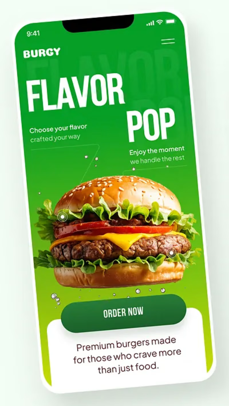
17 voted
57%
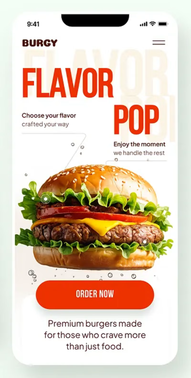
30 votes
Closed

Green for me, and I'd bet on it converting better too. The red version is loud in the way every food app is loud, while the green makes the burger the hero and the screen instantly recognizable in a feed. The green background also gives the white FLAVOR POP type far more contrast, so the message lands a beat faster.

Some people think having text on an album cover is tacky.
But I think it really comes down to how the typography is incorporated.
There's a difference between simply placing text on an image and making it an integral part of the artwork.
So I decided to explore this idea by designing a fictional album cover of my own.
For this concept, I used playful colors, handwritten text and hand-drawn elements to capture the album's imaginative and whimsical personality.
Rather than treating the title as a separate element, I wanted it to feel like a natural part of the overall design.
What do you think?
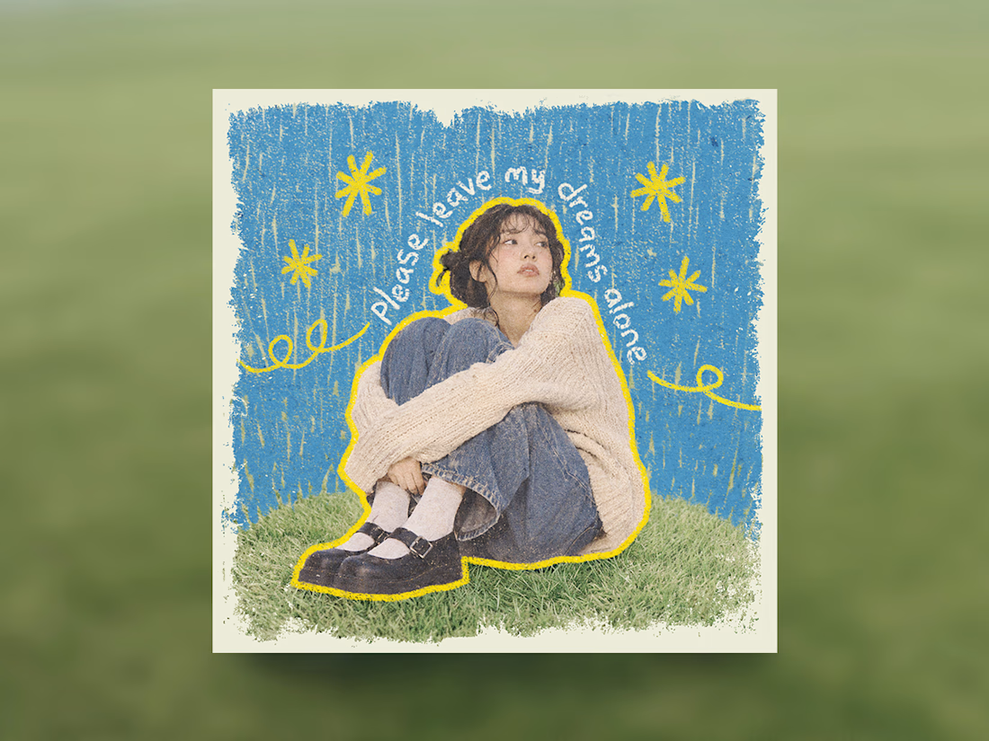

Treating the handwritten title as part of the artwork rather than a label on top is the right call. Email designers fight the same battle with hero images: text baked into the picture looks great until an inbox blocks images. Which came first for you, the lettering or the collage?


Niceee


