The network for creativity
Join 1.25M professional creatives like you
Connect with clients, get discovered, and run your business 100% commission-free
Creatives on Contra have earned over $150M and we are just getting started
Back to feedPost

Every frame is designed to trigger a specific feeling:
→ Darkness at the start = anticipation (brain hates emptiness)
→ Single light pulse = curiosity (what is that?)
→ Slow rise = premium status (fast = cheap, slow = luxury)
→ Orbit reveal = ownership fantasy (you're inspecting it)
→ Macro Home button pulse = dopamine hit (the payoff)
→ Hero hold = desire (brain lingers on what it wants)
This is how Apple, Sony and Nintendo make you want things you don't need.


The network for creativity
Join 1.25M professional creatives like you
Connect with clients, get discovered, and run your business 100% commission-free
Creatives on Contra have earned over $150M and we are just getting started




Related posts

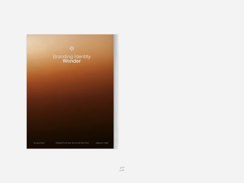
Brand Identity delivered by paper.



Love it🙌

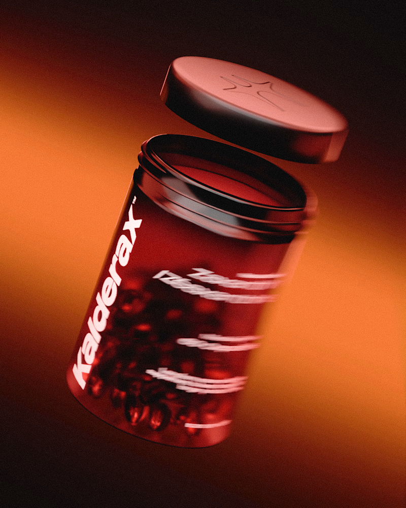
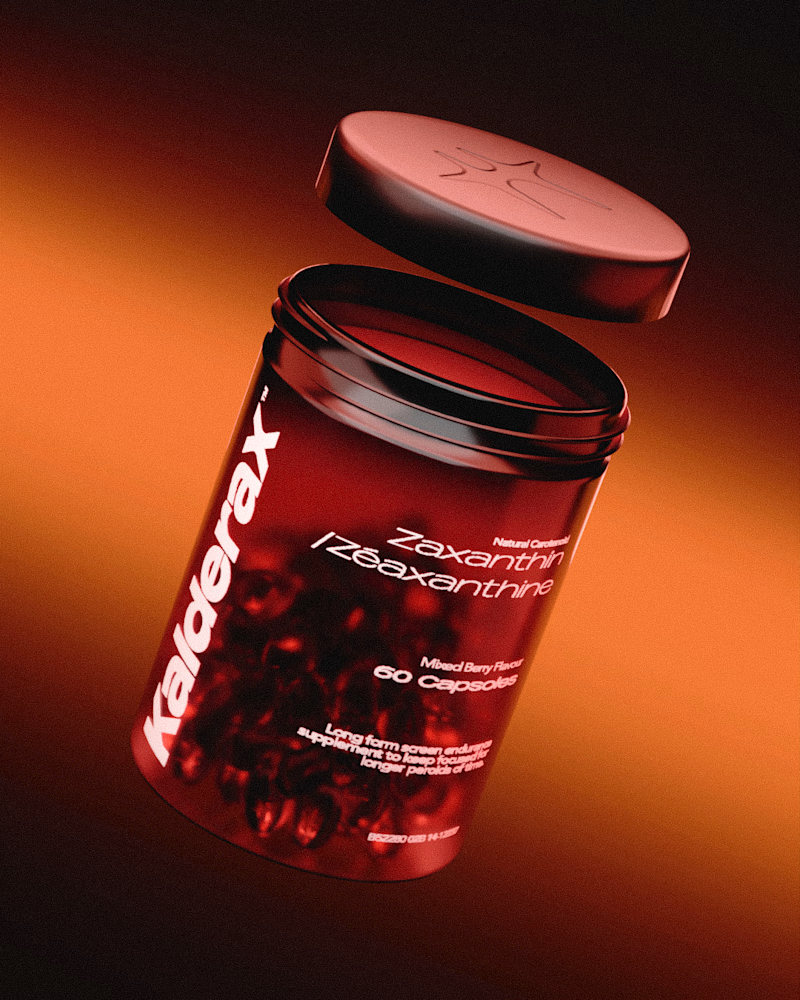
I spent the last week challenging myself to design, brand and 3D model a minimal supplement. I experimented with compositing nodes to add a blur in some renders, which one do y'all like more?
14 voted
44%
18 voted
56%
32 votes
Closed

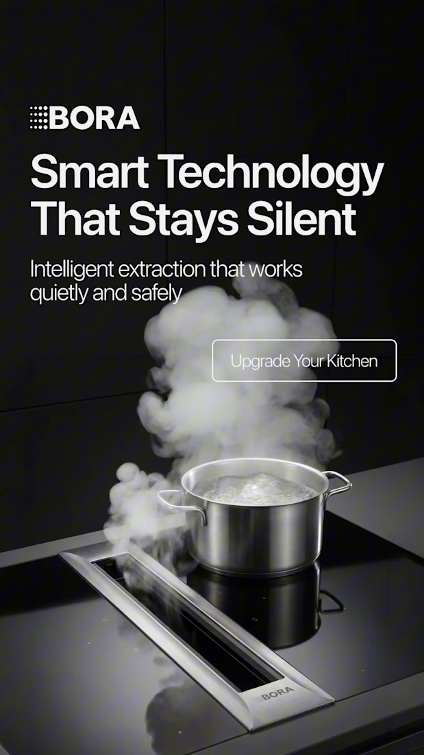
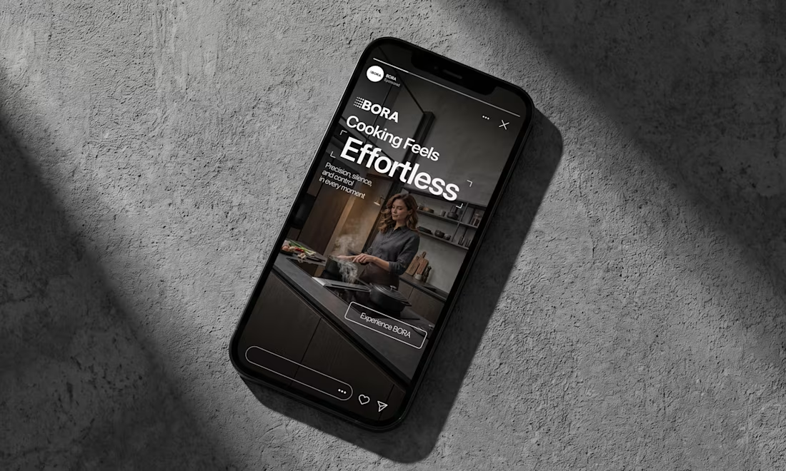
BORA – Ad Creative Concept
Most kitchen appliance ads sell you the warm family dinner. I wanted to try the opposite.
Built this BORA concept as a portfolio piece, treating the product like architecture instead of tech – dark marble, concrete, no hands, no food styling. Just a pot, steam, and silence.
The steam does all the movement in the motion piece. Typography stays out of the way – one line, low CTA, nothing fighting the composition. Turns out when you strip out the lifestyle, the price point sells itself.