The network for creativity
Join 1.25M professional creatives like you
Connect with clients, get discovered, and run your business 100% commission-free
Creatives on Contra have earned over $150M and we are just getting started
Back to feedPost
Taste Test

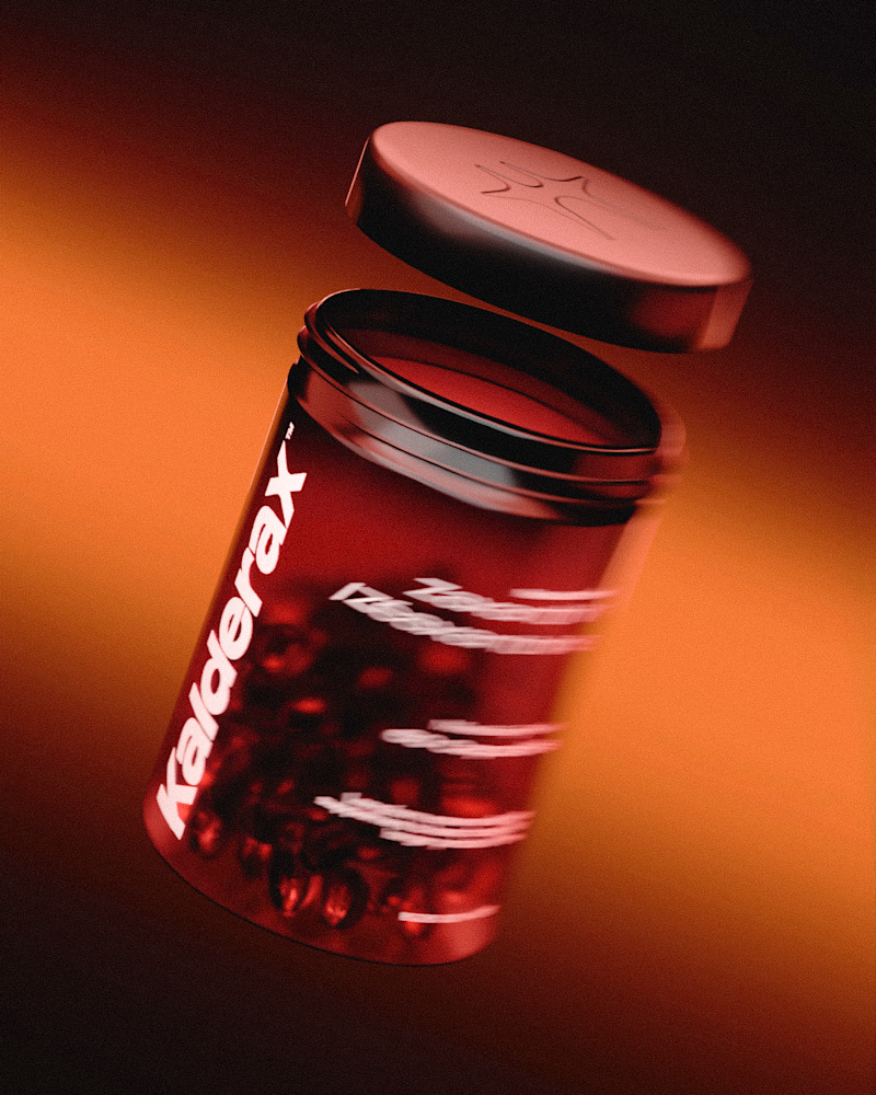
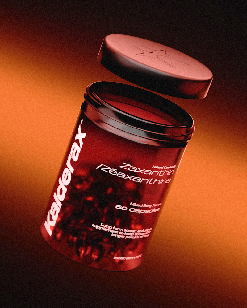
I spent the last week challenging myself to design, brand and 3D model a minimal supplement. I experimented with compositing nodes to add a blur in some renders, which one do y'all like more?

14 voted
44%
18 voted
56%
32 votes
Closed


I prefer the one with compositing blur! ❤️

Team no blur!!

Second one compositing blur🎉

The blur just doesn't make sense for a still product shot like this one. But it's looking fantastic!!

Both images definitely looks amazing, but I believe will work for different purpose


the red jar looks good. did the blur win?

The blur would make sense if you wanna show a spin or movement. Right now it looks like none. So i'd pick without blur.
The network for creativity
Join 1.25M professional creatives like you
Connect with clients, get discovered, and run your business 100% commission-free
Creatives on Contra have earned over $150M and we are just getting started






Related posts

The previous poll on this preloader had exactly 50-50 results between Horizontal gallery and Circle intro. Now I'm continuing with 2 other options. Which one is better? Check the live preview here
19 voted
53%
17 voted
47%
36 votes
Closed
Team mosaic!!


Two ways to redesign the same living room. Which editor would you use?
A · Material Studio
B · Spatial Workshop
Rotate the room, swap the sofa, try a finish and save your design. I built both in Flutter, and I’m sharing both versions and the 3D assets for free:
Roomform

7 voted
64%
4 voted
36%
11 votes
Closed

Material Studio. The light interface lets the room be the hero, while the dark one makes the controls compete with it. Really generous of you to share the 3D assets too. Thank you.