The network for creativity
Join 1.25M professional creatives like you
Connect with clients, get discovered, and run your business 100% commission-free
Creatives on Contra have earned over $150M and we are just getting started
Back to feedPost


Highlights of Orix-Studio! A creative studio website built in Framer.


The network for creativity
Join 1.25M professional creatives like you
Connect with clients, get discovered, and run your business 100% commission-free
Creatives on Contra have earned over $150M and we are just getting started











Related posts


A few years ago I had the chance to take a course where one of the modules was taught by a designer I really admire, Joseph Berry.
The goal was to create a website for a product, in this case, a speaker. We went through the entire process, from receiving the brief to the very last detail, even modeling the product ourselves in 3D using Spline.
I learned so much, and also got to meet great designers. It’s amazing to see how each one has a different process, and having the chance to observe that and take a bit from each way of doing things to make it your own and develop a unique result really helps you grow a lot as a professional.
I’m sharing some frames from the project, hope you like them!

Great website design visuals I like the color palette ❤️❤️
Great job Ivan🎉🎉


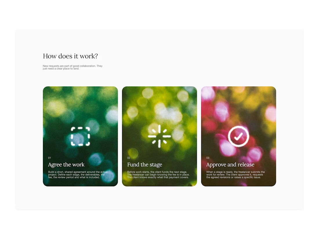

Your web sections always have such strong art direction. Great to see the brand carried right into the layout.

Every AI product apologizes for the wait. I designed the wait instead.
Latency: identity, interactive site and campaign built on Ma, the space that gives a thing its shape. The headline breathes in weight until the answer lands.
Design the pause.


Man, you’re superhuman; your consistency and quality are out of this world... congratulations on your work.