The network for creativity
Join 1.25M professional creatives like you
Connect with clients, get discovered, and run your business 100% commission-free
Creatives on Contra have earned over $150M and we are just getting started
Back to feedPost
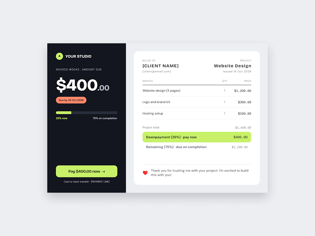
Invoice Design – Split Layout | DailyUI
A clean invoice design for the DailyUI challenge, built so a client can understand it in seconds.
The idea: Most invoices bury what the client needs most: how much to pay and by when. I split the screen in two. The dark panel shows the amount due, the due date, the payment plan (25% now, 75% on completion) and a clear Pay button. The white card holds the details: services, quantities, prices, totals and a short thank-you note.
Design choices:
Lime is used only for money (the Pay button and the downpayment row), so the eye goes there first
A progress bar explains the payment plan without extra text
Monospace numbers keep amounts aligned and easy to scan
Tools: Figma
Fonts: Bricolage Grotesque, DM Sans, IBM Plex Mono
Skills/Tags: UI Design, Web Design, Figma, Invoice Design, Fintech
Project mein kya daalna hai
Cover image: 4:3 Dribbble Shot
Neeche 2-3 zoom shots: left panel, totals wali lime bar, thank-you note


🤌🤌🤌

Splitting the invoice into a dark amount-due panel and a light line-items panel is smart, because the $400 with the lime Pay button answers the only question a client has. Blunt catch: the caption still has your working notes in Hinglish, like the cover image and zoom shot plan....

Thanks a lot for pointing this out and for the solid feedback! Really appreciate you noticing that. Updating the caption right away
The network for creativity
Join 1.25M professional creatives like you
Connect with clients, get discovered, and run your business 100% commission-free
Creatives on Contra have earned over $150M and we are just getting started











Related posts


This UI was really great nice job Piotr🔥🔥🔥

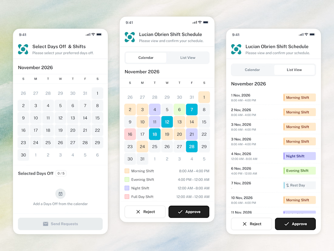
📱 The whole employee experience, right on the phone. Scheduling that goes wherever the team goes.

Amazing work