The network for creativity
Join 1.25M professional creatives like you
Connect with clients, get discovered, and run your business 100% commission-free
Creatives on Contra have earned over $150M and we are just getting started
Back to feedPost
For this entry I wanted to make something simple, yet effective.
Have you ever had to delete large bodies of text on mobile? Or search for a tiny ‘x’ icon to clear an input? I find it rather frustrating.
This interaction aims to mimic the real-world gesture, just like the most iconic interactions do, making it easy and intuitive to erase text.
No holding “Delete”. No precision targeting.
Just… wipe it!
Check it out here: https://wipe-it.figma.site (mobile experience only)
thanks
That’s brilliant!
Thanks!
Love dat interaction! <3
The network for creativity
Join 1.25M professional creatives like you
Connect with clients, get discovered, and run your business 100% commission-free
Creatives on Contra have earned over $150M and we are just getting started
Related posts
I’m experimenting with integrating character animation into user interactions. Deleting files is usually boring and straightforward. You select the files and press Delete, and that’s it!
I thought it would be more fun to design a character who gets excited whenever you decide to delete unnecessary files from your drive!
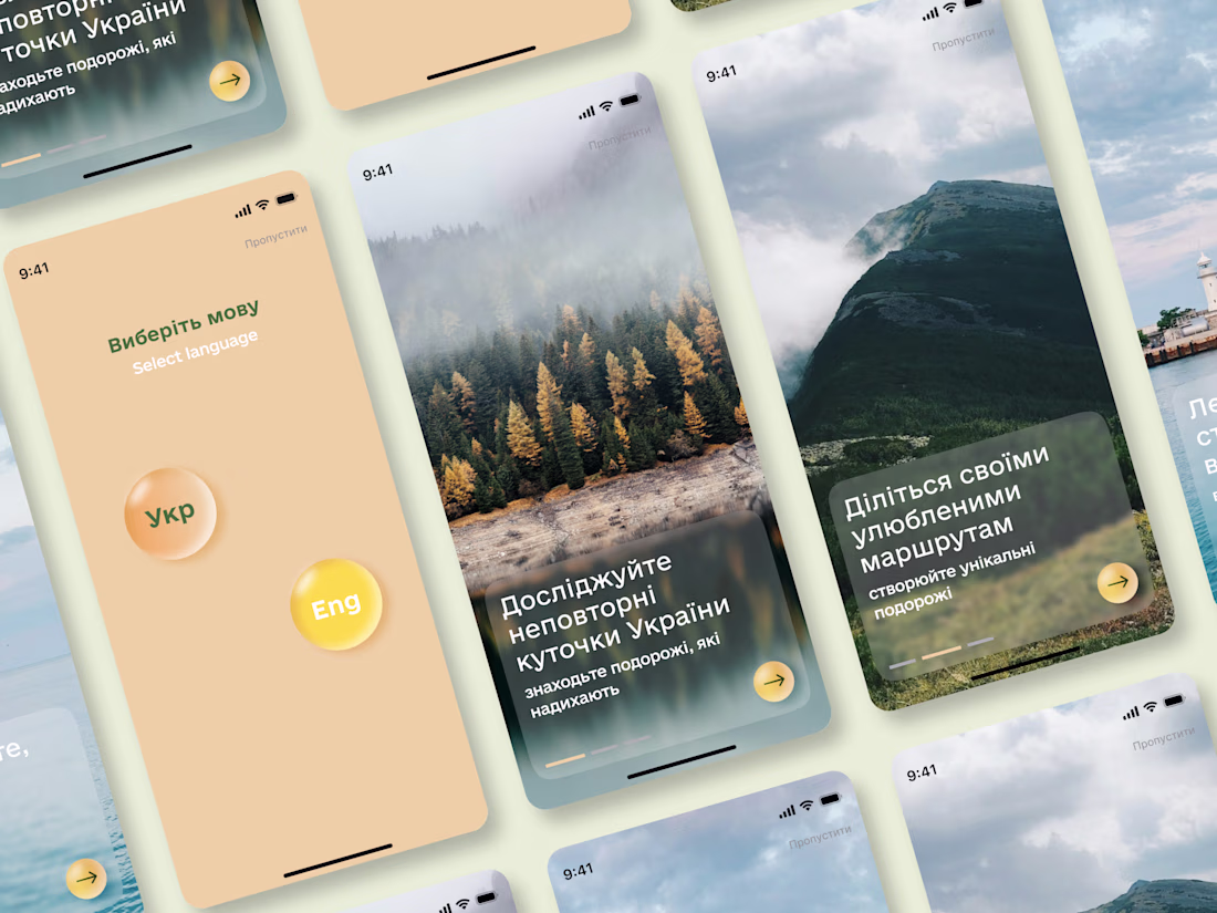
Travel App Concept
Designed a mobile app concept focused on helping travelers discover destinations across Ukraine and plan their journeys.
While preparing the case study, I explored Jitter to add motion to the presentation. It helped create a smoother narrative and made the project showcase more dynamic.
#ProductDesign #UXDesign #UIDesign #MobileAppDesign #AppDesign #InteractionDesign #UserExperience #Figma #Jitter #CaseStudy #DesignPortfolio #UIInspiration
This is a beautiful concept! The typography and layout look so clean, and those glassmorphism cards blend perfectly with the scenic backgrounds of Ukraine. Adding motion via Jitter is a great call — it always elevates the overall presentation and makes the user flow feel way...
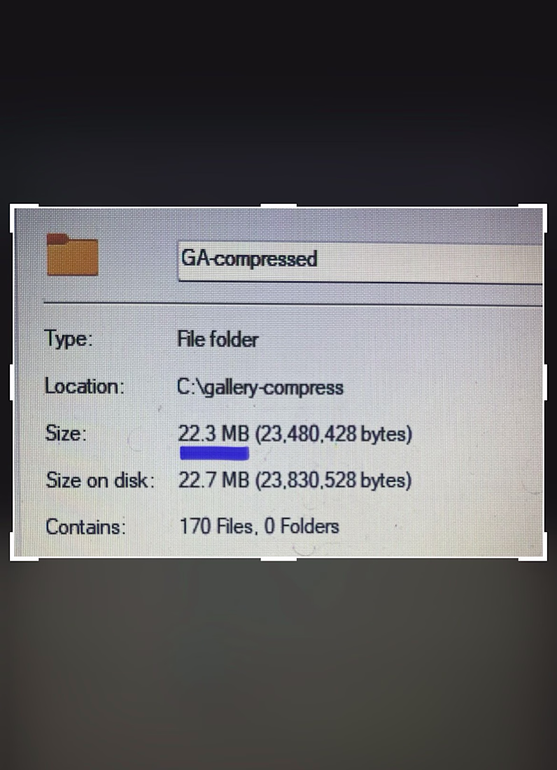
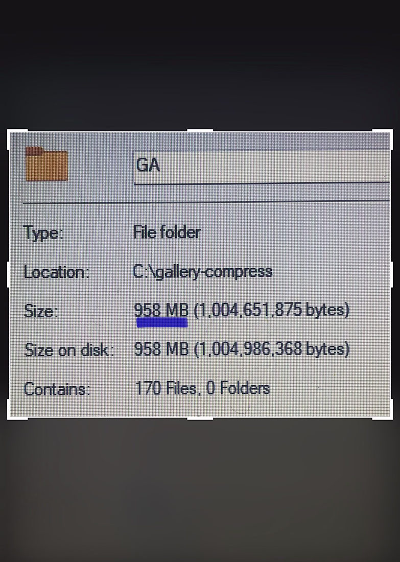
Last week, I shared how I bypassed manually uploading over 400 images to save an agency partner a full day of billable hours.
But getting 400+ images onto a webpage is only half the battle. Making them feel weightless is the real challenge.
If you try to load that many massive assets onto a page using standard methods, mobile browsers will completely freeze under the weight. The scroll gets chunky, the UI locks up, and suddenly, a high-end design feels broken and cheap.
For this project, the client needed lightning-fast tab switching between gallery categories. But natively rendering that much data at once was causing mobile Safari to panic.
So, I bypassed the standard native tools and built a custom architecture.
Instead of forcing the browser to handle everything at once, I implemented "progressive rendering" - chunking the images so they only load when the user actually scrolls to them.
Next, I forced the heavy image processing off the browser's main thread and built a custom DOM swapper that switches tabs instantly, with zero layout calculations.
The result? A massive, content-heavy media gallery that feels instantly responsive, even on an older phone.
Anyone can put 400+ images on a website.
But as a development partner, my job isn't just to match the Figma file. It is to protect the integrity of the end-user's experience.
Trending
Claude
Claude has entered the design space. How are you using Claude Design?
Contra University
Learn from expert creatives how to earn more using next-gen AI tools.
MagicPath
The canvas is infinite, and exploration is becoming the workflow. How are you using MagicPath?
creativeaiflow
Creative AI workflows are evolving. What tools do you use, and what are their strengths and weaknesses?
freelancerlife
Freelancer life is wins, pivots, and everything in between. What’s yours right now?