The network for creativity
Join 1.25M professional creatives like you
Connect with clients, get discovered, and run your business 100% commission-free
Creatives on Contra have earned over $150M and we are just getting started
Back to feedPost
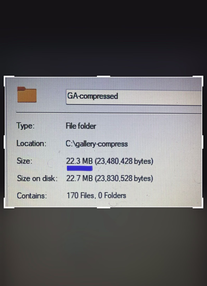
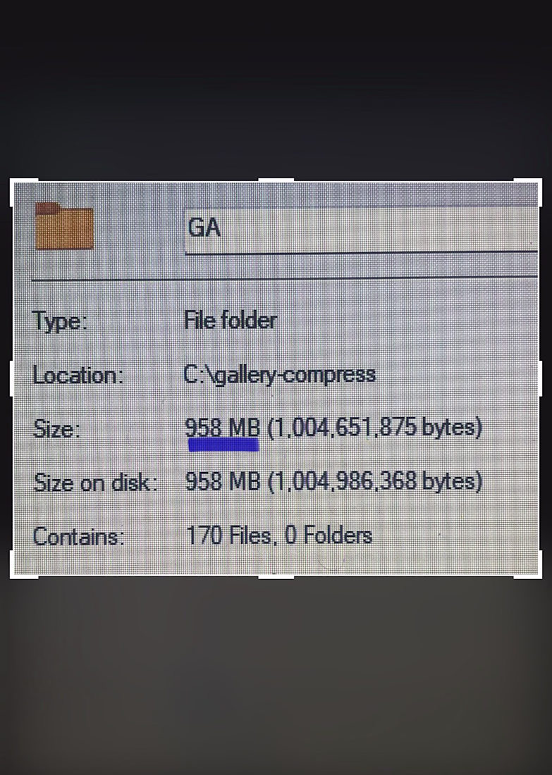
Last week, I shared how I bypassed manually uploading over 400 images to save an agency partner a full day of billable hours.
But getting 400+ images onto a webpage is only half the battle. Making them feel weightless is the real challenge.
If you try to load that many massive assets onto a page using standard methods, mobile browsers will completely freeze under the weight. The scroll gets chunky, the UI locks up, and suddenly, a high-end design feels broken and cheap.
For this project, the client needed lightning-fast tab switching between gallery categories. But natively rendering that much data at once was causing mobile Safari to panic.
So, I bypassed the standard native tools and built a custom architecture.
Instead of forcing the browser to handle everything at once, I implemented "progressive rendering" - chunking the images so they only load when the user actually scrolls to them.
Next, I forced the heavy image processing off the browser's main thread and built a custom DOM swapper that switches tabs instantly, with zero layout calculations.
The result? A massive, content-heavy media gallery that feels instantly responsive, even on an older phone.
Anyone can put 400+ images on a website.
But as a development partner, my job isn't just to match the Figma file. It is to protect the integrity of the end-user's experience.
The network for creativity
Join 1.25M professional creatives like you
Connect with clients, get discovered, and run your business 100% commission-free
Creatives on Contra have earned over $150M and we are just getting started
Related posts
Still can't believe this is fully native.
With the Framer 3.0 update I rebuilt this viral landing page using Opus 4.8. The result is insane.
Edit every layer on the canvas or just ask Claude
Check it live https://lumio.framer.media/
How would you compare this to a website built using only claude code and pulling from something from say, the Figma MCP?
My latest web design exploration
Mount Fuji Web Design Concept built entirely in Framer
https://mt-fuji-web-concept.framer.website
Fully responsive with smooth scroll animation and the best part no single line of code applied.
Fantastic work! Every screen feels purposeful.
Just wrapped up a custom website project in Framer for my client!
Focused on creating a clean, modern, and responsive experience that looks great across all devices. From layout design to smooth interactions and performance optimization, every detail was crafted to help the brand stand out online.
1 Built with Framer
2 Fully responsive design
3 Fast-loading pages
4 Modern UI/UX
5 Easy-to-manage structure
Always excited to help businesses turn their ideas into high-converting websites.
#Framer #WebDesign #WebsiteDevelopment #UIUX #FreelanceDesigner #ContraCreator #ResponsiveDesign #NoCode
nice
Trending
Claude
Claude has entered the design space. How are you using Claude Design?
Contra University
Learn from expert creatives how to earn more using next-gen AI tools.
MagicPath
The canvas is infinite, and exploration is becoming the workflow. How are you using MagicPath?
creativeaiflow
Creative AI workflows are evolving. What tools do you use, and what are their strengths and weaknesses?
freelancerlife
Freelancer life is wins, pivots, and everything in between. What’s yours right now?